Oxford University Press Education UK given new look
Baxter and Bailey has worked with a team of illustrators on a new identity for the publisher so that it can better communicate with a broadening audience.

Oxford University Press Education UK has been rebranded by Baxter and Bailey, which says it has taken a “playful, creative approach” to targeting learners, teachers and parents.
Oxford University Press (OUP) is attached to Oxford University and has an established reputation as an education leader.
Baxter and Bailey says it was brought in to show the breadth of services the publisher now offers. Everything from digital resources, to school improvement programmes and consultative expertise.
Identifying and representing new audiences
Today OUP Education UK is involved with syllabus work and consulting with schools rather than just selling materials to them.
“The OUP Education UK division was struggling to communicate this wider and more diverse offer,” says Baxter and Bailey partner Matt Baxter.
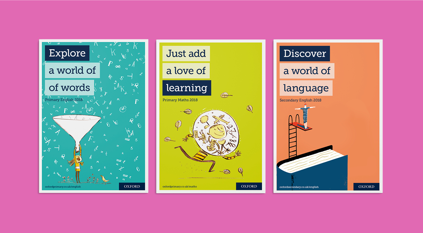
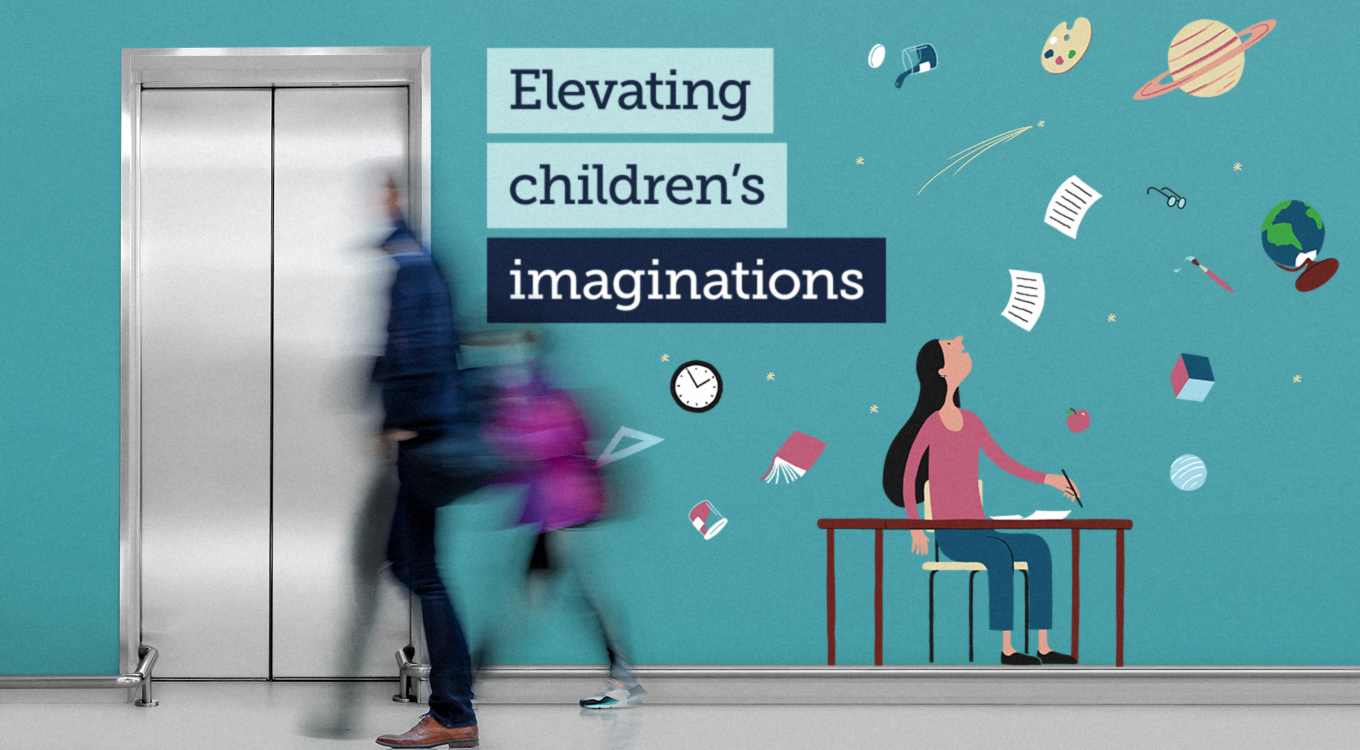
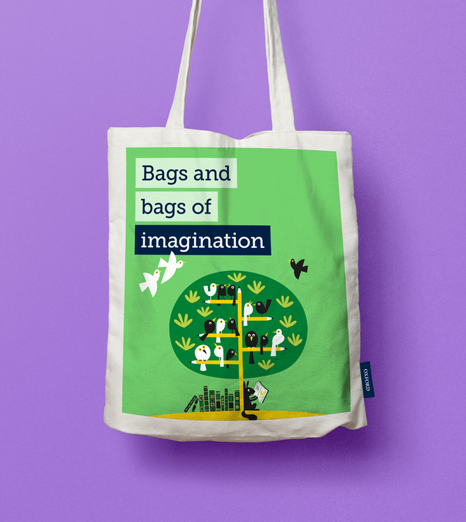
A new strategy identified the three key target groups – learners, teachers and parents – which were explored through new messaging.
Illustrative approach
Copywriter Lindsay Camp was brought in to work on messaging and a team of illustrators was commissioned: Cachetjack; Adam Larkum; Andrew Selby; Daniel Frost; Iker Ayestaran; and Lo Cole.
A vibrant colour palette was developed and an eclectic approach to illustration was taken.
“OUP Education UK obviously works with a lot of illustrators on their publications but we were keen to use new ones so that the identity could stand alone,” says Baxter.
OUP Education UK is a division within the overarching global Oxford University Press brand. Different versions of the OUP Education UK wordmark already existed when Baxter and Bailey took on the project. The consultancy identified and refined a preferred ‘blue tab’ version, which just uses the work ‘Oxford’.
Baxter says, “The blue tab logo links with the repeated use of a blue tab highlight within Lindsay’s creative messaging, and the whole system is contained within a crisp white border which brings consistency across applications.”
As the brand operates globally and publishes in other languages, the new identity may roll out to OUP’s other global locations, with Baxter and Bailey currently discussing new messaging development with OUP Australia and New Zealand.

Read this next

-
Post a comment


