Pentagram’s Abbott Miller leads Sotheby’s overhaul
A Pentagram team led by partner Abbott Miller has rebranded the auction house Sotheby’s
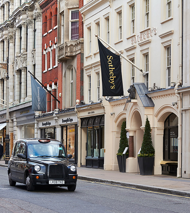
Sotheby’s was established in 1744 in London, its headquarters is in New York and it has salesrooms and offices the world over.
Pentagram was appointed in 2011, initially to redesign the Sotheby’s website, but the project became an overhaul of the brand which is now anchored by a new identity.
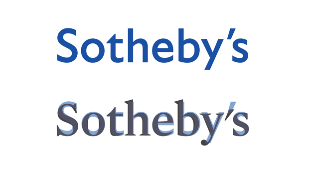
The new wordmark is a Mercury font and replaces a previous Gill Sans-based sans serif.
It fits into the context of what Pentagram calls ‘new design standards’ for stationery and related print collateral, auction catalogues, Sotheby’s magazine, the Sotheby’s website and app, advertising and promotions, signage and environmental graphics, and auction ephemera like aprons and bid paddles.
Mercury is the primary typeface and Benton Sans the secondary font, while Freight is used as a tertiary typeface employed for display and headlines.
Miller commissioned type designer Akira Kobayashi from Monotype to create custom Chinese characters for Sotheby’s Hong Kong wordmark in a way that would complement the Mercury mark.
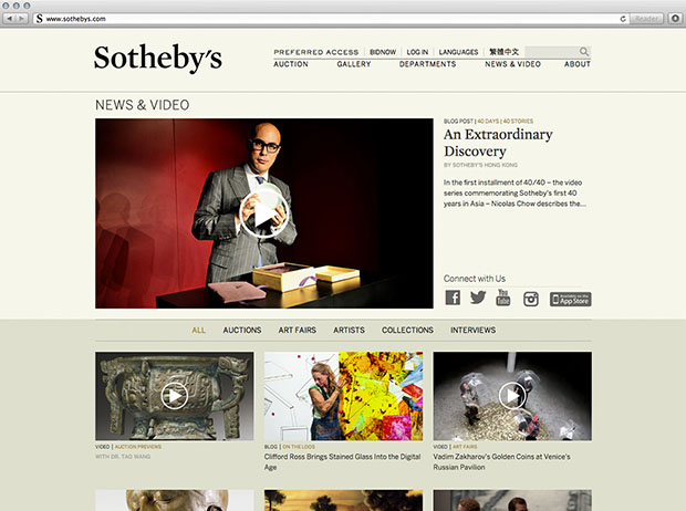
The website and magazine have a new editorial focus around art, collecting and ‘living with art’, themes which are also reflected in images and video.
Pentagram says a more intuitive navigation is ‘elegant and easy to use’ with departments and functions reorganised into simplified channels of information, comprising ‘mega menus’ and ‘fine-grain navigation’.
As Sotheby’s publishes auction catalogues nearly every day Pentagram wanted to create a consistency in the look and feel.
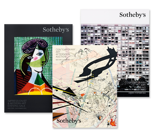
Pentagram says, ‘The designers developed a uniform format for the catalogues that utilises the new logo as an insignia in one corner of the covers. Interior layouts are clean and minimal, with vibrant images silhouetted against white.’
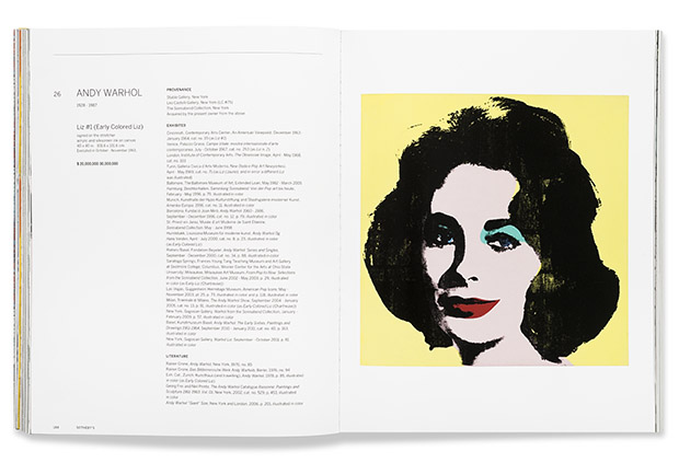
Detail is shown in double-page spreads with full-bleed images and the Beneton font is used in titles headlines and text. The format has also been used for the catalogue iPad app.
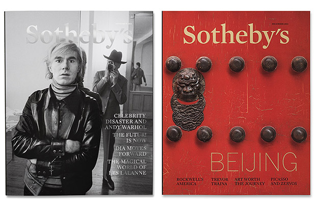
Meanwhile the magazine has been given a new look ‘between an art journal and exhibition catalogue’ with new paper stocks and a matt finish cover.
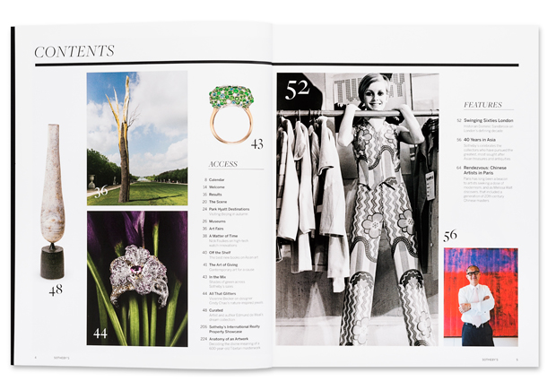
A new grid ‘opens up the pages to let images and text breathe’ and a black bar is used as a graphic device to organise layouts and set off headlines.
Read this next

-
Post a comment


