Designing new icons for the BBC
As part of its ongoing Global Experience Language project, the BBC is introducing a new suite of icons to be used across all its digital platforms – web, mobile and television.
The icons have been developed by an in-house team led by Simon Rooney, creative director for BBC GEL, in collaboration with consultancy Planning Unit.
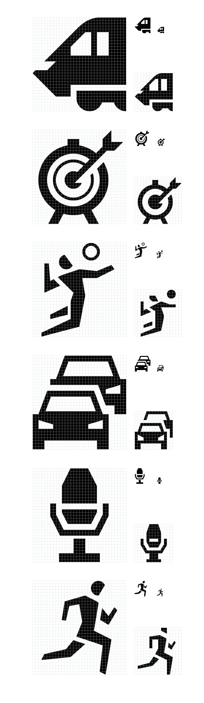
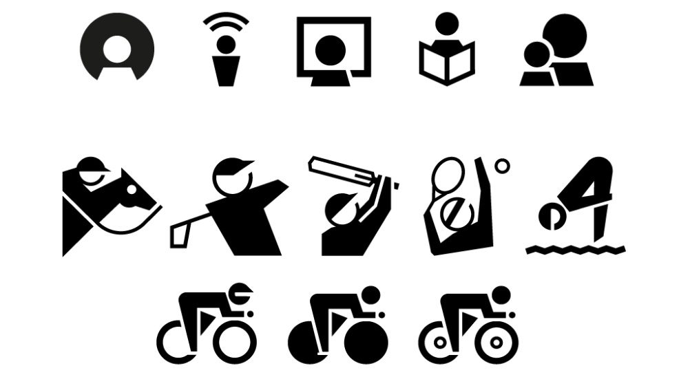
A total of 119 new icons are being introduced across BBC areas such as sport, travel and childrens. Rooney says the project began towards the end of last year, due to a ‘critical mass’ of icon requirements from various BBC areas.
This work builds on existing BBC icons, with the previous phase created in association with R/GA.
Rooney drew up a brief for the new icons, which was sent out as an open tender in January 2013. Planning Unit was appointed in February and worked on the project with a small group from the BBC’s user experience and design team.
Rooney says, ‘The icons needed to be simple, unambiguous and where possible unique to the BBC.
‘The icon style, therefore, continues to embrace a contemporary British design aesthetic, presenting the personality and quirks of the BBC while being respectful of our broadcasting heritage.’
He adds, ‘Ultimately I had executive approval as all of the new icons needed to work as part of a whole, complete suite. Towards the end of the project, Planning Unit and myself were really in synch and could tell if our new icons were moving away from a unified design style.

‘This even meant going back and tweaking some of the designs that had been originally approved from nearer the beginning of the project.’ The number of icons designed was also reduced from 170 to 119.
Nick Hard, partner at Planning Unit says, ‘It was very important to ensure that the icons help and inform the user through their journey, rather than adding noise to any of the BBC content. This resulted in reducing the number of icons in the final delivery.’
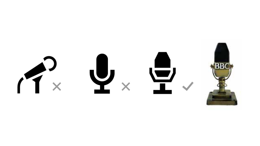
Rooney points to the design of the microphone icon as an exemplar of the BBC icon personality. He says, ‘While other microphone icon examples take a modern representation, we thought that a nod towards an iconic, classic design felt more appropriate for the BBC.’
To maintain clarity, each icons was crafted using 32×32 or 13×13 pixel grids, while angles were restricted to 15º increments and only complete pixel stroke weights were used where possible.
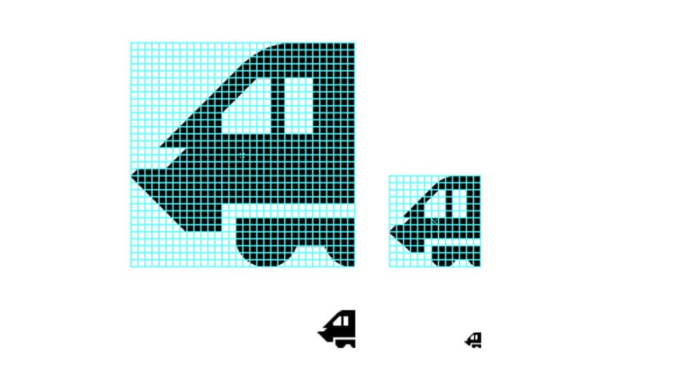
Hard says, ‘When designing the 32-pixel versions we always had the smaller 13-pixel versions in mind. Pulling them apart and removing content in order to rebuild them at smaller sizes informed the 32-pixel designs and in certain cases forced a full redesign.’
However, when developing the Sport icons, Rooney says a ‘less constrained approach’ was taken. He says, ‘Certain sport types such as athletics, gymnastics, judo and horse racing needed to incorporate a human figure somehow.
‘Up to that point, the use of people in the GEL icon suite had been limited to very simple, generic forms.’
Taking as its starting point an unused horse-racing icon developed with R/GA, the team experimented with different styles such as using head-gear to communicate facial direction.
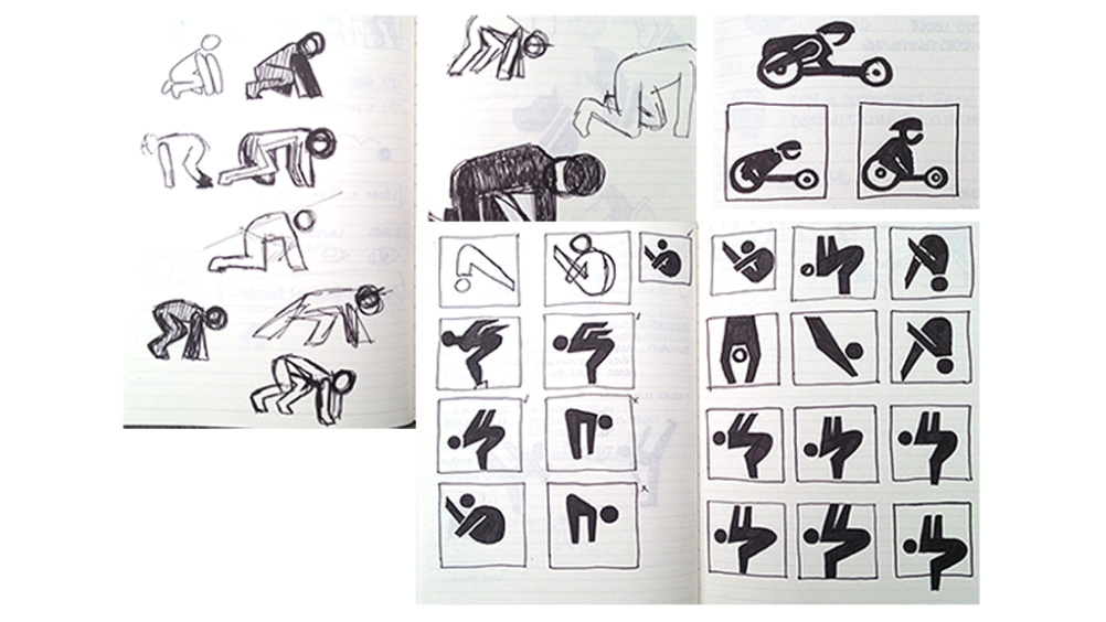
However, the team realised these iterations were ‘a bit too sterile and lifeless’, says Rooney, so they developed a system using the full body shape and anatomically correct proportions. There was also less of an angle restriction, which Rooney says, ‘Gave us the required flexibility to reflect dynamic movement.’
Line breaks represent trailing back limbs, and the human face is defined by removing a flat section from the circular head.
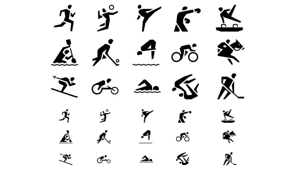
Hard says the Sport icons were the ‘biggest challenge’ in the project, involving decisions on the content, the styling and then for the human forms to work alongside all the other GEL icons.
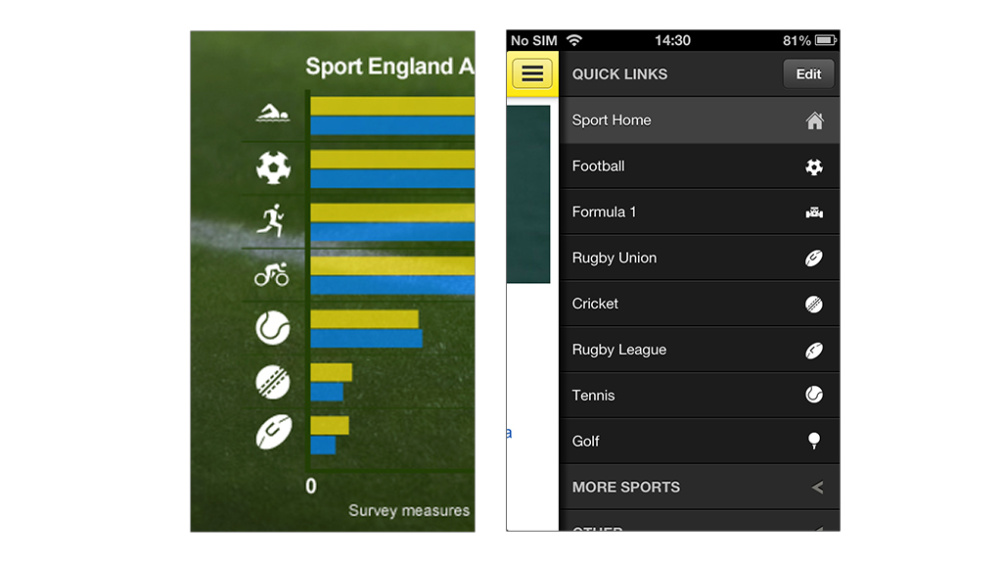
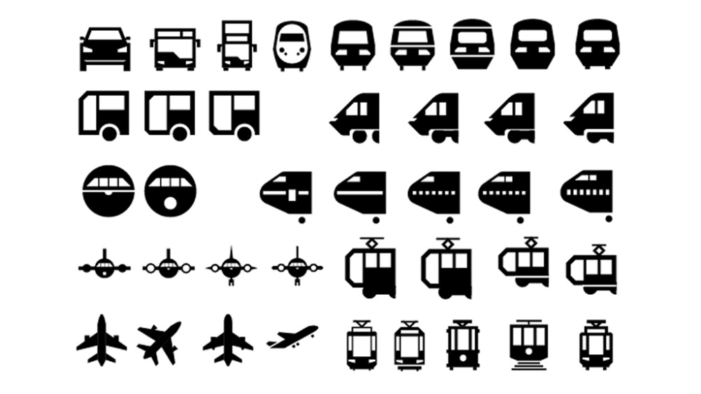
The full icon set was developed over a three-month period, and the first icons are rolling out this month. The BBC Travel section is using some of the traffic icons for road users, with Underground information set to follow, while BBC sport is using some of the icons in infographic content and is user-testing them in other services.
You can see the full icon set here and read the icon design guidelines in full here.
Read this next


Nice!
I thought the microphone was a barber’s chair. I think the second microphone icon is much simpler and faster read. And what is the french coffee press doing in travel icons section? (line 4)
Is it me or do these icons, particularly the sports ones, have more than a passing resemblance to these: http://www.someoneinlondon.com/category/projects/london-2012-olympics-brandworld
Still, they look pretty good all the same!
I agree with Hana about the microphones, personally I would have gone for option two. It is nice to see the development sketches though 🙂
Excellent work