Favourite symbolic logos
As we all know, there’s far more to creating a brand identity than simply drawing a logo. But who could deny the pleasure they get from seeing a logo that makes you smile or makes you think, or sparks an ‘aha!’ moment when you finally see the visual trick that’s been sitting there under your gaze.
Here are some of my favourite witty and clever logo designs from recent years.
Negative space
The Milton Agency, by Magpie Studio
The Milton Agency manages the ‘unsung stars’ of the TV and film industry, including hair and make-up artists. Magpie’s identity uses the clichéd Hollywood stars, but as the consultancy says, ‘the real action happens in the negative space – a monogrammatic M representing the expertise behind the scenes.’
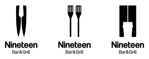
Nineteen Bar & Grill, by B&W Studio
An impressive use of negative space across three different applications in this restaurant branding from B&W Studio – with the different logo elements representing both the ‘bar’ and ‘grill’ offers from the client.
Martin Newcombe Property Maintenance, by Buddy Creative
Buddy Creative’s David Jones says about this identity, ‘We wanted to sum up property and maintenance in a single simple mark. I sketched the idea on the back of an envelope and half an hour later we’d drawn it up.’
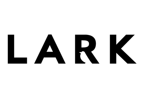
Lark, by ArthurSteenHorneAdamson
ArthurSteenHorneAdamson’s identity for insurance specialist Lark cleverly integrates a lark into the company name. The colour palette for the branding is based on a lark’s plumage.
Double Meaning

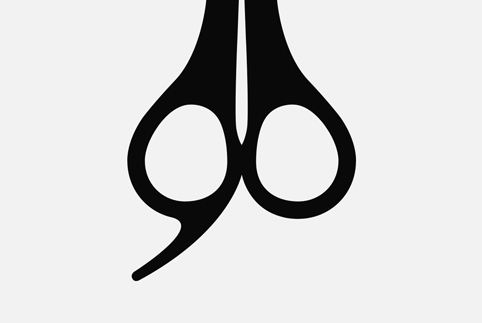
Soho Secret Tea Room, by The Partners
You could, of course, choose almost any logo created by The Partners – with the LSO identity one of the finest examples of a ‘gosh!’ moment when you spot the hidden conductor. The Soho Secret Tea Room identity is one of the consultancy’s most elegant recent examples, combining a teaspoon with a vintage-style keyhole.
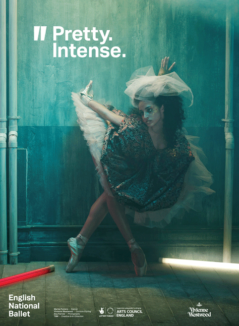
English National Ballet, by The Beautiful Meme
For its English National Ballet rebrand, The Beautiful Meme created an abstract-looking mark that actually represents a pair of ballet shoes ‘on pointe’. The logo also works as a set of quote marks, tying into the ENB’s proposition as a ballet company ‘with something to say’.
90 Hairdressing, by Mark
As Mark’s Mark Lester says, ‘Sometimes, an elegant creative solution seems really obvious. But only in retrospect…’
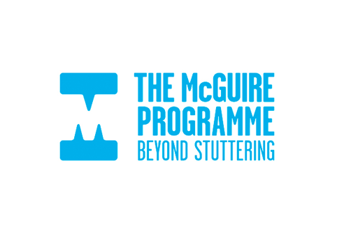
McGuire Programme, by Purpose
The McGuire Programme is an organisation that provides support and therapeutic coaching for people who stammer. For its identity, Purpose used a similar negative-space trick to Magpie Studio’s Milton Agency logo, but with the elements surrounding the ‘M’ representing speech bubbles (and, I think, a set of teeth…).
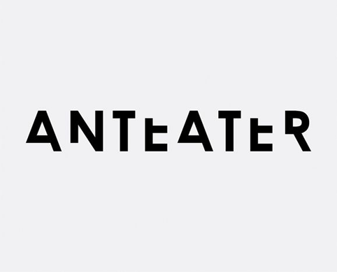
Anteater, by Here Design
Not so much double-meaning as single-meaning, with Here Design branding Anteater – ‘a creative agency with bite’ – using a typeface with chunks seemingly bitten out of it.
St Mary’s Church Restoration Fund, by Rose
Just perfect.
Hidden images
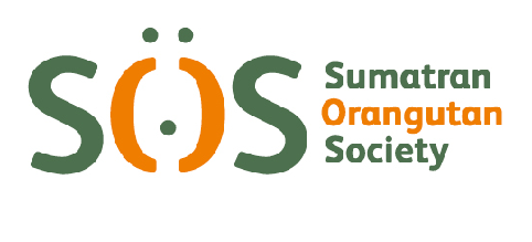
Sumatran Orangutan Society, by Hat-Trick Design
Hat-Trick brilliantly managed to bring an orangutan’s face into its identity for the Sumatran Orangutan Society (or SOS). It’s also an identity that lends itself to plenty of fun print applications.
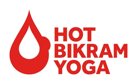
Hot Bikram Yoga, by Fivefootsix
Hot Bikram Yoga is a style of yoga practiced in 40.6 °C with a humidity of 40 per cent. For its identity for the organisation, Fivefootsix created a logo which represents a flame with a drip of sweat running down it. However, yoga afficianodos will also have spotted that the logo looks like someone in the yoga ‘bow’ pose.
Just funny…
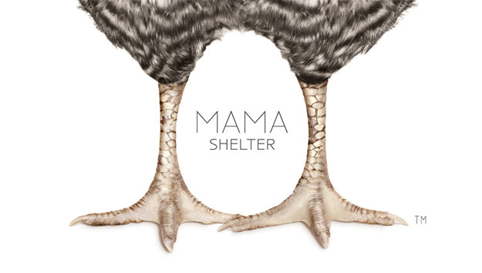
Mama Shelter, by GBH
A nice use of negative space in this hotel branding from GBH, but an even better use of a chicken’s charming pair of legs.
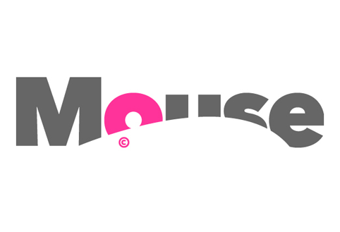
Mouse, by Johnson Banks
When it was working on the branding for Microsoft’s digital advertising awards Mouse, Johnson Banks says, ‘We suspected there would be some way to “embed” a mouse shape into the word.’ This logo gets extra points for the pink ear.
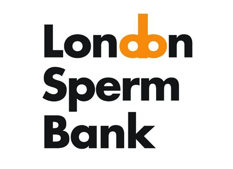
London Sperm Bank, by Silk Pearce
Simple, elegant, direct. Logo design doesn’t get much better than this…
–––––––––––––––––––––––––––––
In this week’s voxpop we asked a selection of designers to tell us about their favourite logos that use hidden symbolism.
Read this next

-
[…] Favourite symbolic logos – English National Ballet, by The Beautiful Meme For its English National Ballet rebrand … bite’ – using a typeface with chunks seemingly bitten out of it. Hot Bikram Yoga is a style of yoga practiced in 40.6 °C with a humidity of 40 per cent. […]


Great selection, the soho tea rooms and St Mary’s church are just brilliant!
Thanks Angus
Inspired – everyone – literally in the case of St Mary’s
London Sperm Bank would also work with the omission of “Sperm” and if Bank was altered to read Bankers
[*!*]
The Milton Agency, by Magpie Studio is very well done – the rest are pretty typical.
Poor choice of colour with the London Sperm Bank Logo – is it supposed to look like a Clockwork Key?!