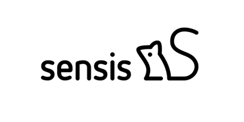
New mouse-based branding for Sensis
Interbrand Australia has rebranded media company Sensis, creating a new identity based around a mouse character.
Sensis was previously a paper directory brand, which now works across marketing, SEO, website design and apps, as well as still offering its paper White and Yellow Pages printed books. The rebrand project aimed to create new position for the brand around its move to digital marketing.

Interbrand worked with Sensis staff to create a new brand architecture that separate the business-to-business and business-to-client functions across Sensis’ portfolio. According to the consultancy, the new look is designed to ‘show how [Sensis] could educate and empower organisations of all sizes to be better marketers’.
Interbrand says, ‘It needed to present itself as a guide for Australian businesses as they navigated from the physical to the digital. It needed to be a brand that could engage and motivate by demystifying technology and simplifying complexity.’
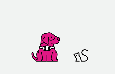
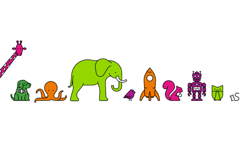
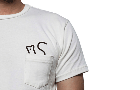
The mouse icon was drawn by Dutch illustrator Tim Boelaars, who also created a series of other icons including a rocket, an owl an elephant and an octopus. The central mouse character is ‘a metaphor for the resourceful, determined and industrious businesses Sensis works with’, according to Interbrand. The mouse’s tail forms an ‘S’.
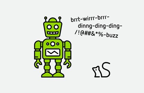
Creative director of Interbrand Australia Oliver Maltby says, ‘Each individual story uses a simple metaphor relevant to a business issue, such as growth (giraffe), knowledge (owl) and technology (robot).
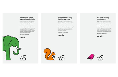
‘Using characters along with straightforward encouraging language presents digital marketing in a way that’s human and accessible.’
Read this next

-
Post a comment


