Pearlfisher creates ‘R&B-inspired’ confectionary branding
Pearfisher has created the branding for new organic confectionary brand Legit Organics, with a look it says is inspired by R&B music.
Legit Organics launches in the US in the autumn, and Pearlfisher’s New York office worked on the project.
Hamish Campbell, creative director at Pearlfisher, says, ‘The standard in organic confectionary has always been about compromise: worthy not tasty; timid not tempting; cluttered not cool.’
Campbell says the look for Legit Organics aims to be ‘enjoyable, accessibly and authentic’.
He adds, ‘Inspired by R&B – which we see as being rich, sensual, bold and charismatic – we drew upon its culture to bring the taste and flavor of Legit Organics to life.’
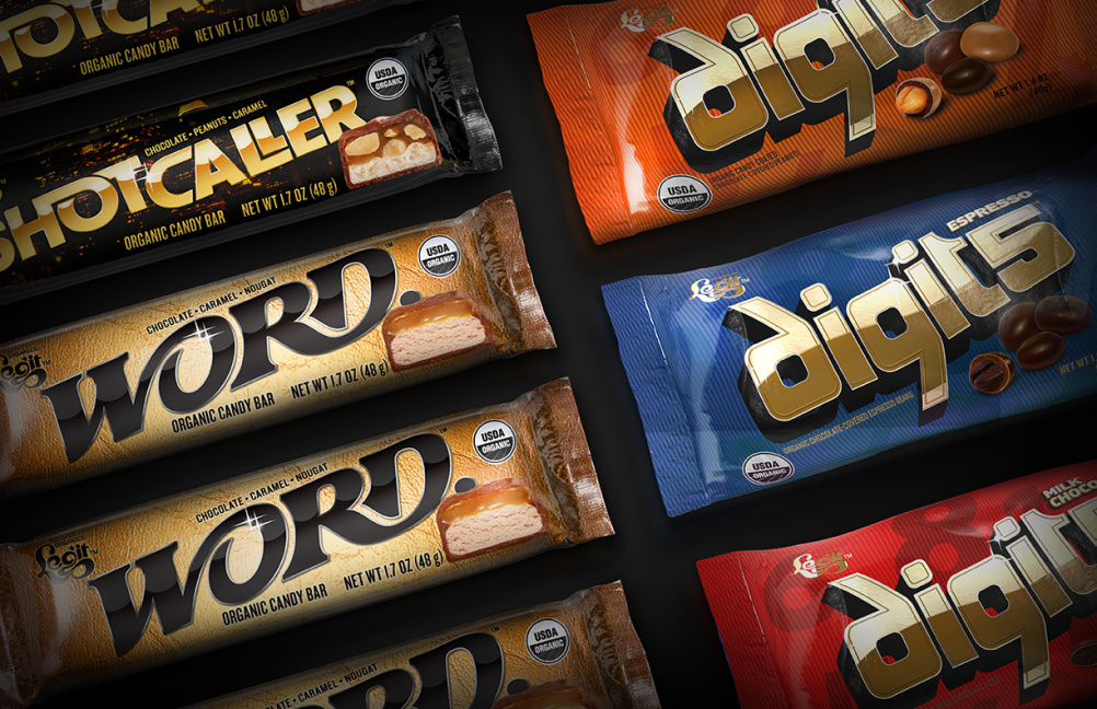
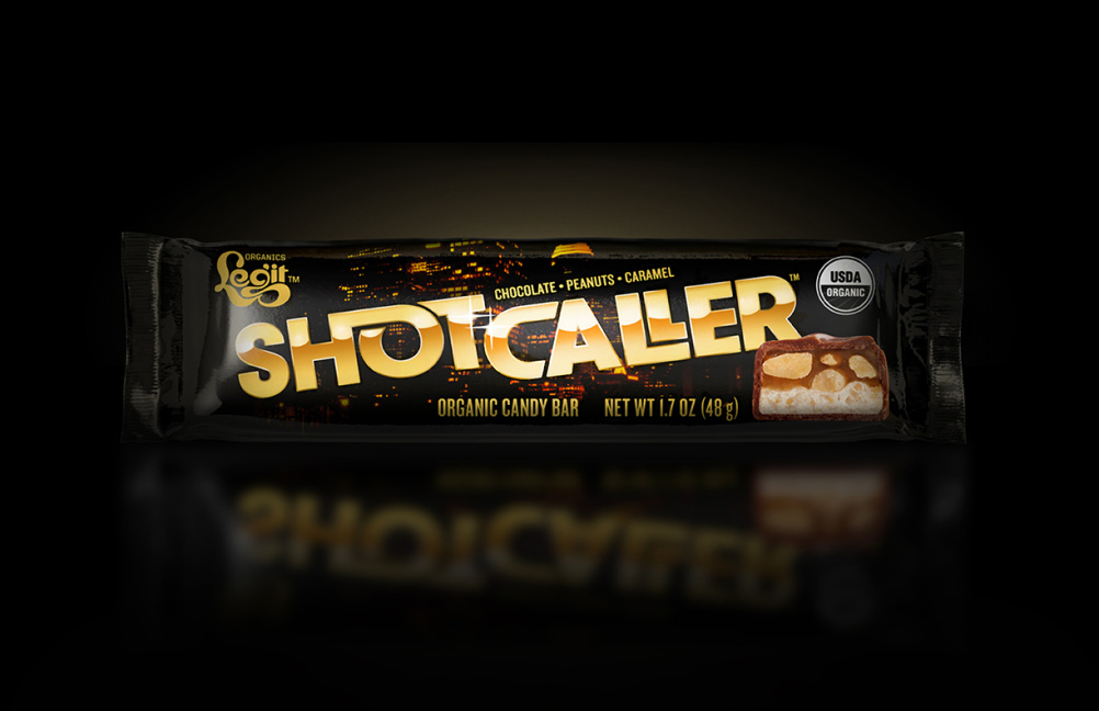
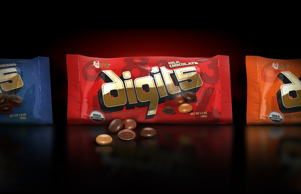
Legit Organics is launching three products, Shotcaller, Word and Digits. The packaging uses a black and gold colour palette and night-time images of the city.
Pearlfisher says the new branding ‘disrupts the notion that candy is an unhealthy and nostalgic indulgence’

-
Post a comment


