1HQ creates new packaging designs for Jordans cereals
1HQ has created an updated packaging identity and range design for Jordans cereals, inspired by the British countryside.
The consultancy was appointed to the project in August 2010 following a three-way pitch. It has previously worked on other products from the parent company The Jordans & Ryvita Company.
The project has seen it redesign packaging across the whole Jordans range of about 30 different products. The previous packs were designed by Pearlfisher.
According to 1HQ client director, Sajag Patel, the consultancy was briefed to ‘reinforce Jordans’ credentials within the cereals category’.
Tim Holmes, 1HQ associate creative director, says, ‘The previous pack designs had started to hint at these nature credentials, but in a very understated way. We have created a much more holistic design with the whole pack telling the story.’
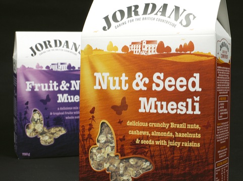
The new packs feature a foreground illustration of wild flowers and oats, and a butterfly window displays the product. The mill building is now more prominent on the pack, and the reverse shows a village noticeboard containing various pinned on-notes and photos.
Holmes says, ‘The project was about making Jordans feel much more integrated, and getting the nature-friendly credentials across. We really wanted the whole pack to tell the story of the brand.’
The new designs will roll out across Jordans products throughout 2012, with the Country Crisp likely to launch at the end of this month.
Read this next


I have given a viewpoint on the design,a little harsh but do you agree?
http://packagedwrappedandslightlyopinionated.blogspot.com/2012/01/jordans-field-of-dreams.html