Wordsearch creates identity for One World Trade Center
London-based consultancy Wordsearch has developed the identity for One World Trade Center, the New York skyscraper under construction on the World Trade Center site.
According to Wordsearch director William Murray, the consultancy pitched to developers Cushman & Wakefield in December 2009 with a film and strategic presentation, before further pitches to The Durst Organization and The Port Authority.
Wordsearch director Matthew Flynn says ‘Our central challenge has been to cut through the incredibly complex context and arrive at an identity that clearly articulates a singular vision.
‘We needed an approach that would support our client’s office leasing objectives, while also acknowledging the interest of a wider audience. We are very excited about how we roll the brand out, across an innovative international leasing campaign.’
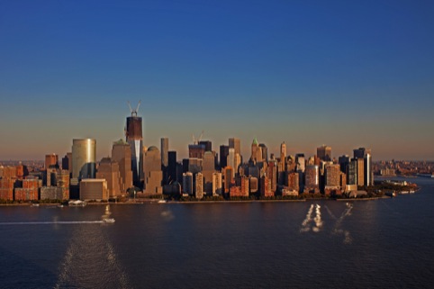
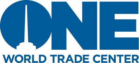
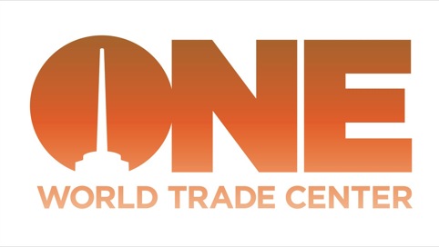
The identity design focuses on the building’s form and its position in the Manhattan skyline. It will be the tallest skyscraper in the western hemisphere when complete, standing at 541m.
An emphasis has been placed on the word ‘One’ which, according to Wordsearch, has been chosen to communicate: ‘The first amongst many, leading from the front, singularity of vision.’
A graphic device within the ‘O’ focuses on the top of the building, as it will be viewed from around the city.
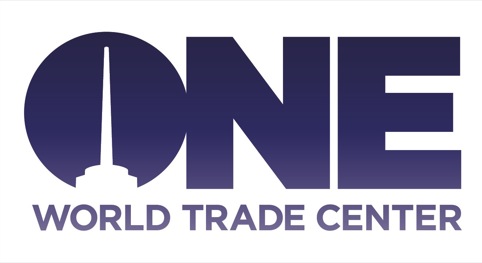
The colour palette of graduated blues, indigoes, oranges, yellows and pinks has been drawn from the Manhattan skyline, taken at different times of the year.
Typography has been set in a customised version of Hoefler & Frere-Jones’ Gotham, inspired by the lettering on old New York buildings.

‘It is a strong bold and timeless font,’ says Wordsearch director William Murray who looked at old New York Times serif style and New Yorker magazine fonts but rejected this in favour of something more ‘forward thinking.’

Talking to One World trade Centre’s architects Skidmore Owings and Merrill, Murray says it became clear the building would need ‘broad shoulders’ and that ‘the design shouldn’t overshadow anything.’
Read this next


Really nice work on the logo… i dont understand the plunger in the O though.
A druggies drop in centre, needles supplied free?
Really really disappointed – what is new and fresh about this folks?
Very, very dull.