Society for General Microbiology goes viral with new identity
Firedog has created a new identity for the Society for General Microbiology, which is formed from the ‘soft, circular’ shape of microbes.
SGM is a membership organisation for scientists working in microbiology, and the largest learned microbiological society in Europe.
Firedog started work on the rebrand project at the beginning of the last year, holding a series of workshops with stakeholders. The consultancy says that the previous brand mark had ‘failed to adapt to a digital domain’ and wasn’t scalable for use as a favicon or for other touchpoints.

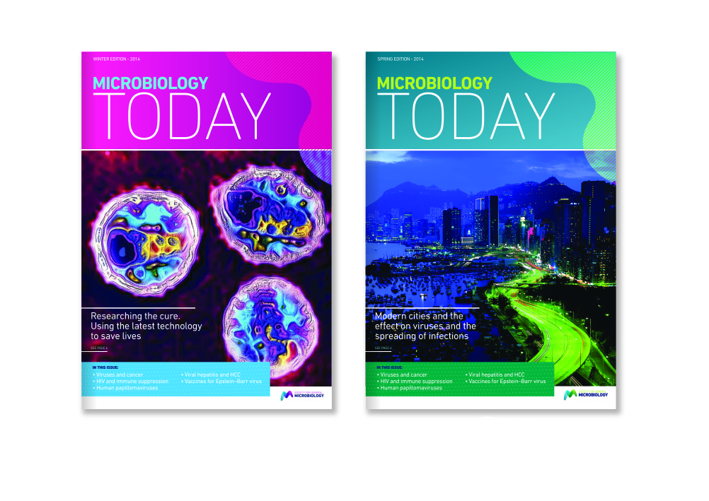
Firedog says early design work used the shape of microbes. The consultancy says, ‘Retaining the roundness of early designs, the brand mark evolved into an M device that subtly hints towards microbiology without being overly explicit.’
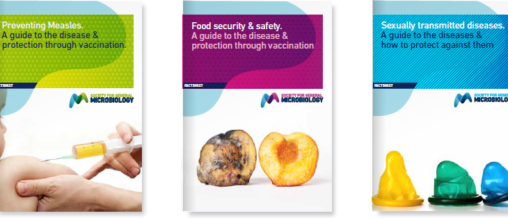
A series of colour combinations can be used ‘to add flexibility and interest’, while Firedog has also created graphic applications that juxtapose the soft shapes with angular geometric ones – to represent the ‘sharp analytical minds of the people who work in this domain’.

Firedog also updated the SGM typeface, changing it from Rotis to DIN. The consultancy says the previous typeface was ‘hard to read in digital environments’.
SGM council member Paul Hoskisson, chair of the rebrand working group, says, ‘The new brand reflects both our heritage and our desire to keep evolving so we remain relevant both today and in the future.’
Read this next

-
Post a comment


