Resident Advisor launches new branding and site design
Electronic music website Resident Advisor has launched new branding and site design, created from a collaboration between the site’s founders and consultancy SOON_, which was co-founded by Fred Flade, formerly of Poke and Deepend.
Resident Advisor initially launched in 2001, and was last redesigned seven years ago. The branding and site overhaul, launching today, aims to ‘emphasise and streamline what we feel are the most essential elements of the site’, according to co-Founder of Resident Advisor, Paul Clement.
Clement and Flade had met working at consultancy Deconstruct, and had worked on project including site design for The Barbican arts centre.
‘When we started in 2001 we didn’t know what it would become or that we would have the audiences we have now. It naturally grew in a nice way’, says Clement.
‘Seven years is an age in the current online world. About two years ago I started talking about [redesigning the site] more seriously with Fred and it seemed like a no-brainer.’
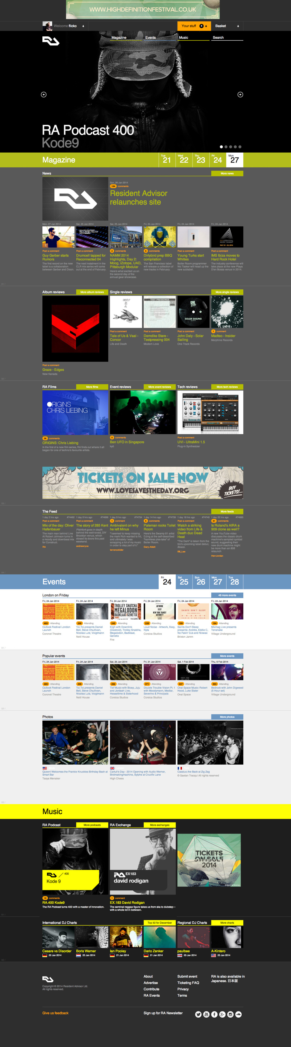
The main focus of the new site, says Clement, is to be responsive across all devices and to simplify the site design.
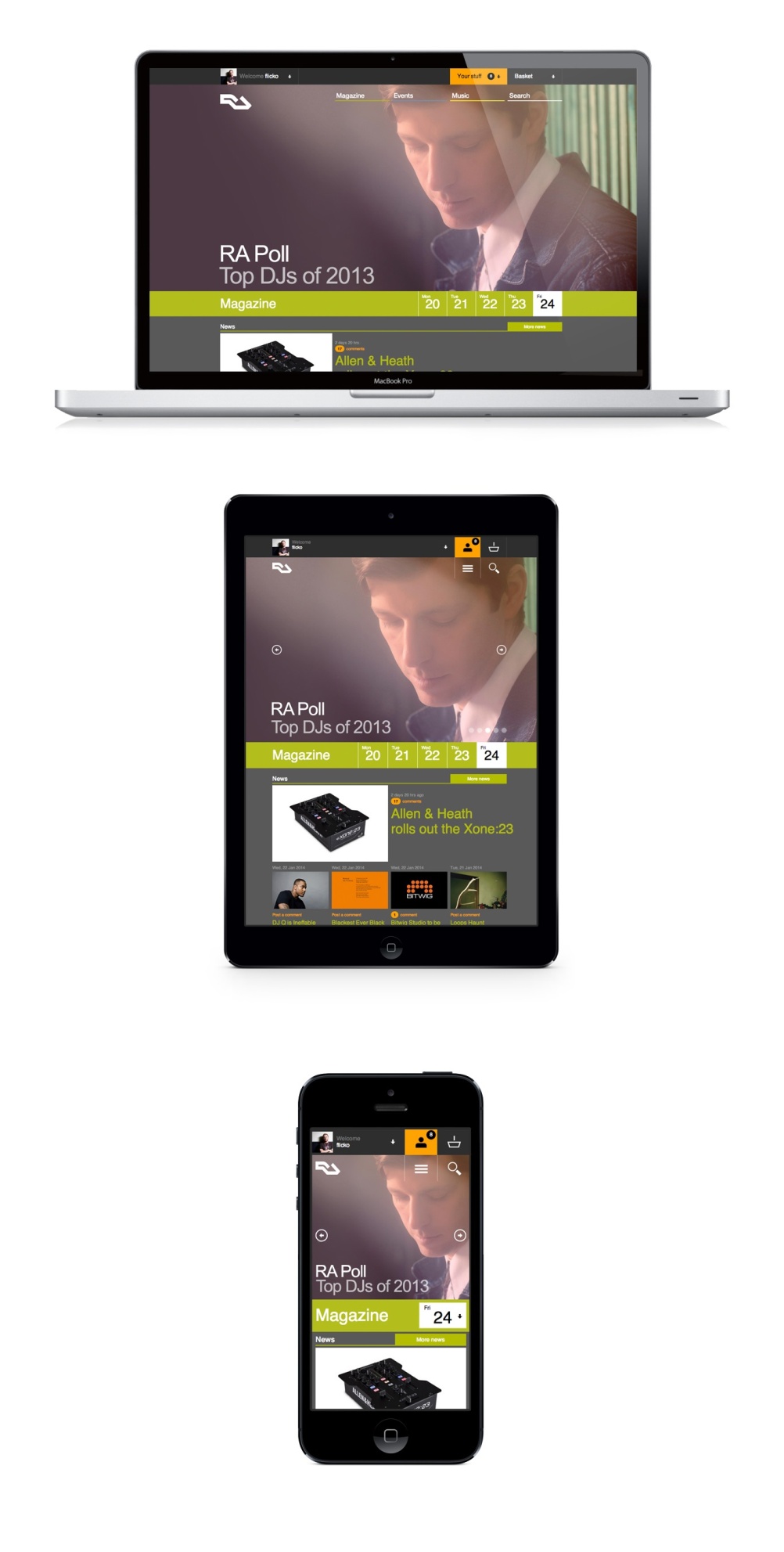
The new logo draws on the previous RA logo, designed by Clement. It links the ‘R’ and ‘A’ into a graphic symbol at a 45 degree angle, creating a brand element that can be used across all touchpoints including the website, merchandise and poster for events organised by external promoters.
Clement says, ‘We wanted to move forward with the branding and create a logo that was more confident, simpler and powerful. It works really well with different sizes but with the site it was critical to look at it from a mobile design perspective, but also create something scalable for a larger screen’.
Flade says, ‘A lot of it was about taking the content that was already on the site and finding a way to make it more visually impactful and bring it up to date. We’re using bigger images and bigger typography so the content can shine.
‘One of the unwritten briefs we quietly agreed on was not to destroy what the brand was in the first place, but to evolve it’.
A series of new icons were developed, and the current colour coding system for various aspects of the site – green for editorial; blue for events; yellow for artists and orange for content relating to logged-in users – remains.
Increased site functionality includes the ability to prioritise content for logged-in users, for instance seeing the artists and venues they have indicated an interest in over others. According to RA, the layout and global navigation will reflect users’ preferred way of exploring the site.
Read this next

-
Post a comment


