The history of Olympic design
The 2014 Sochi Olympic Winter Games are just around the corner and a blizzard of visual communication is sweeping across Russia’s Black Sea coast.
Source: IOC
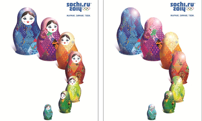
Official Sochi Games posters featuring branding design by Interbrand
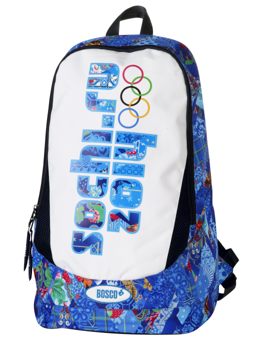
Interbrand has created a flexible brand for the Sochi Games with a tapestry look and feel based on styles of craft from 14 regions around Russia.
By the time the Olympic cavalcade rolls in on 7 February, design will have already shaped the branding – identity, pictograms, posters – as well as stadia, medals, mascots, the torch, and countless other touchpoints.
Source: IOC
Official Sochi merchandise featuring branding by Interbrand
With this in mind Design Week visited the newly re-opened Olympic Museum in Lausanne, Switzerland to look at how previous Olympic cities have handled their branding.
The Museum sits off of Lake Geneva with a dramatic Alpine backdrop that feels like an appropriate evocation of the ‘faster, higher, stronger’ Olympic motto.
Source: By Christophe Moratel
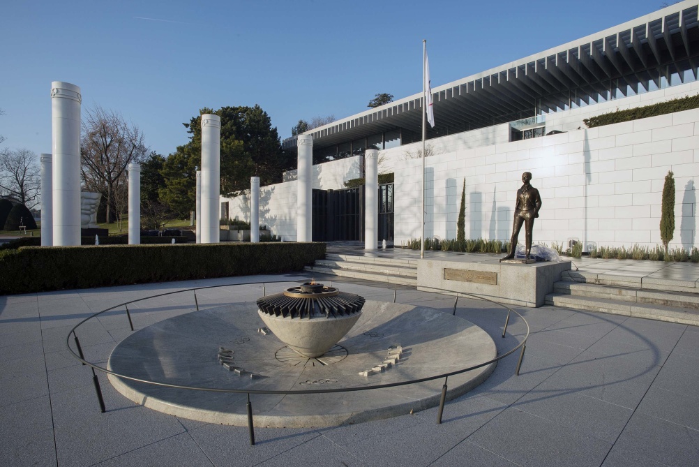
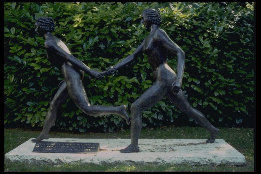
It is set in a re-landscaped park full of bare-bottomed statues showing how Olympians might have competed in 776BC. Steps leading up to the museum are etched with the locations and dates of former Games, there’s a 100m running track for those who want to embarrass themselves and a cauldron holding the Olympic flame.
Source: IOC
Sculptures in the relandscaped museum park
Inside the museum the ancient history of the games is beautifully introduced with AV and through the museum’s collection in the Olympic World section, which is where you’ll also find a hoard of designed artifacts telling the story of the modern history of the Games.
The Olympic World section, in keeping with the rest of the museum, allows visitors to pick up a basic understanding of the theme or drill down into a forensic level of detail.
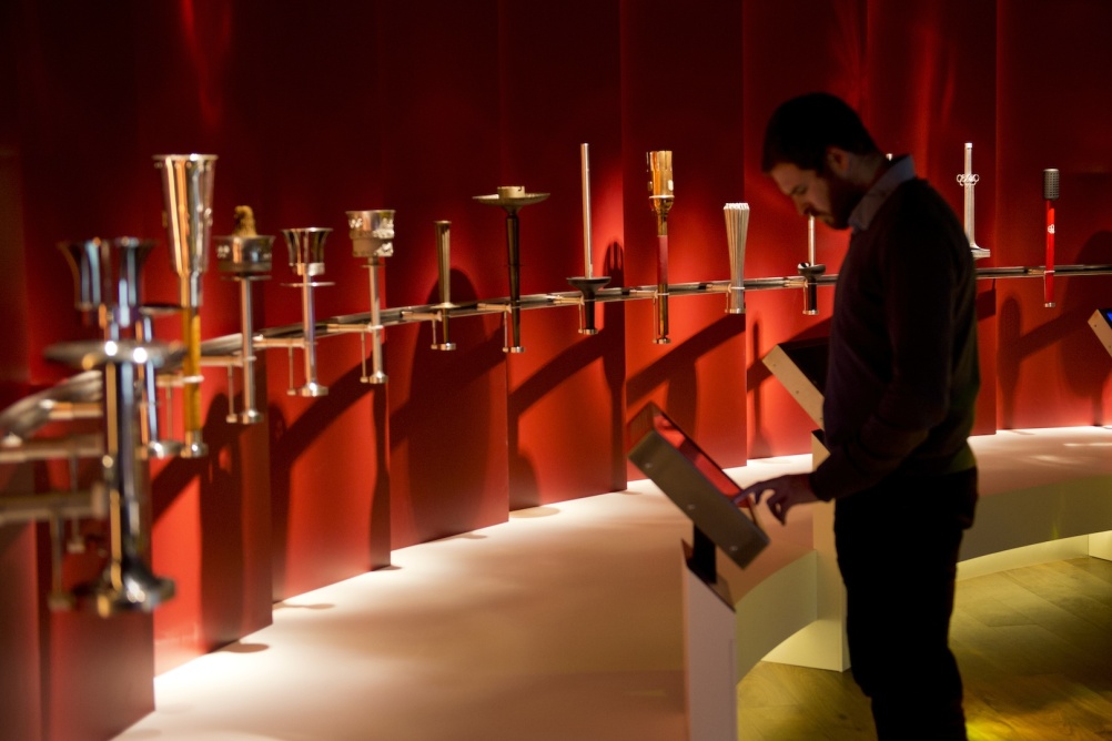
Source: By Christophe Moratel
Here the torches from summer and winter Games are displayed around a snaking contour and occupy a low-light space that feels almost sacred.
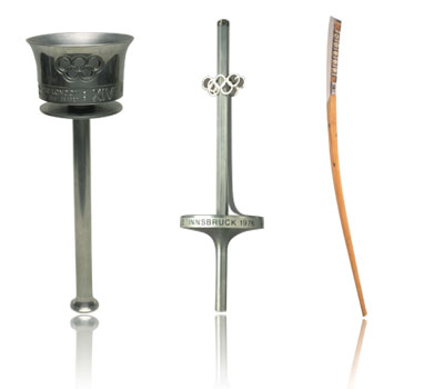
Side-by-side there’s a palpable sense of evolution in the torches, particularly through materials and finishes used, but there are also expressions of national identity to be found, and stylistic flourishes which reveal broader cultural trends of the time.
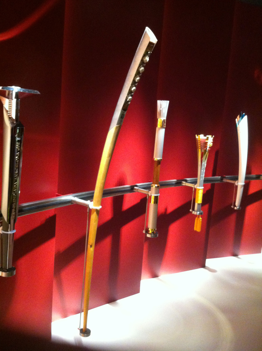
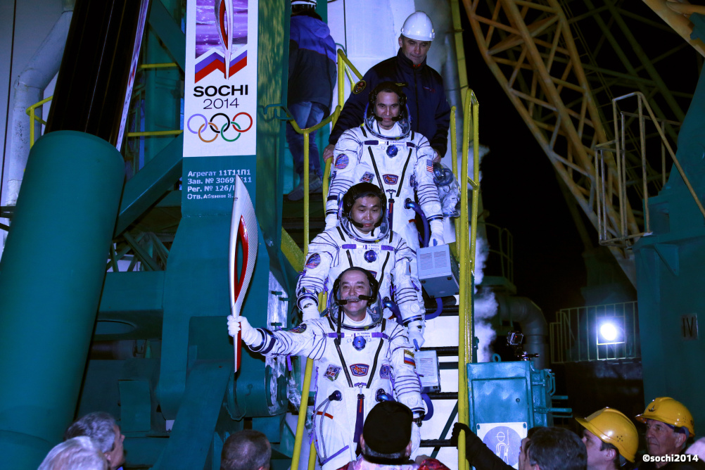
Noteable examples include the Great Britain one from 1948, our first Olympics, Innsbruck 1976, an enormous torch for Lillehammer 1994 – which is about the size of Norway – and the Russians showing off by taking the Sochi torch to space and back.
Browsing official posters for the games shows the unprecedented impact the Mexico 68 identity had on graphic design of the Games. Lance Wyman’s work is at its most mesmeric and hypnotising on the official poster, where concentric rings radiate out from the identity.
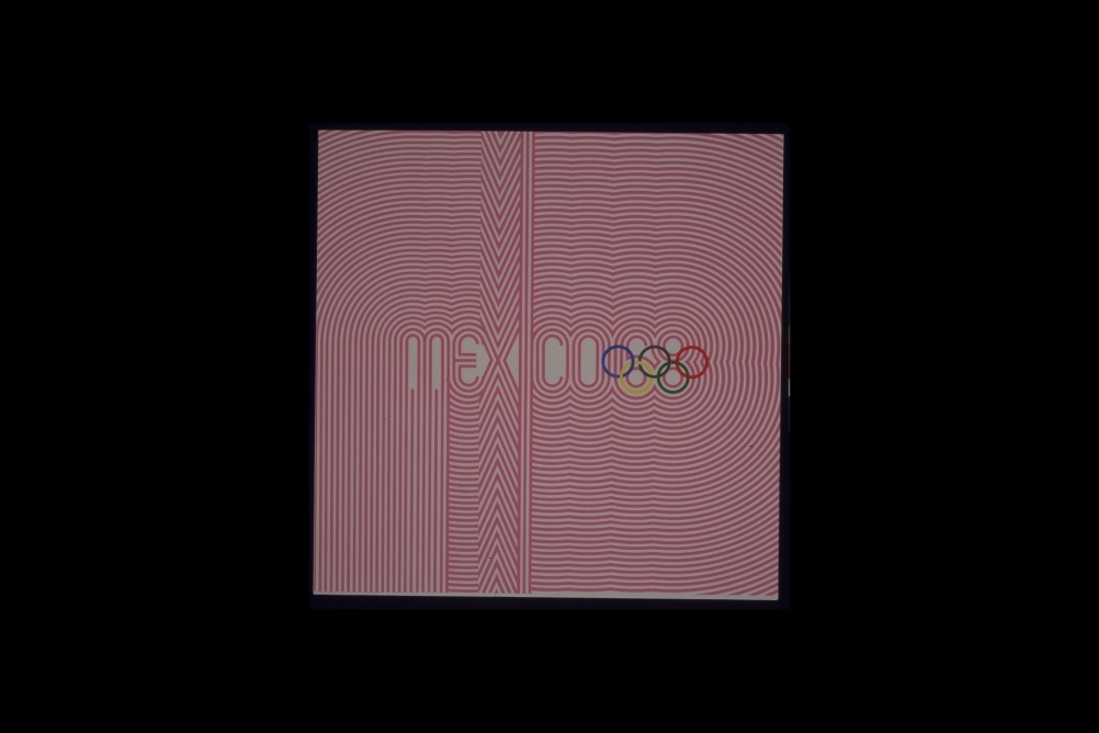
It seems that everyone else upped their game after Mexico. The Munich Games of 1972 – with Otl Aicher’s branding – for example showcased an art series designed by international artists who looked to Olympic competition for inspiration. A handful of examples have been cherry picked and hung, and there’s an interactive to explore which features posters, cultural programme highlights and sculpture.
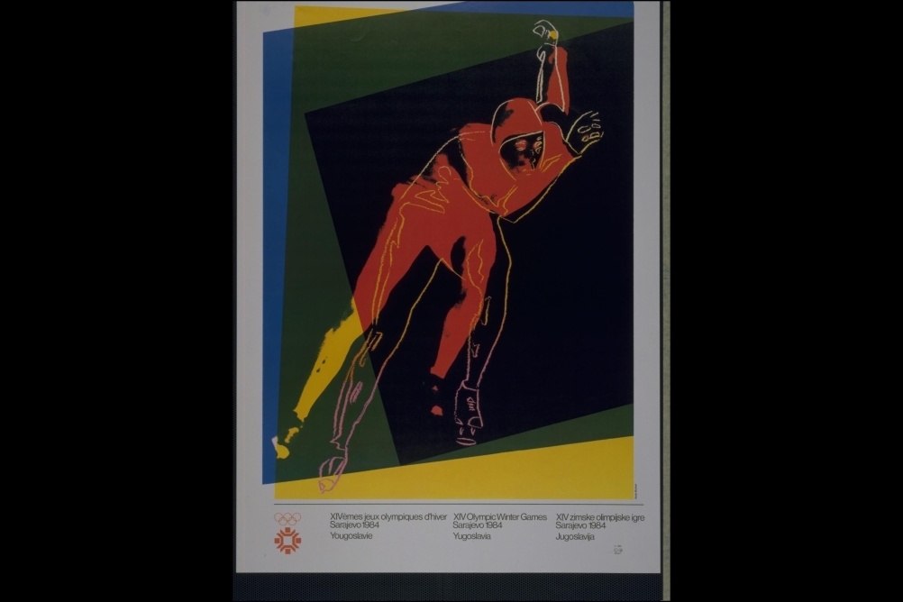
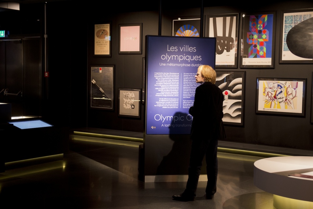
Source: By Christophe Moratel
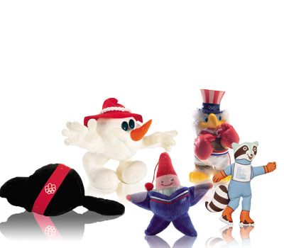
Perhaps the most inexplicable phenomenon of the Games is the mascots. Ranging from cute to terrifying, they often seem to have been chosen at random.
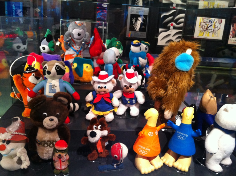
Montreal summer 1976 was marked by the presence of Amik, a beaver in a cummerbund, the same year that Schneemann the snowman was introduced to Innsbruck.
Source: IOC
Magique the star was the face of the Albertville 1992 Winter Olympics, while the 1984 Summer Games saw the arrival of Sam, a sort of hybrid of Uncle Sam bald eagle hybrid. And let’s not forget everyone’s favourite skating raccoon Roni who graced the 1980 Winter Olympics at Lake Placid.
Given everything the Games stands for, it’s almost impossible to think that this lot are in many ways the real ambassadors of the Olympics.
Interpretation design for the museum was led by Mather & Co, with Metaphor helping mastermind the project, Paragon Creative working on design and build, Centre Screen productions working on AV, and Dragon Rouge designing the TOM Café, welcome area and museum shop.
Base has designed branding and communications for the Museum, creating a custom Relay font which symbolises the idea of a baton being passed and is used in a flexible way around the museum.
-
Post a comment


