Longfield brands Cheeky Girls cosmetics
Longfield Studio has branded and designed packaging for a new 36-piece Cheeky Girls cosmetics range.
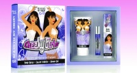
The pop duo approached cosmetic company Fragrances and Toiletries International, which gave the contract to the consultancy – its chosen branding and packaging group – in March, leaving it with a brief to address a teen fan base.
‘We went down the illustration route to bring down the level of sex appeal,’ says creative director of Longfield Studio Simon Peek, who was concerned that as a brand the Cheeky Girls have a dual appeal to teens and a ‘lads mag’ audience.
Using Illustrator, images were drawn from photographs commissioned for the purpose, giving the packaging a ‘Pop Art-type look’, according to Peek.
He says the logotype – a new standalone brand – is ‘girly, 3D, futuristic and easy to read, which will make it stand off the shelf’.
The new range launches in September, when it will roll out nationally.
Read this next


I love this work and the logo is very much on the money, I think beauty products are often hard to get right. It will be interesting to see how it goes in the market place.
to be completely honest there is nothing pop art about this brand identity its all cartoon of the modern age of today . Pop Art is an art movement which was dominated by cartoon combined with mundane objects creating montage… A good brand solution with a relevance to Pop Art movement I feel is Soap and Glory check it out it is sold in Boots Pharmacy.
I love the packaging ! It looks like very much Cheeky Girls. The designer made a very good job, it makes good justice to the girls, is very much like them; colourfull, fun, fresh. I hope the products will be this good too
TheCheekies are pure POP!It’s great to see a very refreshing range,not the raunchy-sexy,everyday stuff.
The girls are Fun,so should be the products;Good Work Girls!