Art directors choice
I receive self-promotional mailers on a daily basis from illustrators and designers, all hoping to catch my eye among the sea of competition out there. Sadly, only a small percentage are on my desk for longer than a day – with the remainder destined for the bin.
The importance of self-promotional mailers is arguably more so in design than any other sector, in terms of its initial impact and what it conveys to the recipient. And for graphic designers no project is more personal than their own identity and promotional output.
What works for one art director may not for another, so this is very much a personal opinion. I believe simplicity is the key.
This week, I’d like to highlight two particularly strong examples.
- Scottish-based designer/illustrator, Steven Bonner recently sent me a simple A6-sized, fold-out presentation of his illustration work.

Illustration work from Steven Bonner
The beauty of this particular example lies in its simplistic, clutter-free design. Employing a simple grid-based presentation, the mailer features full bleed samples of recent work with beautifully set credentials. What adds to its appeal is the subtle embossed wax seal-inspired ‘SB’ logo that appears across all of Bonner’s branding.
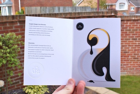
‘I wanted the user to remember the images so I employed a simple grid based presentation to communicate the bare essentials – a little about me and what I do, who I’ve done it for, and how to get in touch,’ says Bonner. ‘I like typographically simple communication in layout design, and I’m not one for unnecessary embellishment.’
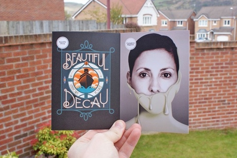
This is a successful piece of self-promotion that hasn’t left my desk since I received it.
- Another lovely example of simple, but strong design is the visual identity from Poole-based consultancy Parent Design.

Business cards from Parent Design
Printed on matt black polyvinyl with white foiling, its business cards are a sophisticated and simple design.
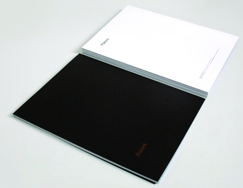
‘Our aim was to create a creative, original and cost-effective business card that was both robust and beautiful,’ explains Andy Russell of Parent. ‘Our solution was to focus on its primary function in the style of a credit card, ensuring that our design is relevant, memorable and to the point.’
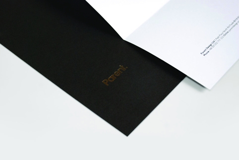
This minimal approach extends to Parent’s website and, indeed, to the work it produces for clients.
On a separate note, a forthcoming book from Laurence King, Designers’ Identities by Liz Farrelly, examines the corporate identities of 76 designers from around the world who talk us through their own corporate identity work and their responses and successes, detailing the thought processes, materials and print techniques used. This promises to be a useful and interesting resource for any designer.
Read this next


If I’m honest I’ve seen this sort of stuff done hundreds of times before, it’s really not that special. Sorry to seem rude but it just isn’t.