Epitype rebrands Article 19 freedom of speech charity
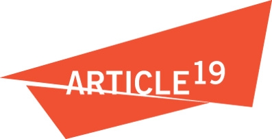
Epitype has designed a new identity for freedom of expression and information charity Article 19, with a typographic identity featuring ‘a shaft of light’.

The charity appointed Epitype in August from a shortlist of four consultancies, which had been whittled down from a long-list of 11.
Article 19 is named after the freedom of expression item in the Universal Declaration of Human Rights. Established in 1987, the organisation is reassessing its brand strategy after expanding into South America and Africa.
The brand also needed to be realigned with ‘political and technological developments which have radically transformed the world around us including [changes in] the media, information and communications’ according to Article 19 executive director Dr Agnes Callamard.
Martin Roach, creative director at Epitype, says the existing identity, which uses Roman numerals and makes a feature of the second ‘X’, lacks international appeal.
Roach adds, ‘It’s also a bit cryptic, has different textures and seems to be suggesting voting with an ‘X’ or censorship.’ For its new identity, Epitype has used Arabic numerals to ensure global appeal.
Roach says, ‘In too many cases charities show what they’re trying to fight against – in this case censorship – so we instead showed the marque with a shaft of light.’
This shines between two graphic triangles which represent counterarguments.
The new look will be unveiled on 12 July on a new Fat Beehive-designed Article 19 website, with other communications rolling out, driven by Epitype-designed guidelines.
-
Post a comment


