Pearlfisher rebrands Maldon Salt
Pearlfisher has created the new brand identity and packaging for Maldon Salt, celebrating the ‘natural elements’ of the seasoning.
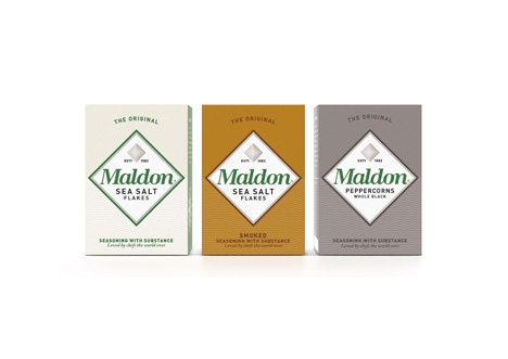
The consultancy used a ‘simple’, ‘strong’ design which will be used across the Maldon range, including the smoked sea salt and organic black pepper variants.
Pearlfisher also created the strapline ‘seasoning with substance – loved by chefs the world over.’
Natalie Chung, Pearlfisher creative director, says, ‘We moved away from the generic world of salt on salad to create an iconic, proud marque inspired by Maldon’s unique texture and shape.
‘The packaging celebrates the depth and quality of the product with confidence and character allowing us to tell the story of Maldon from its heritage to its modern relevance in a way that was tasty, bold and natural – just like the salt.’
The new branding and packaging is launching in the UK, and will roll out across Europe and the rest of the world over the next month.
-
Post a comment


