Greenspace helps narrate Anthology brand story
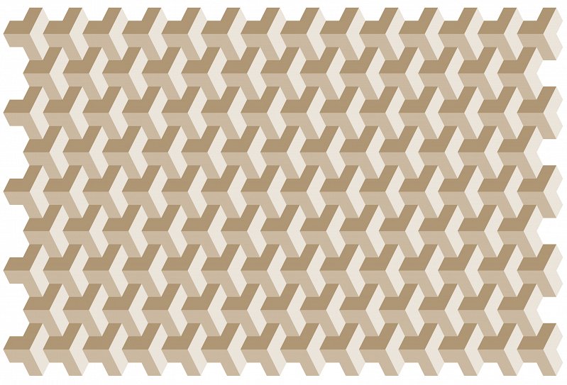
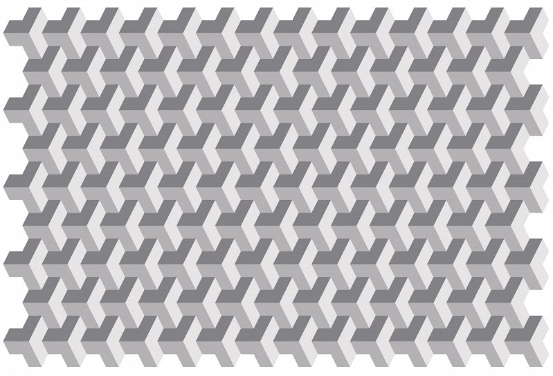
Greenspace has helped name residential property developer Anthology and develop an identity system that uses 2D and 3D patterns designed to look like building blocks and structures.
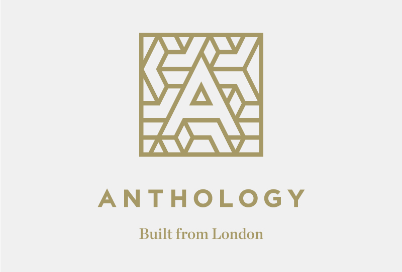
The project began with the phrase ‘Stories of Homes Built from London’, which gave rise to the name of the company, Anthology, and its strapline ‘Built From London’.
A typographic word mark sits with an ‘A’ mark which can also be used in isolation.
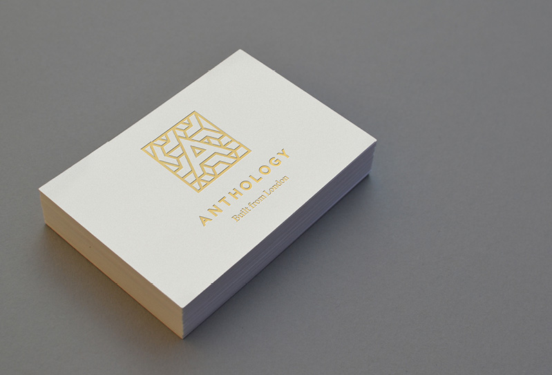
This ‘A’, according to Greenspace founder and chief executive Adrian Caddy, is ‘a perfect triangle within a perfect triangle and a triangular grid flowing out of it.’
The abstracted shapes, which fill in the space around the A, are symbolic of ‘bricks, or houses, or maps,’ he says.
Greenspace found inspiration for the A letter form by studying ‘illuminated letters’ – the freehand letters which predate print and were found at the beginning of pieces of text, often framed within elaborate boxes.
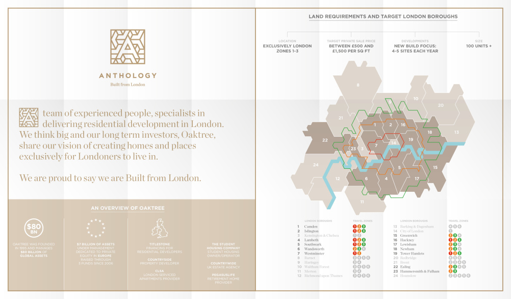
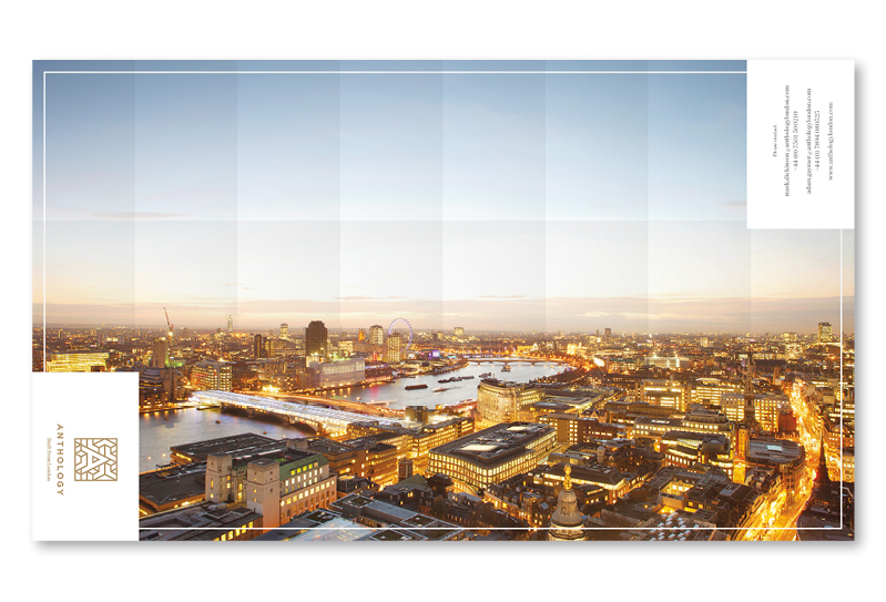
Elements from the box have been extrapolated and applied to a map, which Anthology has used at a launch event to show the areas of London they are hoping to develop.
The first acquisition by Anthology is a two acre site in Deptford and Greenspace is currently working on a version of the identity tailored to it.
Caddy says, ‘The A will always be a symbol for development but the pattern will change to reflect each neighbourhood. We might change the colours, textures or materials – we’ll have to see.’
There are also plans to make the online versions of the identity animate on a website which has also been designed by Greenspace.
Electronic Customer Relationship Management software will help Anthology ‘have a 360 degree view of their customers,’ says Greenspace.
Read this next

-
Post a comment


