News in brief round-up
A round-up of this week’s news in brief.
Stocks Taylor Benson has designed the identity for paper distributor Antalis’ Review 2012/13 print design awards. The identity was designed to echo the awards’ Abbey Roads Studio venue, using a typography-led marque and imagery that references a vinyl record. It will be shown across all Review materials.

Taxi Studio has created new branding and packaging for Finnish cider brand Golden Cap. The consultancy was appointed in August last year to create designs that appealed to a younger audience. The new look features a crown ‘golden cap’ device, with background colours used to reflect each flavor variant in the range.
Animation studios Not To Scale and Silent Studios have created a short for Google. The piece, entitled Across the Pong, tells the story of a couple about to have a baby, an how they use Google’s tools in the run up to the birth. You can view the animation here.

Santiago Aranguiz Sanchez, first Dean of the School of Design at the Universidad del Pacifico in Santiago, Chile, is to be awarded the 2013 Sir Misha Black Medal for Distinguished Services to Design Education. He is being recognized for ‘his work in protecting the cultural history and heritage of his country, Chile, and for his pioneering educational endeavours in this field’, according to organisers.
Smith & Milton has been appointed to work with specialist property adviser Christie + Co to work on a number of creative projects around the brand. It has initially designed the event stand for the company at the International Hotel Investment Forum (IHIF) in Berlin.
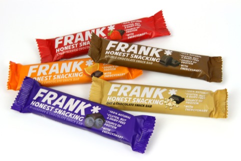
Robot Food has created the branding and packaging for new natural, wheat-free vegan snack brand Frank Bar. The concept of the Frank Bar was developed by former Everton premiership footballer and vegan Neil Robinson. Robot Food says the designs aim to reflect ‘the rich and deep flavour experience of each product’ using ‘direct’ branding and an ‘uncomplicated approach to on-pack messaging’.
Dalziel and Pow is working on a retail concept for Russian fashion brand Modis. It was briefed to create a new branded store environment, refreshed brand identity and new brand collateral. The concept is based around cube and square shapes, expressed through a variety of materials and graphics to ‘bring life and a sense of fun to the space’, according to Dalziel and Pow. The store’s departments are all colour-coordinated to create distinct destinations and the new concept will launch next month.
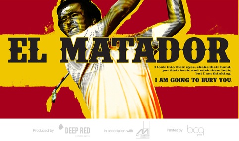
Milton Keynes-based consultancy Deep Red Creative has worked with sports charity the Matt Hampson Foundation to design a notebook aimed at inspiring young athletes with serious injuries. The book, entitled Quote, features images of top sportsmen and women accompanied by quotes containing words of encouraging wisdom. Deep Red Creative donated 250 free hours to the project, with the studio designing 18 spreads for the notebook.

Nevis Design has created a new identity for golfing photography service Recounter. The typographic identity aims to reflect the ideas of time and ‘the perfect stroke of a golf swing’, according to the consultancy.
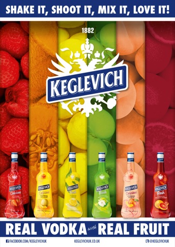
Liquid has designed promotional materials for new vodka-based liqueur brand Keglevich. According to Liquid, the designs ‘reflect the fun and vibrancy of the brand personality’. The consultancy also introduced the with the strap line ‘Shake it, Shoot it, Mix it, Love it’. The designs are shown across posters, point of sale materials andpromotional merchandise.
Consultancy CCD Design and Ergonomics has appointed Chris Girling as wayfinder designer. Girling previously worked for LOCOG, where he was responsible for the design and delivery of the London 2012 wayfinding and signage kit of parts.
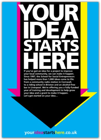
The Champion Agency has designed promotional materials for the Lloyds Banking Group Social Entrepreneurs Programme. It was briefed to promote the programme to conventionally hard to reach communities, with the hope of attracting a wider demographic of applicant. The designs use an arrow device aiming to draw attention to the reader, with a cyan, magenta, yellow and black colour combination used throughout.
Benetton Group research centre Fabrica is marking International Women’s Day by creating two videos, to be shown in seven Benetton flagship stores’ shop windows wordwide. The videos aim to highlight the situation of women across the world.
https://www.youtube.com/watch?v=Q4JPYx9_tgM
Read this next

-
Post a comment


