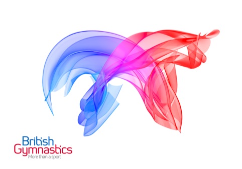
Bear’s ‘moving’ identity for British Gymnastics
Consultancy Bear has rebranded British Gymnastics, using an identity inspired by the movement of the gymnast.
Bear began working on the project early last year having approached the organisation, which is the UK gymnastics governing body, directly. It worked with British Gymnastic on a strategy review and has created the new logotype and supporting motion graphics. The new website will launch over the next couple of weeks with all front-end design by Bear.
Roberto D’Andria, Bear creative director, says, ‘We looked at a lot of international governing bodies [for gymnastics] and they were all trying to work a gymnast’s body into one position. After a lot of work we came to a bit of a crossroad and felt it wasn’t as exciting so we looked at taking real movement and converting it into a graphic language.’
He adds, ‘We wanted to celebrate the movement of the gymnasts and show that it’s not just movement, but also there’s an artistic side. It’s an art form.’
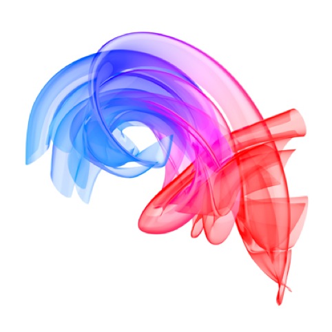
The branding will be shown across touch-points including membership packs, competition event collateral and the website. Bear is also due to redesign medals and trophies for the organisation.
Read this next


Visually interesting to see movement through the colours and shapes. But, the logotype is a let down. It looks so dated and disconnected from he modern vibrancy of the graphic. Shame.