Six gives LSM new look based on European Modernism
Architect practice LSM has been rebranded by Six, which has designed an identity it says draws influence from early European Modernism.
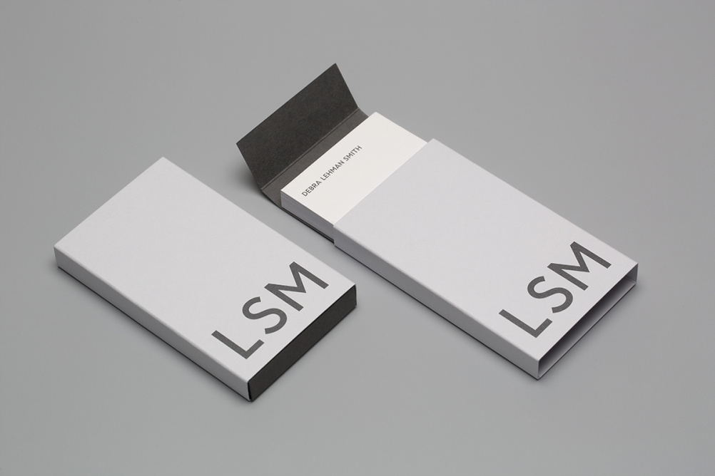
The typeface is set in U8, which is based on lettering found on Berlin subway signage, according to Six managing director Darren Jessop.
Together with its monotone grey colour Six says the new word mark reflects the confidence of the practice.

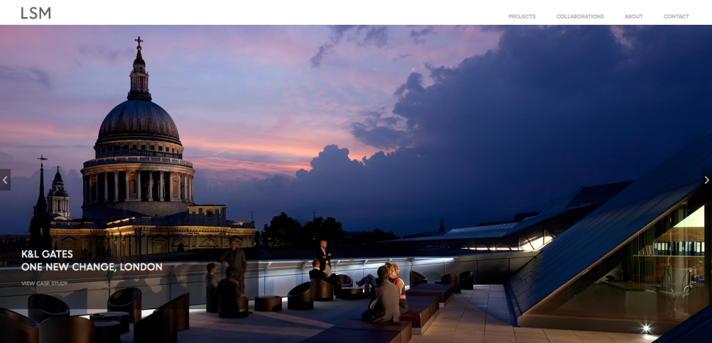
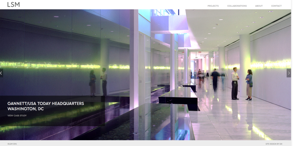
The accompanying website is ‘elegant, bold and functional’ says Six with a focus on project photography featured on a horizontal scroll which gives way to further horizontal and vertical scrolling once a project has been selected.
Six says the site combines ‘a pared down aesthetic’ and ‘an intuitive user-experience that lets LSM’s expertise do the talking.’
Debra Lehman Smith, founding partner at LSM says, ‘The challenge facing a firm like LSM is creating a globally relevant brand that can speak to various audiences from CEOs to the best new collaborators.
‘Showing the intricacy of our work through traditional forms of media can be tough and restricting. The relaunch of the website allows us to celebrate projects in a creative and vibrant manner, while also detailing our commitment to producing spaces that deliver quantifiable results for clients.’
—
The new website can be found at www.LSM.com
Read this next

-
Post a comment


