Graphic designer Leif Podhajsky on psychedelic sleeves, moving album artwork and ‘patience and love’
When the 2013 Best Art Vinyl shortlist was unveiled earlier this month, it was no surprise to see that two of the shortlisted sleeves were designed by Australian graphic designer Leif Podhajsky.
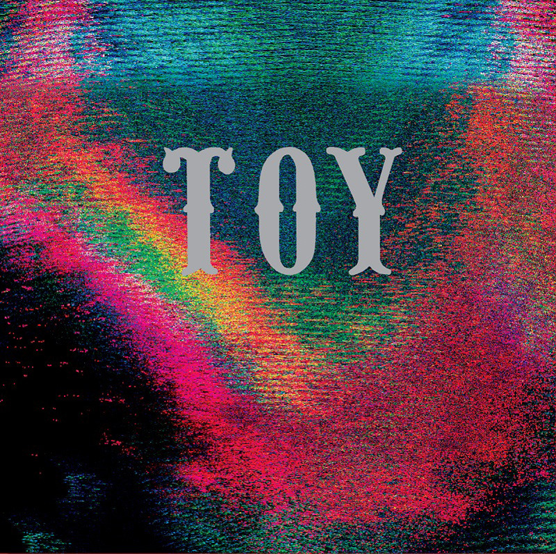
His distinctive bright, surreal abstractions have come to be inextricably linked to one of the main sounds to breakthrough in the last few years – that of a wave of psychedelia-based bands such as Toy, Tame Impala and The Horrors, whose music perfectly harmonises with Podhajsky’s characteristically synapse-warping aesthetic.

If, as many music magainzes have touted, the last 18 months have come to defined by this new take on the psychedelic of the 60s (as illustrated in the Reflections from Damaged Life exhibition that explored the topic), there’s no doubt that Podhajsky’s designs have shaped the look that convoyed it.
We spoke to him about his design approach, his influences, and illustrating the ‘broken connections’ of today’s world between ourselves and the world around us.
How did you start out designing sleeves?
It started as a side project, an exploration of my own ideas on art and design. I put a few early pieces online and got a great response with some features in both magazines and the internet. I guess this led to a few record labels seeing my work and the next minute I was designing Tame Impala’s first album. I never really intended to create for music; it started, and still is an exploration of my own artistic inclinations.
What bands or artists would you like to design for that you haven’t ?
I would love to design something for Bjork, or even some Beyonce just to mix it up…
How do you approach each project?
Concept, sketch, experiment, refine, experiment, refine, define. The concept will differ for each project, depending on the idea we want to share but the process is usually staid.
Lots of your work is very rooted in nature – tell me more about that…
Personally for me it’s a way to connect with my roots. I grew up immersed in nature; rainforest, waterfalls and oceans. But on a macro scale I’m suggesting that we as humans need to re-harmonise with nature and our planet. We are running out of recourses and this re-connection to nature and each other, rather than focusing on entities such as corporations and money, is a way for us to bring about real change.
Your website mentions ‘themes of connectedness’ in your work – can you explain what you mean by that?
We are all connected to each other and everything around us. I believe we’ve lost touch with this and through my work I’m trying to illustrate this broken connection and ways in which we can mend the link to improve how we live with each other and our environment.
How do you think the advent of digital and mp3s has changed sleeve design, if at all?
It may have lost some of the magic in the transition. There’s something very human about physical objects, the whole act of unwrapping, sliding out a fresh vinyl and putting a needle on it. There’s real love that goes in to every step and I think we connect with that.
In saying that, I couldn’t think of a more interesting time to be creating. The internet allows us to break free from these physical formats and play with an array of exciting new techniques. Music and art have always gone together, it’s key to connecting with an audience and sharing a story. It’s only a matter of time until we move away from the lingering physical to digital transition and music art becomes alive with motion and new methods of interaction. I predict thumbnails won’t be static for very long, I’m really into the idea of having objects and colours that shift and morph as you roll over them. There will always be a place for the physical; it will just become more and more niche and therefore more interesting in my eyes.
What are your favourite sleeves that you’ve designed?
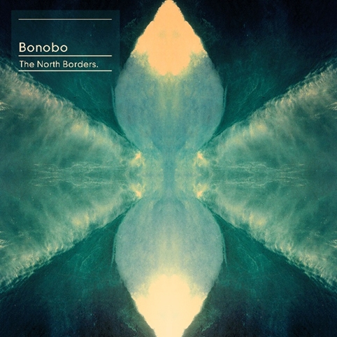
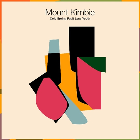
My fave at the moment is the Mount Kimbie Cold Spring Fault Less Youth cover, as it’s very different from what I have done in the past. I love the abstract nature of it and the colour combination. But Tame Impala’s Innerspeaker still has a place in my heart as it was one of the first covers I ever did and people really connect with both it and the music.
What are your favourite sleeves that someone else designed?
I love anything by Mati Klarwein, Storm Thorgerson, Peter Saville and the Hipgnosis gang…There’s a cover by [photographer] Ron Rafaelli for Free that I still think is beautiful. I run a blog called MELT (visual melt.com) in which we showcase a lot of beautiful, surreal and futuristic artwork from over the ages.
What advice would you give to people who want to get into designing record sleeves?
I get asked this a lot, I never have a good answer. I think if you start by just purely creating for yourself and having a unique style this can often lend itself to crossing over with music…having a background in graphic design is a massive bonus also. It’s a combination of ideas/art/typography/design and layout and also print knowledge. Plus lashings of patience and love…
You can see more of Leif Podhajsky’s work on his website http://leifpodhajsky.com/
Read this next

-
Post a comment


