John Morgan studio creates Royal Drawing School identity
Prince’s Drawing School, founded by Prince Charles 14 years ago, has been given royal status – and has a new brand identity as a result.
Now named the Royal Drawing School, the institution has undergone changes in typography, photography and logo design, completed by consultancy John Morgan studio.
The project was lead by John Morgan himself, and assisted by graphic designersTeresa Lima and Mathias Clottu.
John Morgan studio commissioned Norwegian type foundry Monokrom to design the typeface. “They designed a custom version of their typeface ‘Vinter’ specially for the school,” says Lima. “It’s a sans-serif, and has a fine contrast between thick and thin. This echoes the activities of drawing, in how carefully the font’s been crafted.”
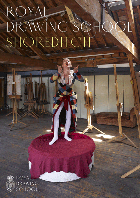
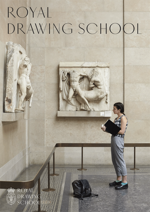
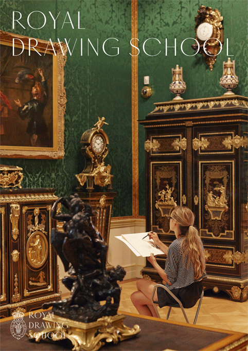
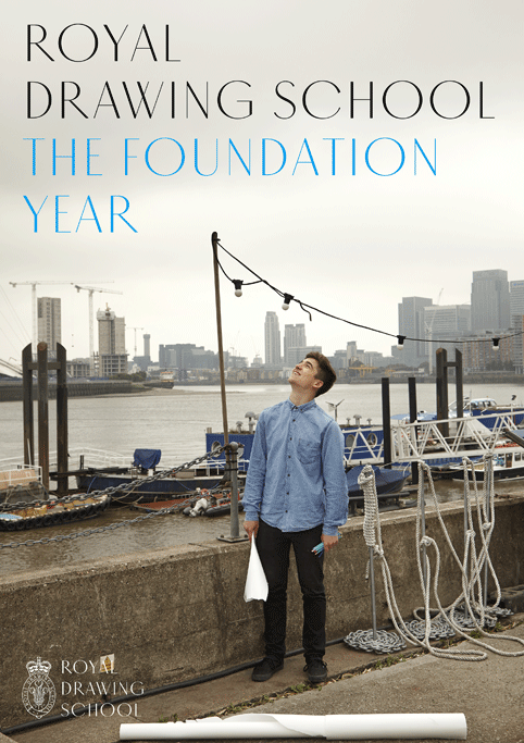
The consultancy, in charge of art direction, asked photographer Angela Moore to capture the diversity of courses at the school and range of environments that the students draw in. “We took photos of students drawing in studios, of museums they visit, like the British Museum and the Royal Academy, and of outdoor scenarios such as Hampstead Heath and the River Thames,” Lima says. “Some of the courses focus on drawing city life, so we took photos at Paddington train station as well.”
“We didn’t want clichéd close-ups of hands drawing,” she says. “It’s about stepping back and capturing the whole environment.”
John Morgan studio commissioned the drawing of the new school crest to print-maker and engraver Chris Wormell, who incorporated elements of the badge of the Prince of Wales, including the crown and feathers. The consultancy also asked Monokrom to tweak the type on the emblem. “We wanted it to look good with the engraving,” Lima says. “It was heavily crafted to achieve a balance between the two elements.”
In recreating the school’s identity, the consultancy wanted to inspire current and future students, Lima says: “Before, the school’s identity was based on bright colours and typography. The photographic elements that were introduced capture a more mature state of the school’s life, and the aspirational side of drawing, through the use of inspiring images. This aspiration already existed within the school, but it wasn’t being conveyed in the identity.”
The redesign has been applied to the school’s publications, posters, website and new stationery. The project has been under way for a year, and will continue to be rolled out across the school brand.
Read this next

-
Post a comment


