The design history of the Sega Mega Drive
Sega opened up its archive to self-publisher Read-Only Memory for book Sega Mega Drive/Genesis: Collected Works, “the definitive retrospective” of the design history of the console. We talk to Read-Only Memory founder Darren Wall about the book, which is full of design documents, production drawings, hardware prototypes and illustrations.

Design Week: Other than a love of Sega how was the project initiated?
Darren Wall: I founded Read-Only Memory in 2012 in order to publish design-led videogame history books. Following the announcement of our first title, Sensible Software 1986–1999, – a biography of the creators of Sensible Software and Cannon Fodder – we were approached by Sega and asked to pitch on a documentary title for them. The Mega Drive console is a personal passion of mine and represented a pivotal moment for Sega, so I decided to focus the publication around the console and its games.
DW: What was the best thing you found in the Sega archive?
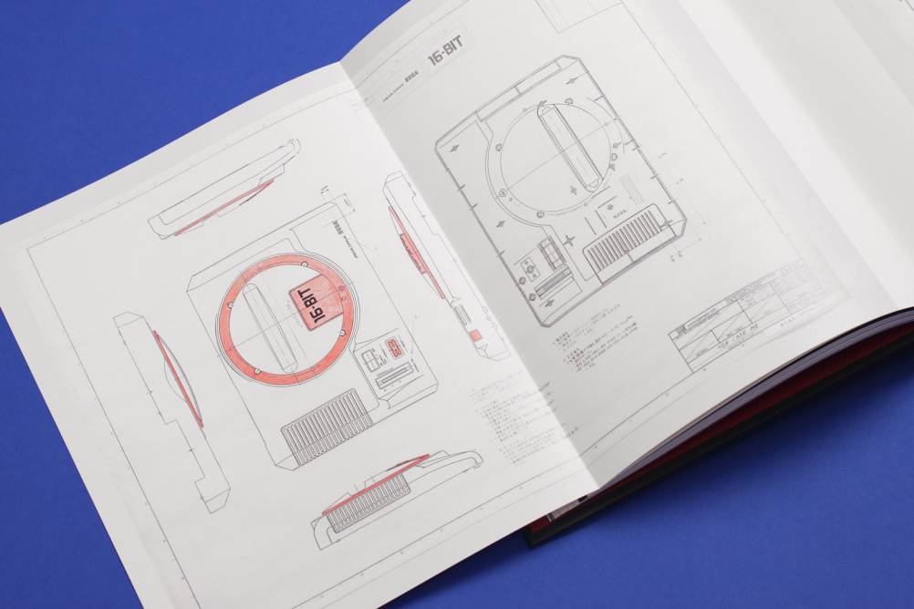
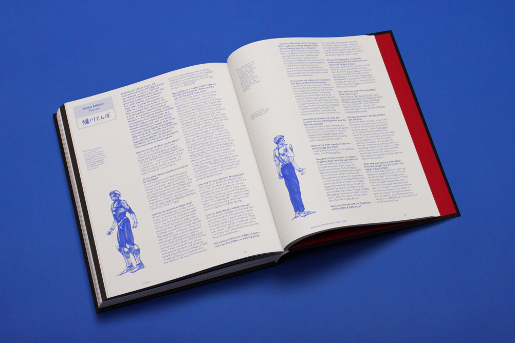
DaW: That’s a toss-up between the design document for the scrolling brawler Streets of Rage and the original hand-drawn plans for the Mega Drive console casing. We included several gatefold pages in the book specifically to showcase the latter.
DW: It sounds like you met some interesting people along the way. You must have got some insight into the design history of both Sega and the Mega Drive. Was there anything that surprised you?
DaW: We managed to speak to Mitsushige Shiraiwa, a member of the team who developed the revolutionary sleek, black look for the console. He revealed that instead of looking at other games machines, they drew influence from high-end audio equipment and performance cars. Other console designs like the Master System were more chunky and toy-like. The Nintendo Famicom, for example, was aimed at children, but Sega wanted to create a video game console that would be enjoyed by a wide range of people from children to adults.
DW: In creating the book, have you got a sense of what Sega was trying to achieve through design?
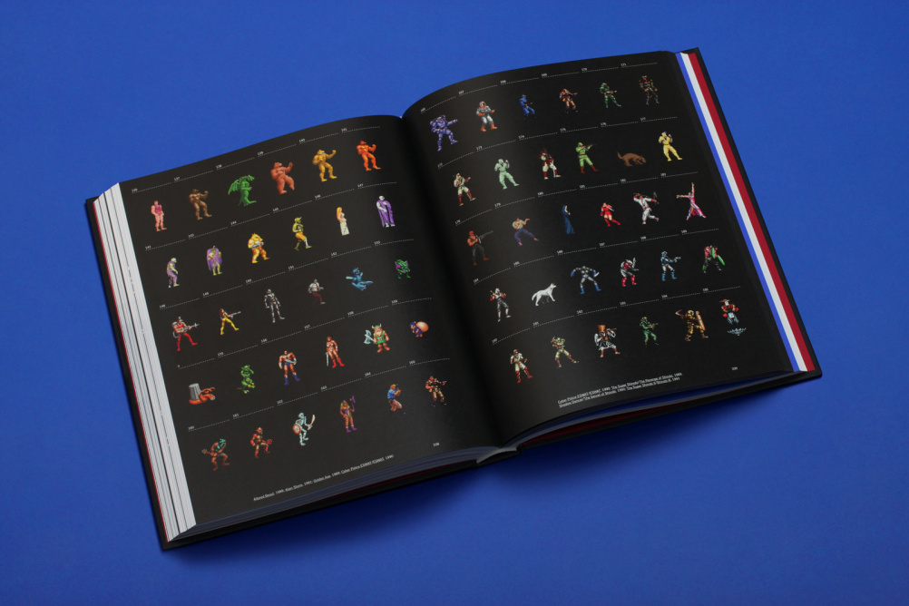
DaW: Sega’s approach to both their hardware and games library was a driven by a wish to expand its audience beyond young children. Not only did the Mega Drive/Genesis look more sophisticated and “adult” than Nintendo’s machines, its games knowingly courted a more mature demographic. Titles like ESWAT, Streets of Rage and Golden Axe visually mimicked 18-certificate Hollywood action movies and marketed them at early teens, broadening the appeal of the medium. Looking back it’s easy to see why videogames caused such controversy in the early ’90s, stirring up a moral panic in parents while simultaneously vying for their disposable income!
DW: The look and feel of all things Mega Drive is very evocative, and of its time (which bridged the ’80s and ’90s). How would you describe it?
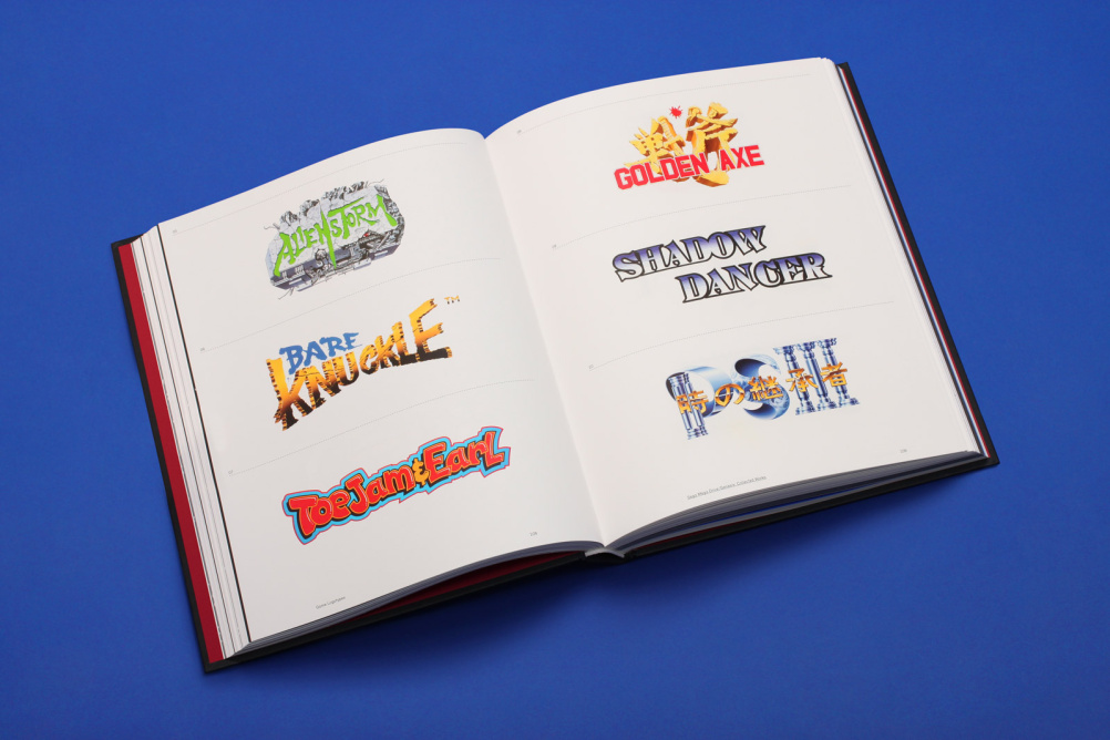
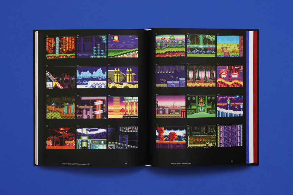
DaW: While Nintendo invented its own unique and friendly universes for characters like Mario and Zelda, Sega borrowed boldly from films and music of the time, imbuing the games with popular trends of the late ‘80s and early ’90s. Alien Storm drew from Ghostbusters, Golden Axe lifted from Conan the Barbarian and Sonic the Hedgehog took its distinctive look from the cutting-edge CGI of the day. Musically, Streets of Rage expertly echoed ’90s house music, while ToeJam and Earl channelled De la Soul. I think this is why Sega’s 16-bit titles are so fondly remembered – they were expertly-tuned games that stole confidently from the era’s Pop culture.
DW: How did the design of the book itself come together? You worked with a few people Kam Tang on illustration and John Short on photography?
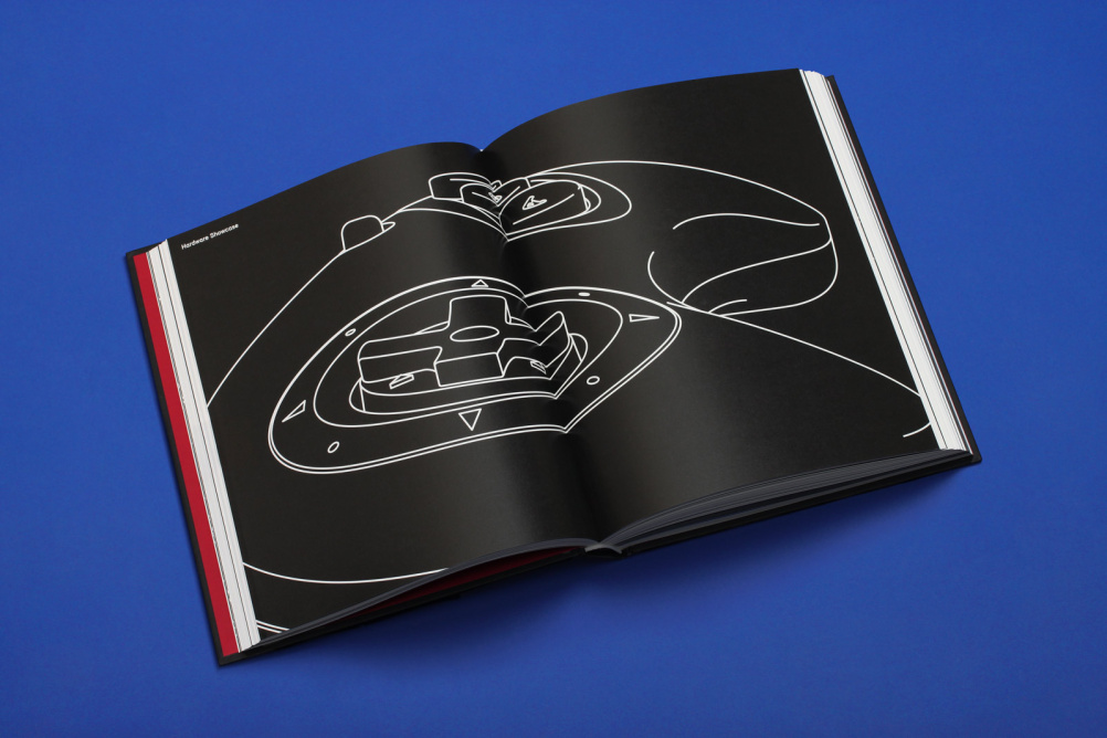
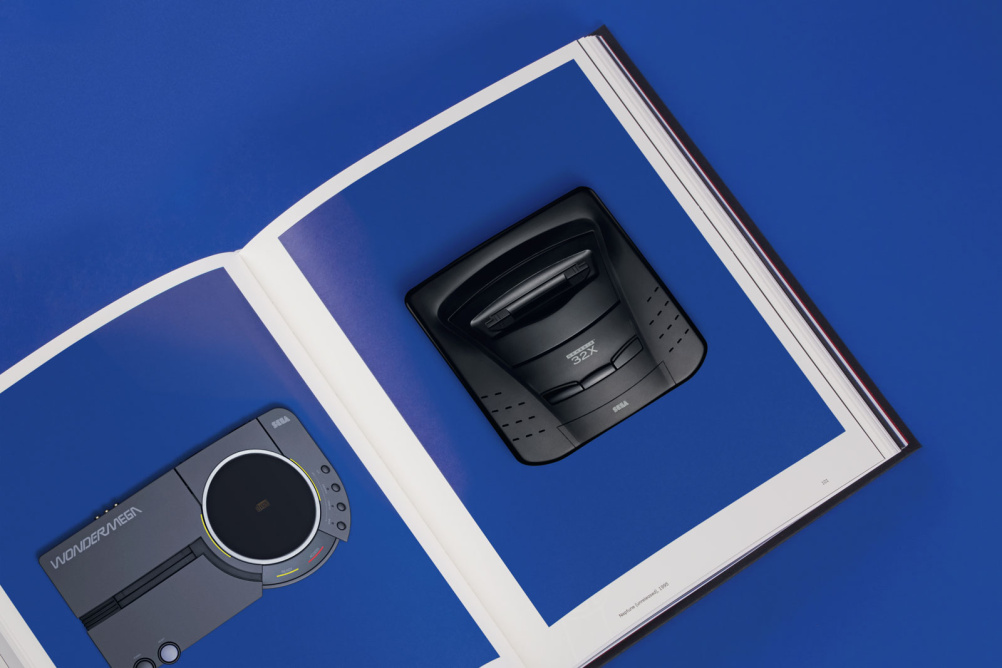
DaW: The design of the book is deliberately restrained as the content is so bright and loud. We’ve used some beautiful paper stocks for the book, so we let the materials do the talking! Kam Tang provided sculptural chapter break illustrations, showing off the form of the console, while John Short was tasked with photographing 18 key items of Sega Mega Drive hardware. We managed to track down some extremely rare pieces, including the Japan-only Karaoke unit and the Mega Jet, which was developed for play on Japan Airlines flights.
DW: What was your favourite Mega Drive game? (Design Week’s were Streets of Rage, World Cup Italia 90, Lotus Turbo Challenge and Sonic The Hedgehog…)
DaW: The Revenge of Shinobi – it was my first Mega Drive game. I recall being blown away when I first booted it up. Having previously owned a Commodore 64, the leap in performance was staggering – it looked and sounded just like an arcade game. In producing the book I learnt this was exactly Sega’s intention, and the game was deliberately designed to show off the capabilities of the console and simulate a coin-op experience. From that moment, I was hooked.
The book is available to buy here.


[…] mature audiences, namely older teenagers and adults. In order to appeal to this demographic, they based the physical appearance of the Genesis on audio-players and cars. Sega felt these two items were popular among older demographics, and that their target audience […]