A hummingbird-based identity for FreshMinds
The Cabinet has created a new visual identity for FreshMinds, a London-based research and recruitment consultancy firm, using a variable hummingbird icon.
The company, which was rebranded by Tank in 2010 , was looking for a new image to mark the merging of its social business, FreshNetworks, with its research business.
The Cabinet was appointed to the project following a four-way pitch, and was briefed to create a new look that would ‘translate our strategic and commercial vision into a visual identity that could be rolled out and embedded quickly and cost-effectively’, according to FreshMinds head of marketing, Nikki Carlisle.
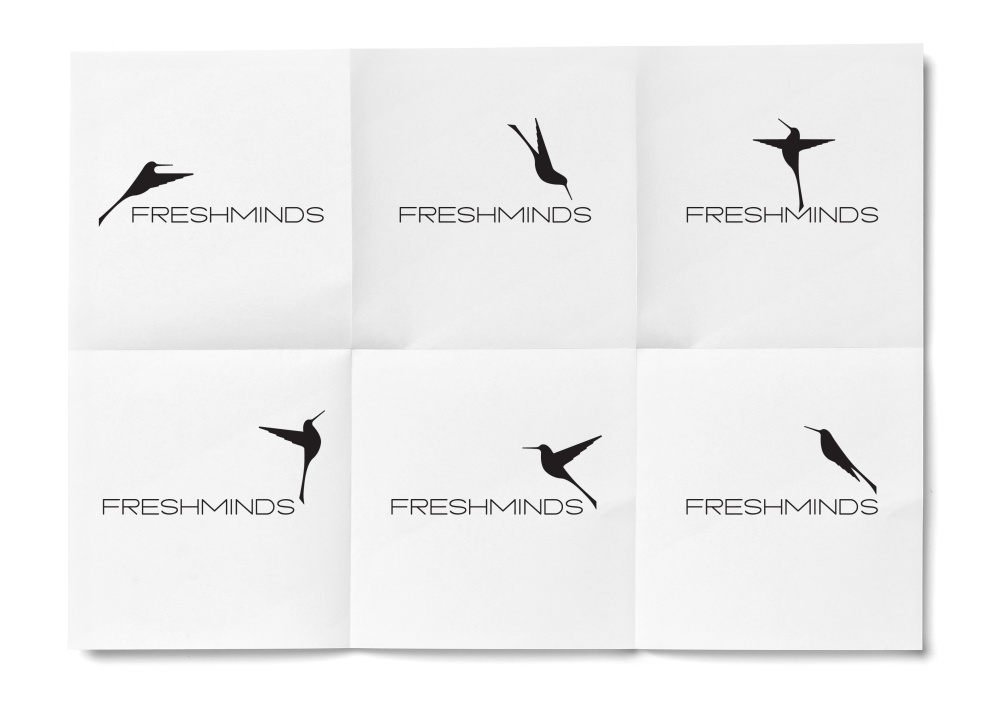
A new identity based on a hummingbird graphic was created, which can be varied depending on its application.

Andy Paul, The Cabinet managing director, says, ‘It’s all about illuminating minds and being a bright, shining light that delivers direction to customers’.
‘We wanted to deliver something different from the competition, which mostly has quite dry typography. We wanted to give them something more symbolic’.
The hand-drawn hummingbird was created by The Cabinet creative director Ads Ellis. He says, ‘The hummingbird is vibrant and charged and is the perfect metaphor for a business that distils insights, makes connections and creates growth’.
He adds, ‘As a brand mark it’s fluid, flexible and brings spark and vibrancy to an otherwise visually safe category’.
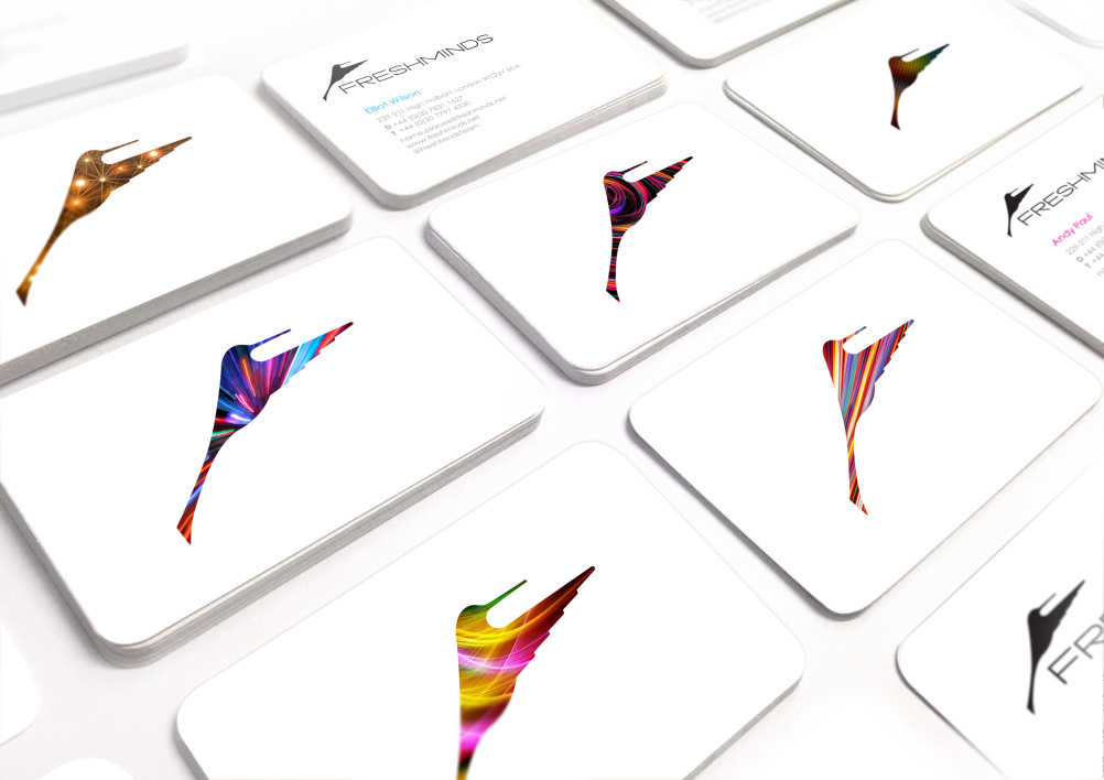
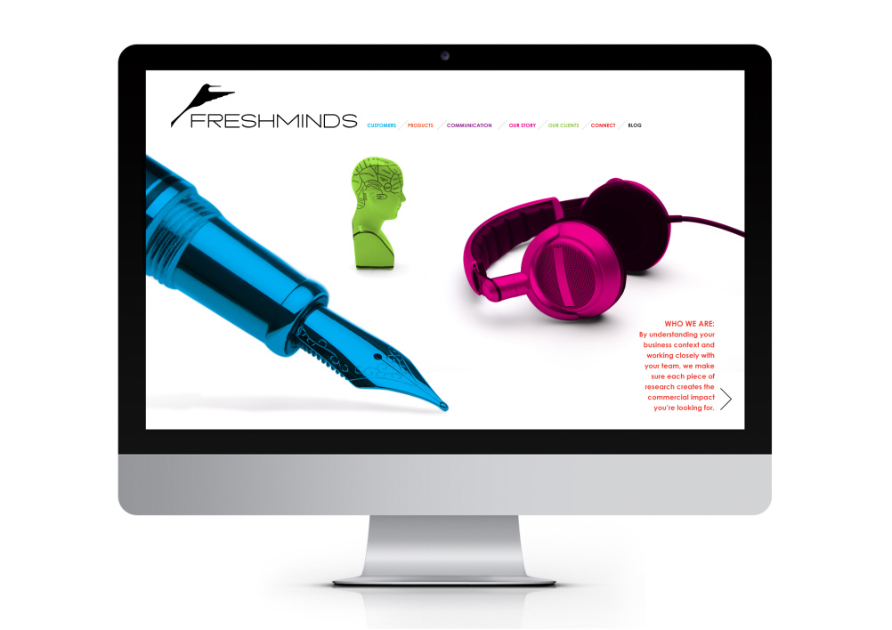
The hummingbird is shown as a black silhouette across FreshMinds’ primary brand mark, and can be filled in with different colours, patterns and imagery for use across touch points such as business cards and online.
Read this next

-
Post a comment


