Aesop brands Barcelona superyacht marina
Aesop has created the branding for Barcelona’s Marina Port Vell, which is set to reopen next year as a superyacht marina.

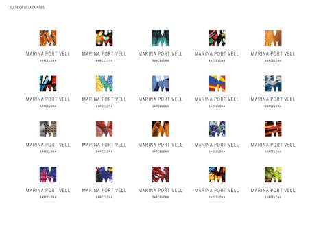
The identity is based around an aperture-shaped ‘M’, which Aesop creative director Martin Grimer says is ‘a playful nod to boat shapes entering the marina’.
The ‘M’ symbol can be filled with different images reminiscent of Barcelona.
Grimer says, ‘Colourful and able to tell many stories, the visual idenity is made up of 20 “M” logos that are interchangeable. Specially commissioned photography ensures a powerful and unique image collection to, again, build on the richness of the identity.’
Roger Hart, chief executive of Aesop, says, ‘We spent a couple of months immersing ourselves in the superyacht world – interviewing captains, crew, industry experts and the like – to understand the market and we subsequently created the strategy and positioning of “the best home port in the Med”.’
Aesop was appointed to the work by the Salamanca Group following its acquisition of Marina Port Vell in July 2010.
Ahead of the identity design work, Aesop was briefed to carry out market and audience research. It is also working on the roll-out of the brand, starting with its unveiling at the Monaco Yacht Show this week.


I’m sure I’ve seen this somewhere before…. Oh, wait a second, I have – in Melbourne » http://level11.tumblr.com/post/177820498/city-of-melbourne-identity
Hardly the same Mat, the Melbourne logo you reference is made up of different geometric patterns whereas the Marina Port Vell is a window to show associated images. If you want to say it looks like something try the Natural History Museum identity, or Bridgeman, or…
To Anonymous (why are you anonymous?? — have an opinion and don’t hide).
They both feature a single capital ‘M’, with imagery inside that form. Cut them out, put them together and stand back… They’re not identical, but they’re close. I actually like the iD, but the similarities are evident and unfortunate.
Everyone’s a critic.
I must admit, I thought exactly the same on seeing the identity.
On revisiting the Melbourne work there are a number of small differences which could constitute as… something entirely different?
There is a different typeface using two lines instead of one. The type is wider than the M which does follow a different shape and the imagery is photography.
Saying all that, the photography is so far abstracted it is pretty much a pattern and it is a little too close for my liking. But hey, who am I to judge.
I wonder what the team who produced the Melbourne Identity would think…