News in brief round-up
A round-up of this week’s news in brief.
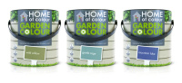
R Design has created new packaging for Homebase’s Garden Colour range of paints. Garden Colour is an extension of Homebase’s existing Home of Colour paint and wallpaper range, and the packs use a wooden-look background and green foliage graphic. The design creates a lock-up between the Home of Colour logo and the new Garden Colour name and flower symbol.
Consultancy Superfutures has designed a new Ping Pong restaurant for Stratford, east London. The designs aim to reference the ‘intriguing and traditional side of old China’, according to Superfutures, and focus on the ‘urban side of Shanghai chic, through both modern and 1930s interpretation.’ Features include a ‘fish scale wall’ formed from more than 6000 anodized metal discs.
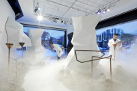
Consultancy Campaign has worked with Selfridges Oxford Street and The Future Laboratory to create the Fragrance Laboratory pop-up. The fragrance space features a series of chambers for the customer to enter, where their personal preferences and interaction with the space is used to inform the scent presented to them at the final dispensary area. The pop-up will be in place from 1 May – 12 June.
Imagination’s New York, London and Coventry offices have designed the content and staging for Land Rover’s Recela event and Innovations Briefings, promoting the brand’s New Age of Discovery campaign, which announces its partnership with Virgin Galactic. Imagination staged the event at the USS Intrepid Sea, Air and Space Museum in New York, transforming the venue with ‘intriguing lighting and a bespoke soundscape composed for the occasion’, according to the consultancy.
Production agency Drive Productions has created a visual experience for the first Battersea Power Station Party, which looks to educate people on the ‘building’s ‘past, present and future’, according to organisers Battersea Power Station Development Company, launching the next stage of the redevelopment. The experience used projections to show the Art Deco features of the building, with a soundtrack written and recorded by Drive’s by Paul Foss and Kosmetiq broadcast via headphones for ‘a silent-disco on an epic 4D-scale’, says Drive.
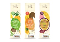
Parker Williams has designed new packaging for Tesco smoothies. The new designs use graphics of fresh fruit and bright colours, with ‘quirky and down-to-earth messages added on the pack to make the customer smile and relate to the products’, according to the consultancy.
Start JG has been appointed as Nando’s design partner. It will work on brand communications across regional, national and in-restaurant campaigns.

Robot Food has created the branding and packaging for Roots & Bulbs, a new cold pressed juice bar in London. The bottles feature numbers to indicate sweetness in the style of the periodic table, and staff uniforms feature t-shirts that show each member of staff’s favourite juice.
Consultancy Brandnation Digital has created a new website for auctioneering and compere services agency, MC & Hammer. The site needed to ‘exude confidence and professionalism’, according to Ian Stafford of MC & Hammer.
Philippe Starck’s consultancy yoo Studio has redesigned the J Plus Boutique Hotel in Hong Kong. Features include yellow, organe and red tineted glass panels at street level inscibeed with Chinese motifs of coins, dragons and bamboo.
Our Agency has created a campaign to promote the MCard travel smart card for West Yorkshire. The consultancy designed the branding for the card last year, and has now created a campaign to promote its usage, including a video which can be viewed here.
Frome-based Pencil Studio Ltd has created a new identity for ‘life stylist’ company Josh & John, which helps clients organise dinner parties, remember birthdays and access exclusive venues. The new logo is created from two ‘J’s representing both Josh and John joined in an ampersand.
Publicis Worldwide has appointed Guy Wieynk as chief executive officer of UK Group and Nordics. Wieynk will be based in London and will oversee Publicis UK’s operations including: Publicis London, POKE, Publicis Chemistry and Publicis Blueprint; as well as Publicis Nordics’ operations. He joins from AKQA.

Cambridge-based consultancy Cream Ink has created a new identity for the Shop and Display Equipment Association. The consultancy introduced the strapline ‘bringing out the best in retail’, and created a new full-colour logo for the company.
Underscore has been appointed by Gatwick Airport to design the retail communications used to promote the airport’s new North terminal redevelopment to prospective retailers and restaurateurs.
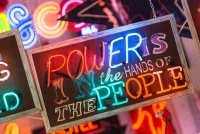
Neon artist Chris Bracey has created three new works for Vauxhall to promote its Mokka model, entitled the Cool Britannia Collection. Each work is based on a lyric or line from a British book, such as the Clash lyric ‘power is in the hands of the people’. The works are to be shown at Bracey’s studio before being auctioned in aid of Kids Company.
Discovery Channel has launched the Make Your World Bigger campaign, designed in-house, to mark its 25th birthday. The campaign will be used across billboard and television advertising.
VFX agency Golden Sq and its production company arm Disqo have created a series of idents for history channel Viasat History. Using the strapline ‘Bringing History to Life’, the idents feature different figures from famous paintings morphing into live action actors in modern day scenarios. These include Vermeer’s Girl With a Pearl Earring, which can be viewed here
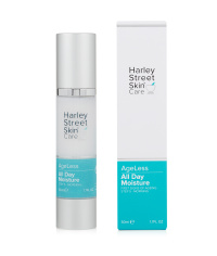
Umbrellabrand has redesigned the packaging for Harley Street Skincare. The brand is now moving into department stores, and the new packs use a refreshed colour palette of cobalt blue and aqua green to ‘recalls the jars found in traditional chemists’, says Umbrellabrand.
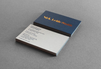
Designer Tim George has created a new identity for Nick Leith-Smith Architecture + Design, creating a typography-led look for the practice using a customized version of the Bella Stencil typeface. A dark blue, grey and bronze colour palette is used across printed communications, which feature bronze foils.
Read this next

-
Post a comment


