Russian airline Transaero looks to the future with new visual identity
StartJG has rebranded the airline, marking the company’s new proposition to deliver change and positive improvement.
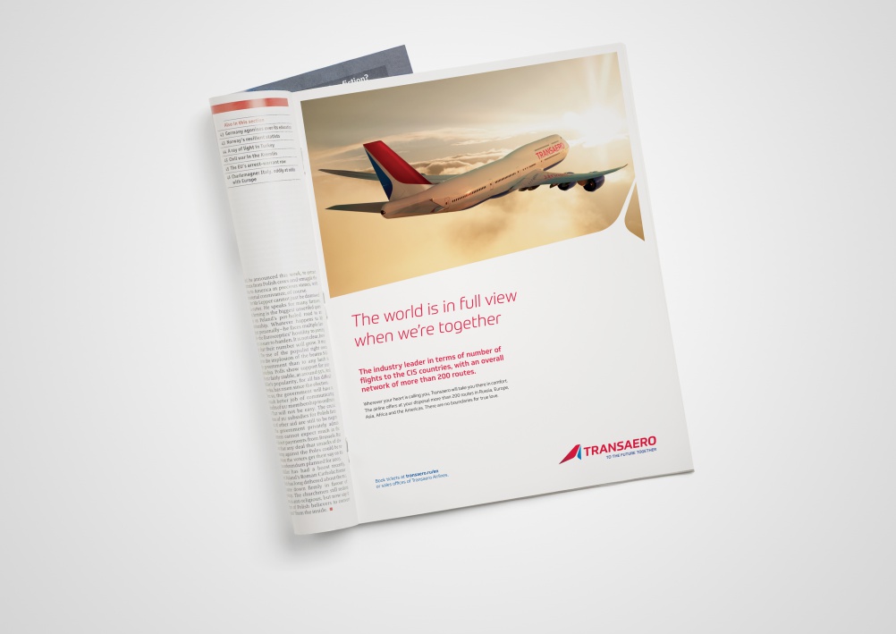
StartJG has rebranded Russian airline Transaero, with the aim of making the brand “more valued by passengers and as a business”, says the consultancy.
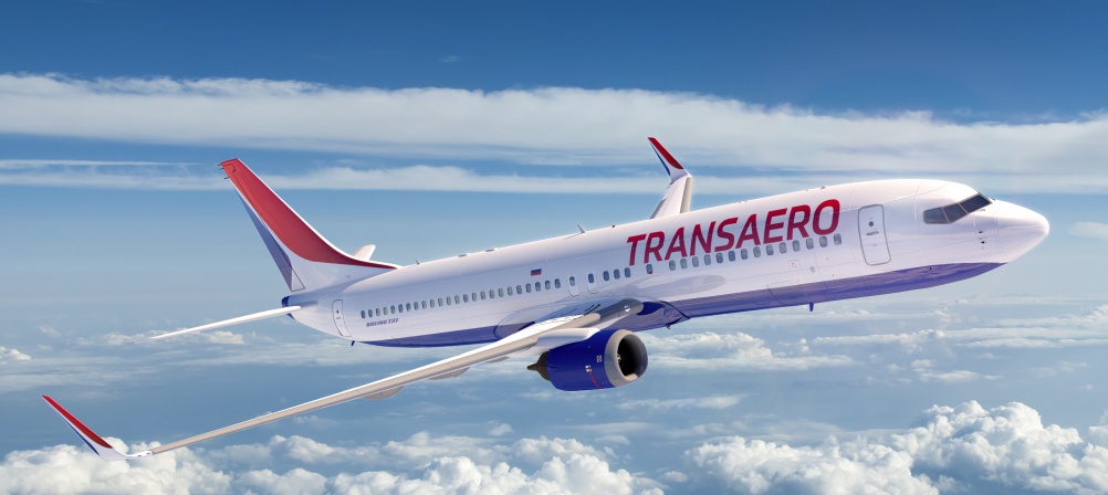
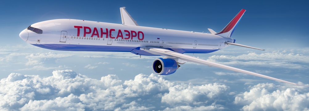
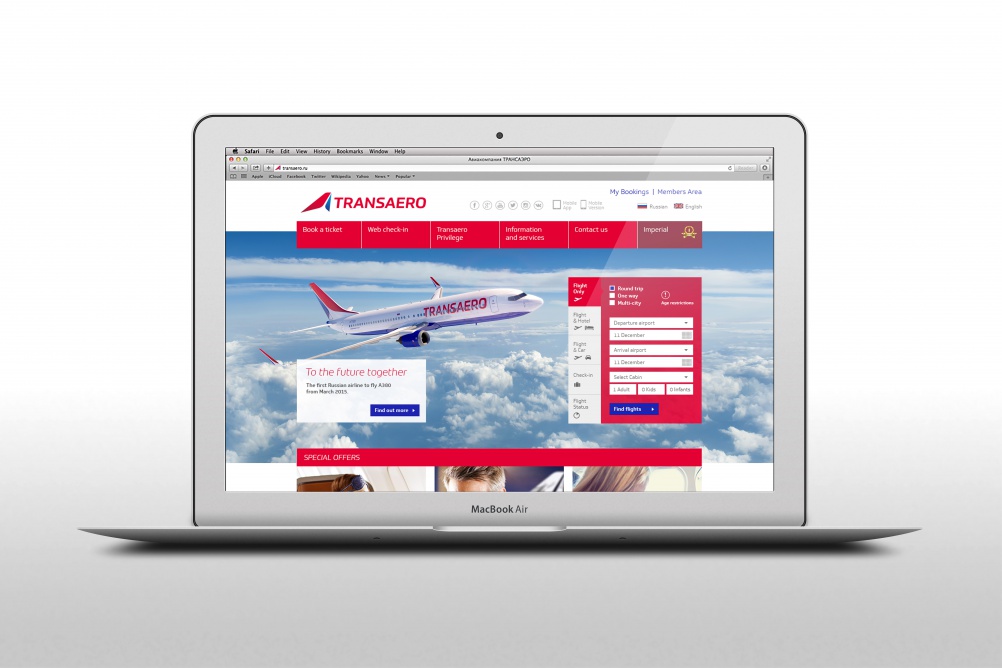
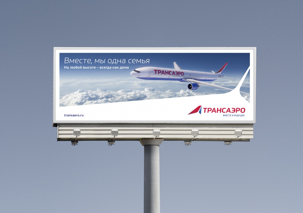
The visual identity has been implemented to “reflect the positive changes being driven within the business”, the consultancy says, and features a red, capitalised logo, with a red and blue airplane tail icon.
It is based on a new brand proposition “To the future together”, which was also developed by StartJG. This looks to “deliver change” to the company’s products and services.
The new business strategy has also seen the 24-year-old company named “world’s most improved airline” by airline ranking site Skytrax.
“This is going to be the start of the next chapter for Transaero and an important step for the Russian airline industry,” says Mike Curtis, group chief executive at StartJG. “It is a smart and creative brand that is challenging the establishment and this can only be a good thing for all travellers.”
The rebrand took roughly three months to complete and will be rolled out across all elements of the brand including aircraft livery, online and print collateral.
Read this next

-
Post a comment


