New Scouts division Squirrels away hidden symbol in identity
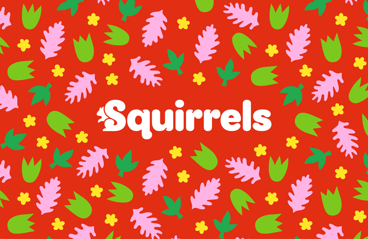
Supple Studio has designed a wordmark featuring a hidden squirrel, which forms part of an identity representing the first new branch for the organisation in 35 years.
Supple Studio has designed the identity for the Squirrels, a new branch of the Scouts aimed at four and five-year-olds.
The group will be the first new addition to the Scouts’ roster since the Beaver Scouts were introduced in the 1980s. Its focus will be on supporting early years children, particularly after the isolation caused by pandemic-induced lockdowns.
Bath-based Supple Studio has developed a wide-ranging brand for the youth group, which includes logos, illustrations and even badges.

“Back to the beginning of the Scouts story”
Supple was introduced to the project after competitively pitching for the work late last year. Since many of the team are parents with Squirrels-age children themselves, creative director Jamie Ellul says the project felt like a good fit from the start.
The studio’s approach was to “go back to the beginning of the Scouts story”, Ellul says. The starting point in question was Brownsea Island in Poole, where Scout-founder Robert Baden-Powell first established the organisation.
“It felt appropriate to use the island’s flora and fauna as inspiration for the visual language and colour, especially as Brownsea is home to a brood of rare red squirrels,” he says.

“More akin to a lifestyle brand”
Accessibility was a driving force behind the work, Ellul says. The Squirrels’ logo, which features the animal’s bushy tail as its first letter has been refined by typographer Rob Clarke, and a “witty but open” tone of voice has been developed with Totalcontent.
But additionally, he says the brand needed to feel “aspirational”. “Rather than looking to other membership organisations and schools, we started thinking more about ‘fashionable brands’ like Muddy Puddles and Mini Boden,” says Ellul.
A design toolkit has been created for this purpose, and the result is “more akin to a lifestyle brand than a charity,” Ellul says. Elements of the toolkit include a suite of paper cut-style illustrations and tree rubbing-like graphics, as a nod to the outdoors where so much of the Scouts’ work takes place.
“The visual language gave the designs an immediate early years feel, but when paired with playful, witty copy lines and clean typography, it hopefully elevates it to appeal to a more discerning audience,” he says.

“We didn’t have to reinvent the wheel”
A varied colour palette is used throughout, with red the primary colour of the Squirrels. Many of the colours used are already found in the Scouts wider identity, as adopted in their 2018 rebrand.
“We didn’t have to reinvent the wheel, and only added a few colours to compliment the Scouts’ existing ones,” says Ellul. Those that have been added have a particular connection with Brownsea Island. The yellow used, for example, is a reference to the yellow ferry that takes visitors too and from the island, while the brown is a nod to mud.
Beyond the various logos and colours, other supplementary design work from the studio includes achievement badges, uniforms and a storybook for children about the lifecycle of a squirrel. Ellul recalls a lot of these elements “were not on the table originally”, but that the joint Scouts-Supple team got excited about where the brand could go.
“A good learning opportunity”
The biggest challenge of the project was ensuring the work was appropriate for various audiences, Ellul says. Not only did the identity need to appeal to young children, but also their parents and the numerous volunteers that run each club.
To ensure this was the case, the brand underwent substantial testing, including a YouGov quantitative analysis involving 1,000 parents of four and five-year-olds. Scouts also conducted further research, testing the brand out with both staff and external groups.
The brand was tested on early years kids themselves. Ellul says having four and five-year-olds critique work was a first for Supple, but it was “a learning opportunity”.

What do you think of the Squirrels’ branding? Let us know in the comments below…


AWOOF!!!
Very funny first commenter Duggee.
However, this is very good design. Well done the designer!
Finally a well worked branding project on Design Week!
Nice work Supple Studio
Clever and beautifully crafted wordmark. Great branding!
Great work!!
‘Supple Studio has designed a wordmark featuring a hidden squirrel’.
A. ‘Hidden’. Squirrel?
mini bowden?
or mini boden!
Checked and changed. Many thanks.
Less hidden, more cleverly integrated
I think the branded is superb.
I love this work. It is my favourite project for some time and worthy of that word that I normally hate ‘playful’. Also wondered what the late Ken Garland would have thought of it. It has a timeless quality.
It’s great! I am a leader in Scouting and the idea of a new section for younger children means that they aren’t left out when their older siblings attend Beavers, cubs, scouts etc.