
O Street’s gutsy rebrand for the Thackray Museum of Medicine
The museum – which explores the history of healthcare – has leant into a “gross-out” positioning with its new visual identity.
Design studio O Street has crafted the new visual identity for Leeds-based Thackray Museum of Medicine, with an emphasis on guts and gore.
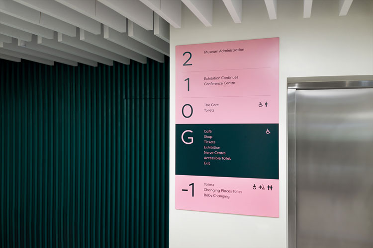
As well as a new logo, the design studio has worked on exterior signage, internal wayfinding and a campaign for the museum.
The museum is named for Charles Thackray, who opened a chemist shop in Leeds in 1902. It developed into one of the UK’s leading medical companies and in the 1980s, Thackray’s grandson started an archive in his predecessor’s honour.
O Street’s redesign coincides with a revamp of the centre’s visitor experience. Studio co-founder David Freer explains that initial consultation work – a collaboration with agency Creative Concern – led to a “gross-out” brand positioning, which aims to engage children with the museum’s content.

“Kids like playing with slime and disgusting stuff, and it would be very easy to shy away from doing things which are a little bit disgusting, but this is actually the most appealing and fun,” Freer says.
O Street worked from the concept of What’s Inside Us, which seeks to spark curiosity in audiences about what’s inside the museum and also what make up the human body, according to the design team.

The studio created a set of illustrations, which depict body parts and medical instruments in a range of bright colours. The “bold, brightly-coloured gorefest version” of the illustrations resonated with the museum team, Freer says. The shapes form the ‘T’ logo, which can be animated for use on social media and video.
The theme even runs into the new colour palette, where shades have names like ‘vomit orange’, ‘bruise blue’ and ‘pus green’. Two versions of Filson Soft have been used as the typefaces for the new identity.
The illustrations have also been made into oversized cut-outs which have been used as exterior signage at the museum. These “eye-catching” designs aim to intrigue passers-by, explains Freer, as well as helping to differentiate the museum next to the neighbouring hospital.
“We really wanted to get people excited and invested in something fun that was happening there,” he adds. O Street art-directed photography for the OOH campaign which has been launched across Leeds.

The updated branding has been applied to the museum’s wayfinding system, using the new colour palette and typefaces.
“We wanted to make sure there were echoes of the bright, fun, gorey aspect but also clarity in the way we had a really clear sans serif typeface,” Freer adds.

-
Post a comment


