The OWO’s identity is inspired by the destination’s wartime past
London’s Old War Office has been reimagined as a high-end destination, with period-inspired branding from design consultancy Greenspace.
Greenspace has revealed the new identity for The OWO, a new hospitality and residential destination housed in London’s Old War Office.
The work – which includes a logotype, bespoke typeface and Morse code-inspired graphic pattern – is inspired by the central London building’s heritage.

The Whitehall building was completed in 1906 – known then as the War Office – where it housed the government’s war department. In the 60s, the newly-formed Ministry of Defence took over the site and it acquired the name Old War Office.
Following its public sale in 2014, plans were announced to transform the building into a mixed-use destination comprising a hotel, residential apartments as well as hospitality venues.
“People search for authenticity”
According to Greenspace founder Adrian Caddy, balancing the building’s history with a modern outlook and authenticity was crucial to the branding.
“When we started to think about what to call the place, it seemed impossible to us not to call it by its authentic name,” he says, despite how views of war may have changed since the building’s original opening. “People search for authenticity,” Caddy adds.

The design team explored the National Archives in Kew, London and found thousands of copies of letters from the office which used the acronym ‘WO’. From the 60s onwards, the acronym ‘OWO’ was adopted.
“When you look at that as an acronym, it’s a very graphic one because it’s a perfect palindrome,” Caddy says. “And if you say it aloud, The OWO sounds a little like Soho or Noho – in a way, it makes it sound new again.”
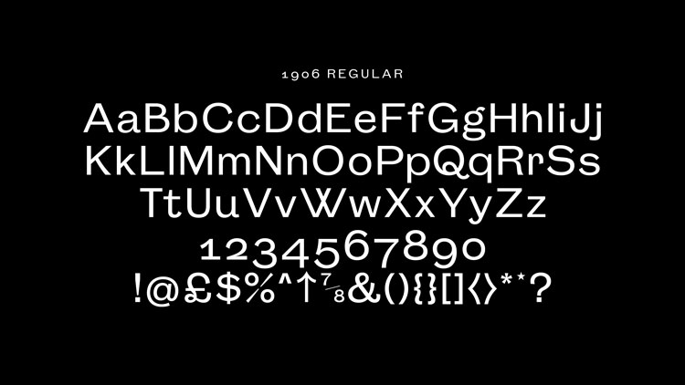
The studio has worked with London-based foundry Colophon on developing a bespoke typeface for the project, called 1906.
When it came to inspiration, Greenspace had to look more broadly at history, as all material and signage had been removed for security reasons after the Ministry of Defence vacated the site, explains Caddy. “There wasn’t any material that we could typographically base anything on,” he adds.

Instead, the team looked at typeset material from the early 1900s, such as the work of British type foundries like Stephenson Blake. Inspired by the contemporary use of Grotesk fonts, 1906 is designed to feel “quite restrained, quite reduced, quite utilitarian”, he says.
Greenspace had already developed a logotype for the new name with an overlapping ‘W’ letter, and Colophon created a full font family with three different weights.
The resulting “flourished forms” are crafted to work as well digitally as they do physically, Caddy explains. “It feels authentic but not old-fashioned,” he adds.
Morse code-inspired graphics
Greenspace has also designed a system of graphic patterns which are inspired by Morse code. These reference a covert messaging system used at the old offices, Caddy explains, where runners would send messages around the building via Morse code through an underground system of cables.
The studio developed a pattern which depicts the geographical co-ordinates of The OWO in Morse code. “The idea was to herald that and have a mechanism of telling people about things without it being super obvious,” Caddy says. The pattern can be applied variously across products, from wrapping paper to umbrellas.

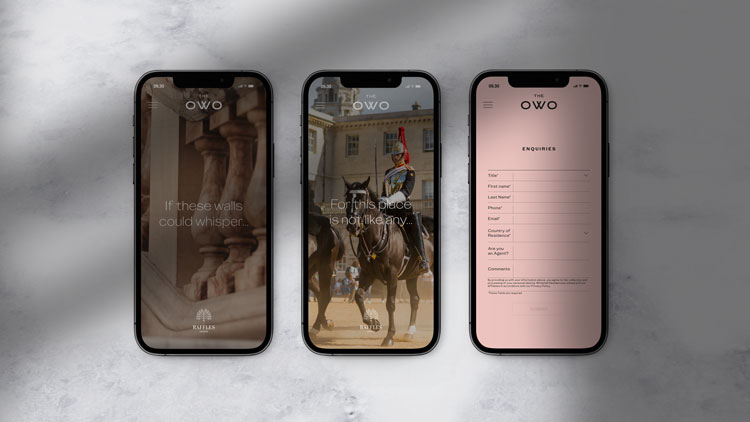
While the identity is primarily black-and-white and grey, a pink shade has been brought in. This tone has been taken from the pink alabaster balustrade that surrounds the double-height staircase in the building, Caddy explains.
“It has a slightly transparent quality to it,” he adds. “And together with the black-and-white mosaic and Portland stone grey, it felt sufficient to be true to the building.”


Excellent work and good to see such an important and impressive building reused in a modern way whilst retaining it’s origins in its identity.