The book covers that never made it: “rejected” designs revealed in new book
No, No, No, No, Yes editor, David Dunn, tells us what he has learned about creating a winning book cover.
Designing a winning book cover can be a complex journey, as many covers never see the light of day. With authors, publishers and marketers to please, it is perhaps not surprising that creatives can face their fair share of rejection along the way.
A new book shines a light on book cover designs that did not make it, tracking the process from early versions which have not been publicly seen, to the final covers.
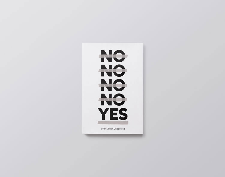
No, No, No, No, Yes: Book Design Uncovered, which has been published by D&B Books and edited by the company’s founder, David Dunn, presents 25 books, each with four rejected cover designs and the final, successful covers.
Dunn’s book idea was sparked after attending a talk about cover design by book designers Jon Gray and Jamie Keenan at St Bride’s Foundation, a historic, cultural venue dedicated to the printed word, in London’s Fleet Street.

“Wouldn’t it be great to show the world these covers?”
Keenan, whose work includes covers for Vladimir Nabokov’s Lolita and Nick Hornby’s Otherwise Pandemonium, and Gray, who is behind several Zadie Smith covers including Swing Time and Feel Free, among others, revealed some of their own rejected book covers during the talk – which led Dunn to a “light bulb moment”.
“There are all these beautiful book covers that never quite made it, that no one ever gets to see,” he says. “I thought, wouldn’t it be great to show the world these covers?”
Dunn, a publisher who also collects books including illustrated Penguin paperbacks, admits that he had not previously thought about the process behind designing covers.
“When you look behind the curtain, you see the amount of work that goes into these things,” he says. “It’s not just the final cover, but the many covers along the way; there is all this work that never gets any credit.”

His book offers a glimpse into the “alternative history of book design” and considers “what could have been”.
Dunn launched an open call for rejected cover submissions at a follow-up event at St Bride’s and on social media, asking designers to send in four cover designs that did not make it, along with the winning design.
He decided this was enough to show changes a cover went through, without overwhelming readers.
As a “small publisher”, he had not banked on getting many responses but received “hundreds”.
The book includes work by designers from all over the world, including Brazil, America, Argentina, Hungary and Ireland, among others.
Design development
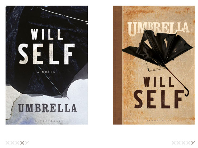
Books range from those by well-known British authors such as Will Self, whose book Umbrella was designed by Greg Heinemann, through to some which Dunn says a UK audience is less likely to know, such as A Mente Organizada which was published in Brazil, written by Daniel J. Levitin and designed by Rodrigo Maroja.
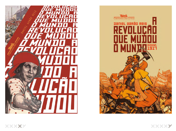
In each case the design development is shown. It Can’t Happen Here (Não Vai Acontecer Aqui) by Sinclair Lewis shows how designer Carlos di Cielo explored various designs featuring the US flag before settling on a deconstructed muddle of stars and stripes on a white background.
In the case of The Ginger Man by J.P. Donleavy, which was designed by Niall McCormack, different routes are revealed. Early cover designs include an image of a beer bottle and a stylised orange silhouette of a man, while the final design features a shadowy staircase.
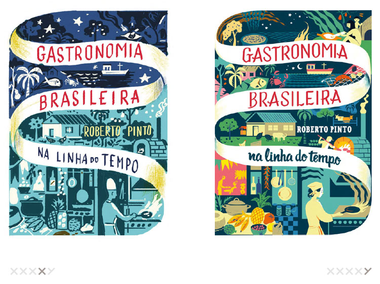
Some covers were changed more subtly, such as Gastronomia Brasileira, written by Roberto Pinto and designed by Nik Neves, which mainly saw changes in its colour palette as the design evolved. The designer eventually settled on a range of blues, greens and pinks for the final version.
It’s hard to please everyone
While compiling the book, Dunn says he discovered there is no set formula for how to design a winning cover and that “the book doesn’t really try to answer that question”.
“There are people involved in the decision-making process, such as sales and marketing teams, who might have different ideas as to what makes a good cover,” he adds. “There can be conflict over one person saying a cover is artistically amazing and someone else saying it won’t sell.”
Reasons for a cover being rejected can simply be the author “having a strong feeling” about it, or the design lacking “clarity”.
“If the message on a cover is cloudy or unclear, it tends to get rejected,” Dunn says. “If it makes people feel uncomfortable or confused about the message being portrayed, that can be off-putting.”
But a “direct” and “simple” message and good use of “colour” is often the key to finding a design that works, he adds.
“We are seeing book covers becoming more colourful or looking more like pieces of graphic design,” Dunn says. He puts this down to a need to stand out from the competition.
Standing out
As well as a “busy real-world shop experience” with books fighting for attention, online stores usually display covers as small, thumbnail images, Dunn says, “so something bold often draws the eye over something restrained”.
When it comes to dealing with rejection, “perseverance” has been a key factor for many designers, according to Dunn, with some telling him they repeatedly “tweaked” cover designs until one was accepted.
No, No, No, No, Yes, which has been designed by Paul Felton and Alex Woolley from design studio Common Curiosity, follows the theme of four rejections and one winning design for its own cover.
The book comes with a reversible, foldable dust jacket featuring five different cover designs for readers to choose from, which all show the book’s title in a range of typographic styles in black, white and grey.

The book is slightly larger than an average paperback, which Dunn says provides a “decent-sized canvas” for each of the images, with one appearing per page.
Though he had initially asked designers to each submit 100 words explaining why one design was chosen over another or sharing their design process, he eventually decided to “let the images speak for themselves” and not include text.
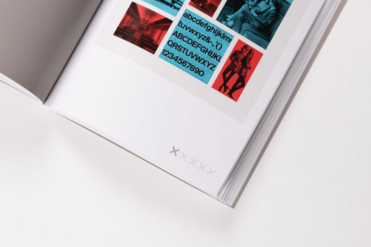
A page precedes each set of covers with the name of the book, the author, the designer, the publisher and the year of publication in a white, sans-serif font on a grey background.
The symbols “XXXXY” appear in grey on the bottom outer corner of each page, with either an “X” or a “Y” highlighted in a darker shade to indicate whether the cover was rejected or chosen.
If there is one thing the book makes clear, it is that not everyone agrees on what makes the perfect cover, as often “a design that didn’t make it is the one that a lot of people thought was the best,” Dunn says.
“I have posted covers of rejected books on social media and had authors posting comments like ‘that’s beautiful, I wish that had been the cover’,” he adds.
No, No, No, No, Yes offers an illuminating insight into book covers that could have been and the journey that led to the final products, leaving readers to decide for themselves if they agree on the winning designs.
No, No, No, No, Yes: Book Design Uncovered is available to buy for £19.99 from D&B Books.
All images courtesy of D&B Books.


-
Post a comment


