
A mentorship scheme’s rebrand is based on “impossible shapes”
Lantern studio has given Zero Gravity a geometric new look, which seeks to highlight students’ hidden potential when applying to university.
Zero Gravity, a university mentorship programme for students from disadvantaged backgrounds, has been given a visual identity by Lantern studio.

The update includes a name change, new logo, as well as a range of illustrations and website.
Zero Gravity originally launched as Access Oxbridge, founded by Joe Seddon. Wealthier students are ten times more likely to go to a top university than those from poorer backgrounds and according to its website, the scheme has so far helped over 300 state school students.
It has been positioned within the ‘tech-for-good’ sector, a label which denotes organisations using technology to effect social change. Zero Gravity connects students with mentors through a digital platform, which means lessons are provided through video.
“Energy, drive and ambition”
The name change was inspired by the challenges students face, which can act as a force of gravity on their ambitions. ‘Zero’ seeks to reverse that and show how they can overcome difficulties.
Lantern’s director Ryan Tym tells Design Week: “We wanted to find a way to visually represent the seemingly impossible challenge that students from low-income background can face.”
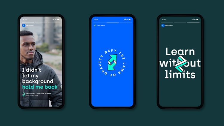
This resulted in a visual identity based around the idea of “impossible shapes”. The logo, for example, is an “impossible Z” which “symbolises the energy, drive and ambition to challenge convention that both mentors and mentees have”.

The design also took into consideration the target audiences – “smart students” – and so has an “brain-teasing” element to it. The shapes are designed, Tym says, to “show that with a fresh perspective, you can find a way forward – a way to progress through the system”.
A series of illustrations (more geometric shapes) feature throughout the website, from the “functional” (such as a ‘play video’ button) to signposts, which “guide students and mentors through the online application process”.

Typeface and colour palette

An “unconventional” sans serif typeface, Archia, has been used to complement these shapes. Its “unusual angles mimic the geometric nature of the logo and illustrations”.
The blue and green colour palette was chosen for its “electric feel”. It is an attempt to “reflect the power that the platform gives to students and mentors,” Tym says. This part of the identity also seeks to move the brand away from the “social enterprise, charity and education sectors” and place them “firmly in the tech space”.
Lantern worked on the brand’s online presence with Brighton-based web developer Rob Dove.

Read this next

-
Post a comment


