Sarah Hyndman: “It’s easy to see typography as an invisible discipline”
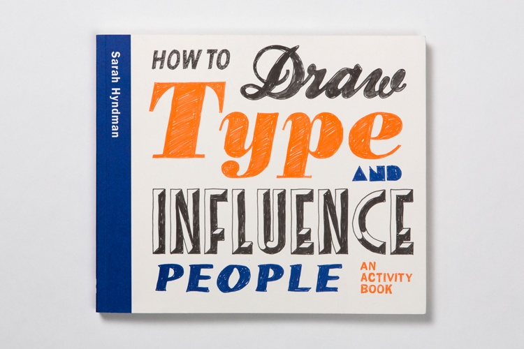
Type expert and graphic designer Sarah Hyndman has written and illustrated an activity book that asks readers to bring typefaces to life through drawing, colouring and thinking. Published by Laurence King, How to Draw Type and Influence People encourages people to delve into the words they encounter subconsciously every day and think about how they might look, feel, smell and sound. We speak to Hyndman about how the book aims to get people away from their computers and engage their imaginations.
Design Week: What is the main aim of the book?
Sarah Hyndman: The aim is to change the perception that typography is an academic or dry subject. I want to show that it is part of people’s everyday lives and it’s fun – it’s about the first record you fell in love with, the first sweet shop you went to as a child. Our written language is formed of letters that have taken on all sorts of shapes and styles over centuries. It is a visual code that is a mirror to our lives.

DW: Why did you choose to do an activity book?
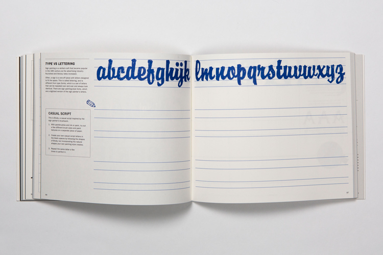
SH: This was a very conscious decision based on the workshops I run where the most successful part is getting everyone away from their computers and getting them to explore typefaces by hand. Doing it by hand makes more sense and means people are more likely to remember it because you form relationships with shapes and styles. Rather than just reading and observing the theory of type, the only way you’ll understand it is if you roll up your sleeves and do the exercises. Everyone will have unique experiences.
DW: Why is typography such an important part of graphic design?
SH: In this information era, so much of the information we encounter these days is written digitally. We’re sending emails rather than hand-writing. We interact with it all the time but it’s easy to see it as an invisible discipline.
There’s also a trend for easy-to-read sans-serif app-style typefaces. We’re losing sight of the fact that a wider array of typefaces can help you communicate a wider range of tone of voice, and convey different information.
DW: Can a wide selection of typefaces ever be confusing rather than informative?
SH: We live in a world where everywhere we look there are lots of typefaces. It’s visually cluttered with many things vying for your attention. That’s why it’s helpful to understand how to read different typefaces and navigate the clutter.
DW: How did you come up with the exercises for the book?
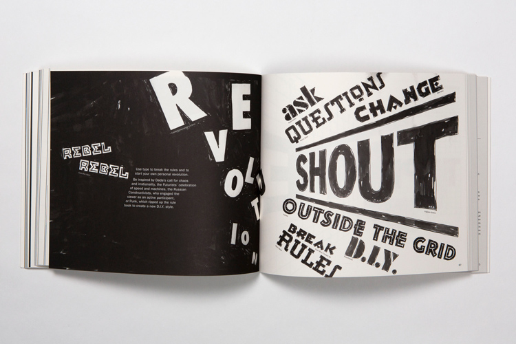
SH: Every single one was partly inspired by the typefaces themselves and their personalities – for instance, the more rebellious ones encourage readers to explore noise or break rules. Some of the exercises are based on formulas I’ve used before, such as when I taught experimental typography at London College of Communication (LCC).
DW: Tell me about some of the exercises?
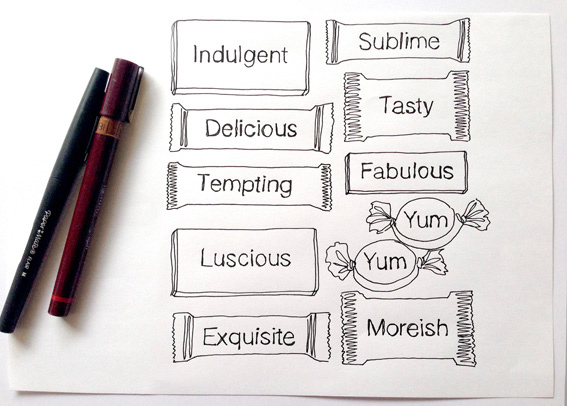
SH: One of my favourites is right at the beginning and is based on sweet wrappers. Before I even understood what type or lettering was, I used to love the shapes and styles of sweet wrappers. It compares neutral san-serif and more exciting typefaces used on wrappers, then invites readers to draw supermarket products they see in day-to-day life.
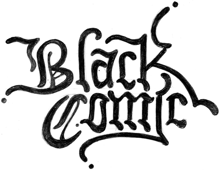
The mash-up exercises started with a Twitter conversation I had with a French lettering street artist Mr Cromso. We were talking about mixing different typefaces, looking at extremes that would never go together. He came up with a hybrid typeface called Black Comic, which is Blackletter combined with Comic Sans. I liked the idea of taking such diametrically opposite personalities and splicing them together to create a new, rebellious typeface. The exercise asks readers to think of two completely opposite typefaces, combine them and name it.
DW: You say typefaces have personalities – what typeface would you be?
SH: It’s the same as choosing your clothes, music or food – it completely varies from moment to moment. Today I think I feel like Thorne Shaded, which is featured in the book. It’s a bold and confident three-dimensional typeface inspired by Victorian display styles. The letterforms are shadows so it creates a typographic blank canvas waiting to be coloured in.
DW: So are you hoping people will learn something about themselves from the book?
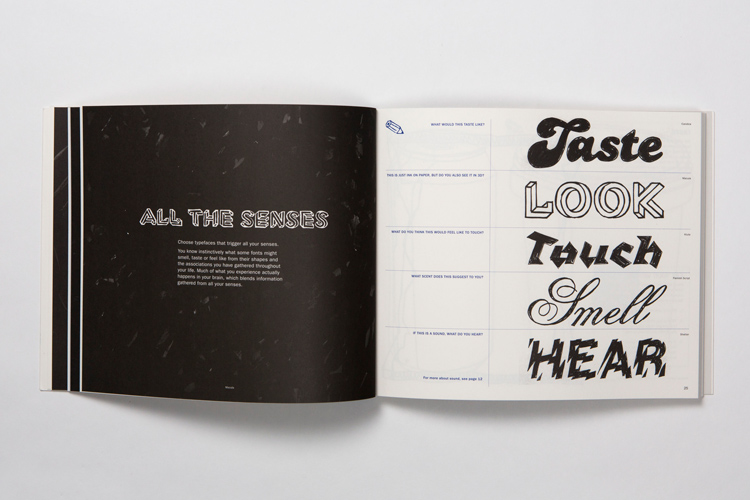
SH: I’m never going to see readers’ finished books so it’s not about making people self-conscious about their personalities. It’s about breaking the code of typefaces to understand what they mean. Various scientific studies show that the more senses you incorporate into an experience, the more memorable it is. When I flick through my sketchbooks, I know what was on the television when I was drawing something, even from when I was 10 years old. It somehow captures a whole sensory memory.
I’m hoping the exercises will create new memories centred around people’s appreciation of typefaces, and will teach people about type history in a way that makes it stick. By getting their hands on it, it’ll make much more sense.
DW: So are you hoping this will encourage designers to work by hand?
SH: Yes – it’s about helping people generate more creativity by stimulating their hands. I hope that, instead of having a cigarette break, designers might have a drawing type break. Designers spend so much time at a computer. I would love it if it was used by both younger and established designers to take them back to the craft of drawing typefaces by hand.
How to Draw Type and Influence People is available from 21 April through Laurence King’s website.
Win a free copy of the book
In partnership with Laurence King, we’re asking readers to take part in a fun competition to stand the chance of winning a free copy of the book.
We’d like you to take part in the mash-up challenge by thinking of two typefaces with very different characteristics and personalities, and combining them to create a new, hand-drawn one that showcases the best – or worst – qualities of both.
For example, street artist Mr Cromso was challenged to combine a Blackletter typeface with Comic Sans and he came up with a new typeface called Black Comic:

Email us at sarah.dawood@centaurmedia.com with your mash-up creation, along with a name for your typeface by 19 April. We’ll pick our favourite one, showcase it on the site, and send you a free copy of How to Draw Type and Influence People.
Read this next


Surely Thorne Shaded (c.1810) cannot be ‘inspired by Victorian styles’.