Value judgement
With supermarket value lines more popular than ever, the challenge is to balance cheapness with an assurance of quality. But achieving stand-out with minimal, no-frills packaging is one of the toughest tasks a designer could face, says David Benady
From EasyJet’s garish orange to the stark red, white and blue of Tesco’s Value range, the design of low-cost brands is a vital element of their success.
As supermarket price wars rage, Internet competition sharpens and consumers tighten their belts after the credit boom, value is a word being increasingly dropped from marketers’ lips. Designers are being called on to create brands that scream ‘cheap’, while maintaining an aura of reasonable quality.
The watch-words for creating economy brands are ‘what you see is what you get’ – abbreviated in value speak to ‘wysiwyg’.
While premium brands lead consumers on a journey of discovery, gradually unveiling new layers of meaning and functionality, branding for value generally entails shouting the word ‘price’ loudly. That means stripped-down graphics, one or two bright colours and no-frills packaging.
In the supermarket sector, value ranges dispense with the need for novel design cues associated with brand leaders. Giving a brand added value piles costs on to the packaging design, since expensive new machinery may be needed to produce the bespoke shapes and materials required to achieve ‘stand out’. Economy ranges, on the other hand, shun exclusivity, so the packaging design is created ‘off the shelf’, using packs, typefaces and colours that are already standard. This keeps production costs to a minimum, though the design may be farmed out to external consultancies.
Supermarkets launched value ranges in the mid-1990s to see off competition from Continental discount retailers, such as Aldi and Lidl. The sensitivity of the subject is clear from the supermarkets’ unwillingness to discuss it, but the strategy appears to be working and the discounters have failed to grab much more than a 5 per cent share of the UK’s grocery trade. Much of this success is down to the power of packaging design, which has differentiated the ranges from standard and premium own-label brands offered by supermarkets. But value lines have also wiped out many manufacturers’ ‘tertiary’ or ‘fighter’ brands, which can no longer compete on supermarket shelves, and this has led to less work for designers.
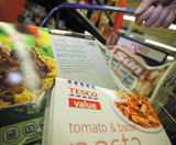
But it hasn’t all been plain sailing for value brands. When Tesco first introduced Value lines in 1995, the design was considered by some to be just too cheap and tatty. As Spencer Buck, creative director at Taxi Studio, says/ ‘The trick these days is to deliver the feeling of value but not to make the buyer look like a loser – Tesco Value lines made people feel self-conscious.’ Since then, the look has been softened with the introduction of photos and greater use of colour.
The range now accounts for an estimated 5 per cent of Tesco’s packaged grocery sales and includes more than 1200 lines. A spokeswoman says many shoppers mix value, standard and premium Tesco Finest products in their shopping baskets. Asda has nearly 800 products in its Asda Smart Price value range, but an accompanying logo – featuring a fox, to indicate the wiliness of ‘smart’ shoppers – was dropped earlier this year.
Meanwhile, Sainsbury’s has this year re-launched its Low Price range as Basics, designed by Williams Murray Hamm. Some see the relatively high specification packaging, using classy photography and amusing descriptions, as part of a delicate repositioning task for Sainsbury’s – catering for its upmarket customers while attracting a wider audience.
One reason supermarkets provide value ranges is to show off their social responsibility credentials, providing for all sectors of the community, according to Simon Black, head of brand propositions at Design Bridge. But, he adds, ‘It is becoming difficult to find true value packaging, and supermarkets are trading us up through desire and guilt.’ He believes supermarkets use the design of value ranges – often stark and unattractive – to induce guilty feelings about buying cheap food. This encourages people to trade up to higher margin standard and premium lines.
Dragon director of packaging Dominic England says that many designs fail to strike the right balance between value and desirability. ‘Lots of brands haven’t really cracked it yet. It’s about the right level of design for the right level of consumer expectation. People are buying for a particular reason, so you need design which doesn’t promise too much, but is just straightforward and honest.’ He cites Turner Duckworth’s controversial repackaging of Mr Kipling cakes, earlier this year, as an example of a standard brand position confused by the use of premium design cues.
But it is not only in supermarket retailing that branding for value is rising up the agenda. Consultancy L&Co was hired by Estonian Mobile Telecommunications to create branding for its economy mobile phone off-shoot Diil, launched to see off competition from new low-priced entrants. ‘We based the Diil concept around the idea that it’s a value brand, so there’s no money for design. We made a hand-drawn font that looked like it hadn’t been anywhere near a computer,’ says L&Co founder Paul Barlow. Other value ploys include using a bright, day-glow green colour, and photography that looks like it’s taken in a phone booth. ‘The irony is, it’s all quite difficult to do because you’re engineering it to look home-made,’ Barlow adds.
‘Wysiwig’ may look simple, but creating value branding is a great challenge for designers. As Taxi Studio’s Buck says, ‘When design is stripped to nothingness, how do you differentiate yourself with just three colours? It is one of the hardest design jobs you can do.’ But it’s one that more and more designers may be called on to perform.
Read this next

-
Post a comment


