
Taxi Studio’s “optimistic” identity for equal opportunities design initiative Up
West of England Design Forum’s latest venture aims to address the imbalance between female graphic design students and those in leadership roles.
Taxi Studio has created the new identity and positioning for gender equality design initiative Up.
The Bristol-based studio worked on the naming, brand positioning as well as the visual assets for the group, which seeks to support female designers throughout the industry.
Up is the latest initiative from the West of England Design Forum (WEDF) and was set up by the organisation’s managing director Emma Blackburn.
According to the initiative’s mission statement, it was inspired by the discrepancy in its Buddies programme, which links up students and graduates. Blackburn noticed that most of the pairings were between female students and male professionals.
View this post on Instagram
Blackburn’s observations were backed up by statistics from another design-oriented equal opportunities organisation Kerning the Gap: women make up 70% of graphic students but only 11% of leadership roles.
While the “days of Mad Men levels of sexism and misogyny are long gone”, the problem can now be harder to spot, according to Up. The organisation acknowledges that designers need “different conditions to thrive” and is therefore focused on “embracing difference”.
There are five key focus areas for the initiative: Divide Up (parental leave), Listen Up (mentorship), Loosen Up (flexible working patterns), Mix it Up (tailored training) and Big Up (an area to celebrate success).
The volunteer-run initiative is encouraging people to get in touch with case studies and stories of female designers worth celebrating. You can visit the website here.
“Each person has a different view on what success looks like for them”
Taxi studio designer Pam Partridge says that the initiative was the “perfect opportunity to get under the surface of campaigns around equality, from the likes of #metoo and #thisgirlcan” and “to gain a broader understanding of the some of the problems faced”.
“It became clear this wasn’t just about salaries and promotions, but that each person has a different view on what success looks like for them,” Partridge adds.
The wordmark draws inspiration from the WEDF logo, designed by Mytton Williams studio. Taxi’s Lily Papadopoulos explains that the core idea behind it was about “elevating women in the industry”. She was inspired by upwards imagery: “I focused on creating a platform or ladder out of the typography which subtly comes through by marrying the letters together.”
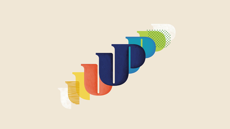
The multi-coloured mark, which features different textures and typographic treatments, also had to sit alongside the WEDF logo. Papadopoulos wanted it to “feel like a sister” – “the chunky curves and the slab serifs from the WEDF logo were my inspiration.”
A further palette of textures and colours have been developed to “reflect richness” and “evoke optimism”, the studio says. Animation for social media channels including Instagram and LinkedIn have been storyboarded and copywritten by Taxi’s Stu Humphrey.
Bath-based Touchpoint Design created the website, using the brand guidelines provided by Taxi.
“Not every young female designer gets the opportunity to work on an initiative dedicated to celebrating and elevating equality within the industry,” Papadopoulos adds. “I’m excited to see how this can spark a positive change for the design industry.”
Read this next

-
Post a comment


