
Otherway’s “retro-futuristic” identity for plant-based meal kit Future Noodles
The visual identity seeks to put a space age spin on noodle packaging, while showcasing thefood brand’s ethical values.
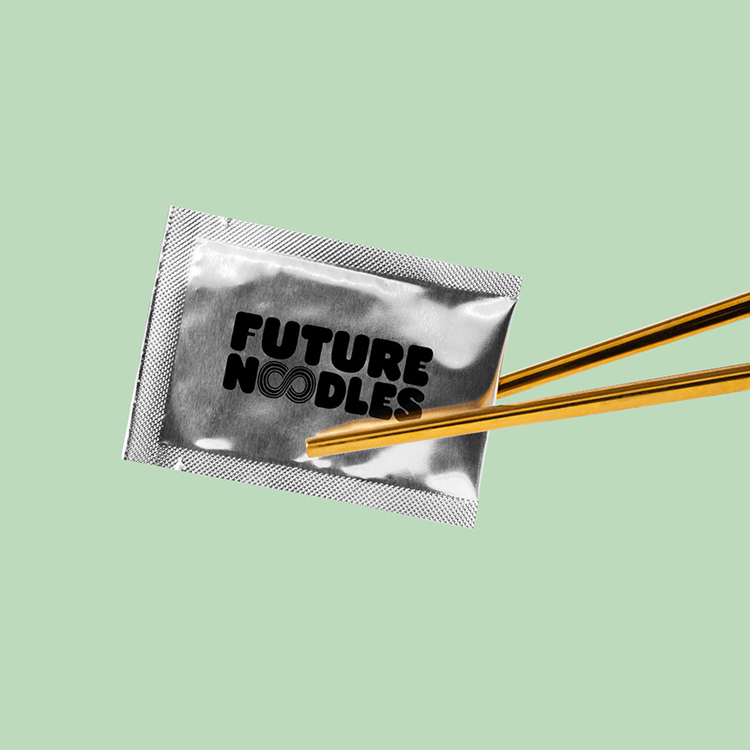
London-based design studio Otherway has created the “retro-futuristic” identity for instant noodle brand Future Noodles.
As well as designing a logo, typeface and illustrations, Otherway has crafted the brand’s packaging which the studio hopes will set it apart in the ready meal category.

Future Noodles is a new venture from chef Carl Clarke who set up London restaurants Chik’n and Chick ‘n’ Sours. The instant noodle kit aims to provide a nutritionally complete and plant-based alternative to tradition noodle brands, according to Otherway.
Future Noodles also uses sustainable ingredients and works with charity FareShare to donate meals to the vulnerable.
“Space age noodles sent down to earth”
The design team was inspired by the “innovation in health and nutrition in the product” as well as the “futuristic thinking behind the development of the noodles themselves”, Otherway founder Jono Holt says.
Another ambition was to create a distinct brand in a crowded category. “We wanted to take reference from the varied and punchy world of noodle packaging, but come at it from a different angle,” he adds.

He adds that while noodle branding has “historically always been fun and entertaining”, it was important that Future Noodles was taken seriously.
Working from an early idea of “space age noodles sent down to earth”, the studio developed a “retro-futuristic look and feel that felt pioneering but also comforting and natural”, Holt adds.
“What goes around comes around”
This influence can be seen in the rounded condensed typefaces, Holt says, which seek to echo a tech start-up but add a “friendly edge”.
The typeface was chosen for its “techy but friendly” style while a custom typeface has also been created for the identity which mimics the shape of noodles.
“We wanted it to sit apart from the brand like a fan had done it themselves, then loved it enough to make it a core asset,” Holt says of the noodle-inspired typeface.

It has also inspired the infinity loop logo, which aims to highlight the brand’s charitable work with FareShare. “The infinity logo is a nod to that,” Holt says. “What goes around comes around.”
The infinity loop takes the place of the ‘oo’ in the wordmark and is accompanied by illustrated characters called Noodlers on packaging. These have been created to provide the brand with a sense of community, according to Holt.
Noodle-inspired typeface
The green, pink and yellow colour palette has been inspired by the first three flavours of noodles – Spicy Kimchi, Yellow Curry and Smoky Mushroom and Miso.
The packaging took months to perfect, according to Holt. It has a Forest Stewardship Council (FSC) certificate which means that all materials are made from forests intended for production. Meanwhile, colours have been limited to “minimise the impact of printing”, the designer adds.

Otherway has also designed a website for Future Noodles, which mixes images from food photographer Rob Billington and “fresh modern colours”, Holt says.
An accompanying ad campaign will roll out across central London with more space-age themed copy like: “Take me to your kettle”.
What do you think of the identity for Future Noodles? Let us know in the comments below.

-
Post a comment


