
A “craft-inspired” new look for 120-year-old luxury hotel Kempinski
Kempinski, which was founded in Berlin in 1897, is Europe’s oldest five-star hotel group, and has been given a new visual identity by Paris-based studio Work in Progress.
Paris-based studio Work in Progress (WIP) has given five-star hotel chain Kempinski a new visual language that has been inspired by “design and craft”.
Kempinski Hotels was founded in Berlin, Germany in 1897, and is Europe’s oldest luxury hotel group. It now has its head office in Geneva, Switzerland. It currently runs 75 five-star hotels in 30 countries, having expanded beyond Europe to the Middle East, Asia and Africa.

The calligraphic Kempinski logotype has been retained, but there are two new typefaces, a refreshed colour palette and a suite of illustration and photography.
WIP worked with French typographer Mathieu Réguer to design the new primary, serif typeface, HeleneHess, named after the hotel group founder Berthold Kempinski’s wife. A custom, sans-serif typeface accompanies this, which aims to “improve legibility” and “bring unity” to Kempinski’s hotels and sub-brands, says Sean Habig, founder at WIP.
A deep blue alongside gold and cream have been used to form a “sophisticated” core colour palette, with a secondary palette of red, green and blue to add “energy and vibrancy”, he says.
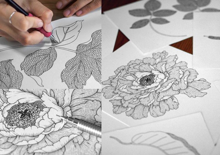
Thailand-based illustrator Suthipa Kamyam was commissioned to create flower illustrations for the brand, which also feature as tactile patterns that can be felt when used on printed materials. Four flowers have been designed to represent the four regions Kempinski now runs in: Europe, Asia, North America and Middle East and Africa.

Danish photographer Claes Bech-Poulsen was also commissioned to take still-life photography that would “elicit emotion”.
Habig says the new visual language was inspired by Kempinski’s “archive of Swiss-German design from the 19th century onwards”.
“Craft informed our choice of printing materials and finishes, adding texture and warmth… [while] photography gave us an opportunity to be bold and capture the originality and eccentric nature of Kempinski,” he says.
The new Kempinski visual language is now rolling out across print materials such as brochures and leaflets, marketing communications, merchandise like stationery, and items inside the hotels.


-
Post a comment


