
Andrew Lloyd Webber’s theatres get a rebrand inspired by “stage and spotlight”
LW Theatres has a new overarching brand, as well as unique sub-brands for the group’s six main London playhouses, which all have a typographic style influenced by the architecture of each space.
LW Theatres – Andrew Lloyd Webber’s group that encompasses six London theatres – has been rebranded by Elmwood, with a new look that references stage spotlighting as well as the playhouses’ individual architectural styles.
The theatre group, founded in 1977 by Webber, was previously called Really Useful Theatres and was renamed as LW Theatres last year in a bid to better reference the founder himself.
The group owns the Adelphi Theatre, Cambridge Theatre, Theatre Royal Drury Lane, Gillian Lynne Theatre, The London Palladium and Her Majesty’s Theatre. Also part of the group is The Other Palace, an experimental space for new musicals that was not part of the rebrand.
Webber is the composer of some of the world’s most successful and best-known musicals, including The Phantom of the Opera, The Wizard of Oz and Cats.
Elmwood was employed at the end of 2018 to create a new visual identity for the group that would work alongside the new name.
The previous brand identity centred around a roundel logo, a colour palette of red, black and grey, and a swiss army knife illustration, referencing the previous name of Really Useful Theatres.
Kyle Whybrow, associate creative director at Elmwood, says this past branding “wasn’t connected to the theatres”, so the design studio set about creating a new identity that aimed to reference the stage spaces themselves.
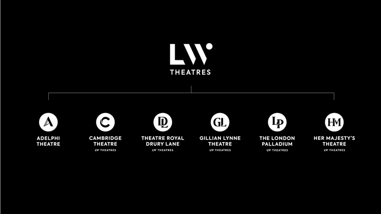
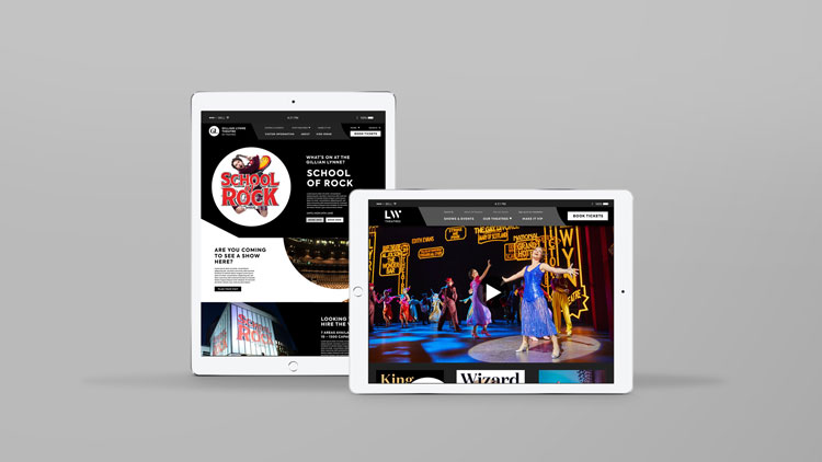
Elmwood has designed an overarching brand for LW Theatres, alongside six unique logos for the theatres. All the logos are typographic, with some being monograms, so featuring two initials summing up the theatre names, and some featuring just one initial.
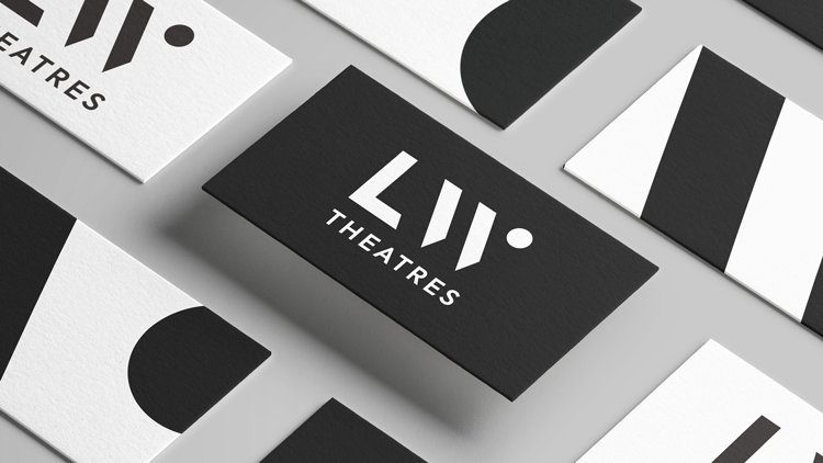
The main brand features “LW” characters set in a slanted, sans-serif, bespoke typeface, with two diagonal lines and a dot character used to form the “W”. The line-and-dot device looks to reference the “stage and spotlight” of theatres, says Whybrow. The word “Theatres” is set underneath this, in sans-serif typeface Axiforma. This type has also been used for body copy across communication materials.
The six theatre logos are all set within roundels, which also look to reference spotlighting, with initials contained within them, set in different typefaces.
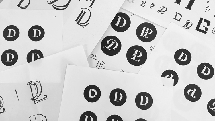
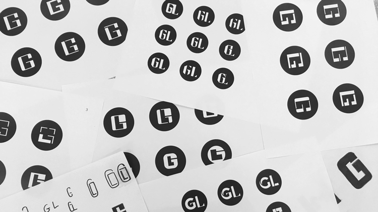
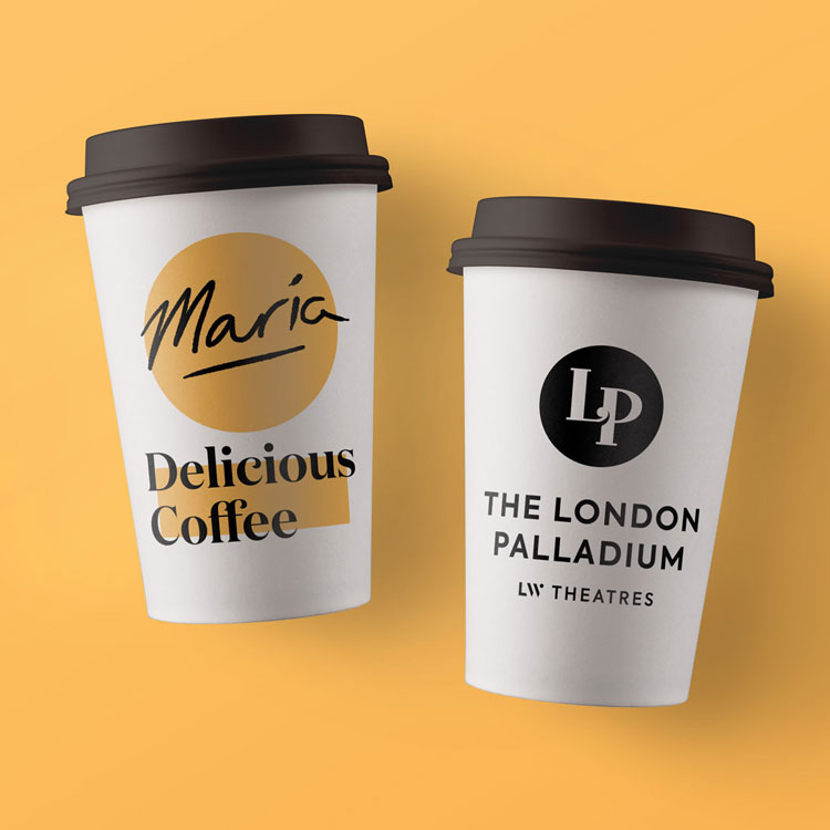
“The monogram styling was inspired directly by the architectural styles of each theatre,” says Whybrow. “The straight vertical lines in the Gillian Lynne monogram reference the Brutalist styling of that theatre, whereas the Edwardian and Neo Baroque architecture of the London Palladium has been showcased by the playful overlap and serif detailing of the LP monogram. The Adelphi is a beautiful Art Deco theatre, so bold, geometric shapes informed the styling of the ‘A’ monogram.”
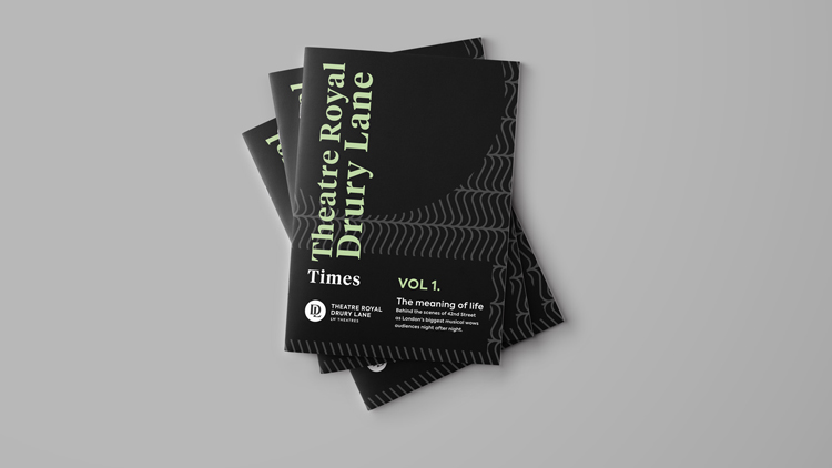
The six typefaces include Chiswick Sans for The Adelphi, Neutraface for Cambridge Theatre, Tiempos Headline for the Theatre Royal Drury Lane, Knockout for Gillian Lynne, Domaine Display for The London Palladium and Portrait for her Majesty’s Theatre. A primary colour palette of black and white has been used.
The overall aim of the rebrand was to make obvious reference to the stage while creating a consistent look-and-feel that felt tailored to each theatre, says Whybrow.
“The rebrand brings the theatres together as a family of unique individuals, while maintaining the charm and character of each venue,” he says. “The spotlight theatre monograms celebrate the unique styling of each theatre, which is a homage to Andrew [Lloyd Webber]’s artistry and passion for art and architecture.”
A secondary colour palette of pink, red, orange, grey and blue has been used across marketing materials such as play advertising posters, as well as the dot-and-line (stage-and-spotlight) graphic device.
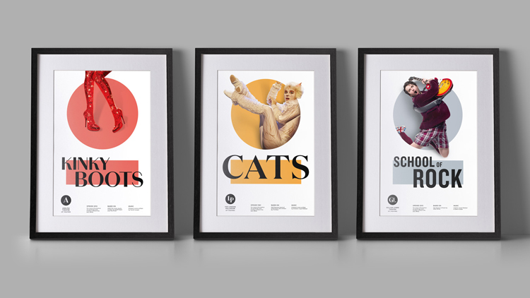
Cut-out photography of actors in current shows has been used alongside these graphic devices and a white background, while the headline typeface used on the posters tends to correlate with logotype for that particular theatre.
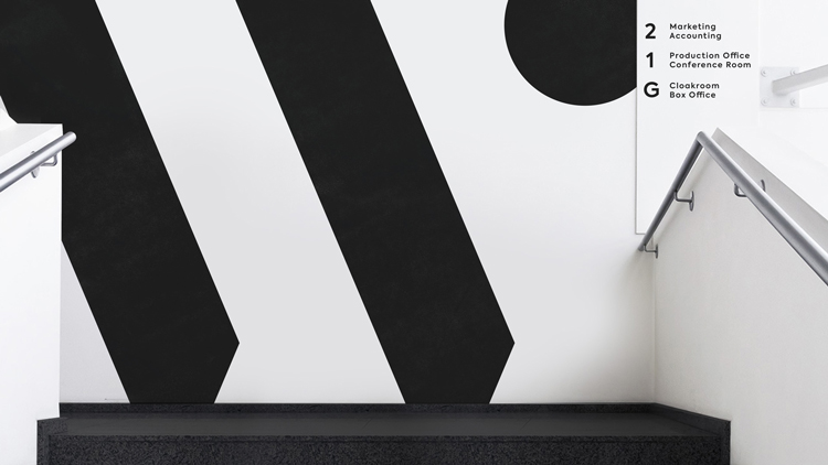
The project took six months to complete, and the new brand is currently rolling out across all touchpoints, including the website and social media, staff uniforms, in-theatre and building signage, print marketing materials such as posters and business cards, and customer merchandise such as bags and coffee cups.
Elmwood is currently working on another LW Theatres project, which will involve a branding refresh for the Theatre Royal Drury Lane, as it undergoes a refurbishment. The redesigned theatre will open its doors at the end of 2020.


Read this next


The LW doesn’t really work… It looks like the designers were ‘inspired’ by the excellent Lewis Moberly LM logo thats been around for years and tried not to make it too similar and ended up with something that looks quite contrived.
I saw this the other day in London and I love it!
Really well put together, you can tell a lot of thought went into it. Well done to the design team!
British designers usually handle theatrical graphics better than Americans with more simplicity, modernity, and power, but this is really disappointing to this New Yorker. The system restricts the posters into dreary versions of what could be; the Cats poster, for instance. The initials, typeface, and circle shape vocabulary will get old in two more seasons. The whole program looks like a before picture from 1972!
I think the Cats, Kinky boots and School of Rock posters really restrict the personality of each production by trying to put them into an almost cheap ‘budget own label’ packaging format, and strip them of any excitement and specialness of their own.