The New York Times Style Magazine redesigns to “reflect the times”
As T magazine unveils its new look under the editorial direction of novelist Hanya Yanagihara, we speak to creative director Patrick Li about the design’s greater “sense of urgency”, and the freedom allowed by not being sold on the newsstand.

Design Week: What is your role at The New York Times?
Patrick Li: I’ve been the creative director of T: The New York Times Style Magazine since 2011, when the former editor-in-chief Deborah Needleman and I came aboard following our stint at the Wall Street Journal’s WSJ Magazine.
DW: Why did you decide to redesign the magazine?
PL: Our new editor-in-chief and novelist Hanya Yanagihara wanted to refresh T’s visual language to reflect her perspective on culture. Her aim wasn’t to completely overhaul the magazine as it wasn’t broken, but she did want the look and feel to reflect a radically different cultural moment than her predecessor’s time.
DW: What was your brief?
PL: The design brief was more of a conversation than a mandate about what Yanagihara found aesthetically meaningful. Her voice and point of view is so well articulated and thoughtful. I remember when she first said that the new visual mood needed to be more urgent and less inert. She explained that the output from true artists and creators reflects their time, whether it is conscious or not, and we needed to mirror that thinking. Those words really stuck with me, and all our design decisions have been driven by that sense of urgency.
DW: What are the main design features of the new magazine?
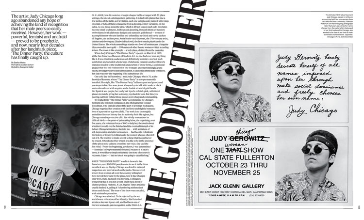
PL: My team and I had countless discussions on how the magazine’s design direction should be less templated and more experimental than before. Since T is a luxury product to its core, and because it reaches some of the world’s most discerning readers, we also understand that the aesthetics need to be more striking and beautiful than ever. Negative space and typographical compression and expansion are our solutions, especially as the text becomes more substantive. We will also incorporate more handwriting to keep the tone conversational, though not necessarily more personal. We will definitely incorporate more colour in the magazine in future issues. You’ll see it in the pages, the logo, and the imagery. But you’ll also see more black and white whenever that feels right.
DW: Tell us about the cover design.
PL: It’s funny, in editorial meetings we constantly talk about the freedom allowed by not being sold on the newsstand. We aren’t obligated to feature the latest celebrity on the cover to sell the magazine. Nor do we have to write about ‘50 new ways to comb your hair’ or ‘the 10 best new looks for the season’. We wanted to bring that freedom to the cover design, so in future issues we will explore moving the logo and cover lines (if any) to reflect what’s best for the image or the story. I am particularly grateful for Yanagihara’s courage here.
DW: Can you explain your choice of typography?
PL: We wanted to move away from expected tropes like high contrast fonts, which have become somewhat repetitive within the fashion and lifestyle worlds. In collaboration with the excellent type foundry Commercial Type, we designed two radically different fonts simultaneously. The sans-serif family is called Kippenberger after 20th century artist Martin Kippenberger’s seminal books, and the serif family is named Fact after graphic designer Herb Lubalin’s radical and politically engaged magazine. They each have the same cap and x-heights and play on the width relationships that were a signature from T Magazine’s previous typographical language.
DW: Do you expect the new design to evolve over time?
PL: Since we are only at the beginning of the refresh, we are still finding our way. There will certainly be more surprises to come. Watch this space!


-
Post a comment


