
Delving into the life of Berthold Wolpe: the German Jewish designer who fled the Nazis
A new exhibition at the Lettering Arts Centre in Suffolk explores the design processes, personal collections and work of typography and graphics legend Wolpe, who designed the Albertus typeface and over 1,500 Faber & Faber book covers.
The Times newspaper’s masthead; ubiquitous typeface Albertus; Faber and Faber book covers; these are all things designers may be aware of, but far fewer will know they are the handiwork of German typographer, calligrapher and graphic designer Berthold Wolpe.
Far fewer still will know Wolpe’s fascinating history – his escape from Nazi Germany in the 1930s; his arrival in the UK as a Jewish immigrant, only to be locked up in a Croydon jail; his marriage to an English wood-worker and dress-maker, which allowed him Government permission to continue living and working in London.
The life and career of Wolpe is set to be explored in a new exhibition at the Lettering Arts Centre in Suffolk, which looks to not only delve into his finished work, but also his design processes, rough sketches and personal life.
Guest curator and visiting professor of typographer at Birmingham City University, Phil Cleaver, has worked with Wolpe’s daughter Deborah Hopson-Wolpe to put together the exhibition, which is fittingly titled Berthold Wolpe: The Total Man.
The show will give visitors “an idea of him as a person”, says Hopson-Wolpe, as well as provide insight into his personal collection of drawings.
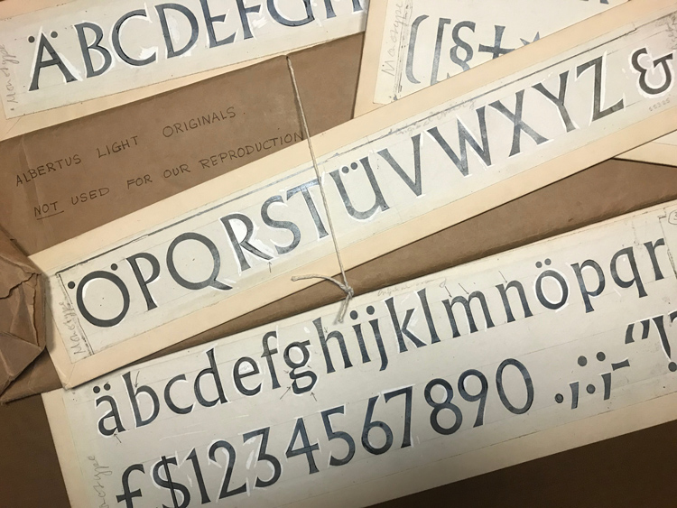
“It’s amazing how freely he drew,” she says. “These were the days before computers, or even Letraset. If he wanted a typeface, he’d just draw it. You can see the brushmarks in black Indian ink, then the corrections he made on top in white poster paint, as well as the terrible quality of paper he used after World War Two that’s all faded and stained by glue. There’s a freshness to it all.”
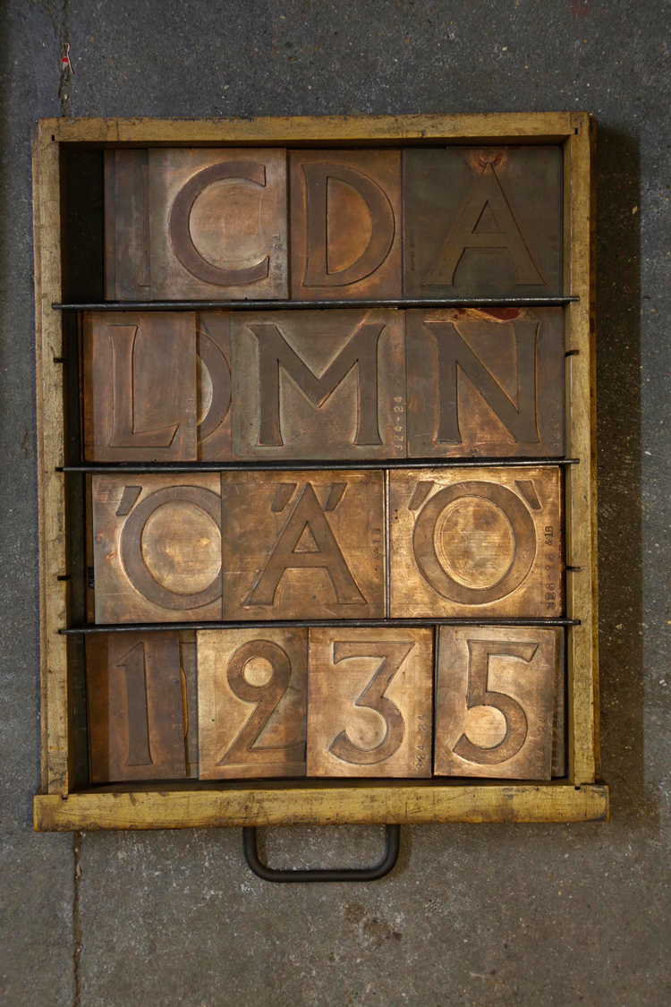
Wolpe was born in Offenbach, Germany in 1905 to a family of dentists. Picking up on his natural talent for drawing, a family friend advised that he do an apprenticeship in design, and Wolpe went on to work at a bell foundry – his first experience as a typographer was creating and engraving the lettering that went onto bronze bells.
He later went to art college in Frankfurt and Offenbach, and began teaching at Frankfurt University. But after the Nazis came to power in 1925, he set about trying to emigrate, and spent a few years trying to gain a work permit to come to the UK. This proved a laborious and drawn-out task.

He began travelling to London to work for Monotype in 1932, and was commissioned by them to design a printing type of capital letters. The typeface he designed, Albertus, became one of the most popular typefaces used across advertising and marketing in the UK.
Despite his contribution to UK design, he had not yet been granted permission to stay and work in the UK permanently. Given his Jewish heritage, Wolpe was subject to constant scrutiny by the Nazis when in Germany, and was eventually arrested, fingerprinted and sent to prison in 1936.
He was released suddenly and inexplicitly, and Wolpe attempted to fly to Paris without the correct paperwork, only to be turned back and sent to Croydon instead, where he was arrested and locked up again. “Although the policeman put him in jail, he also apologised and offered my father a cup of tea,” says Hopson-Wolpe. “It made him realise the UK was a much better place to be at that time.”
It took years to organise the correct paperwork for Wolpe to stay in the UK, and he had to get written permission whenever he wanted to travel to London. But then in the late 1930s, Wolpe was invited to a tea party for refugees by a fellow artist he knew called William Ohly. Here, he met a British fine artist called Margaret, who was a wood-worker, letter-cutter and dress-maker during the war.

They got married in 1941, and by this point Wolpe’s perseverance had paid off. He was granted permission to stay in the UK, helped by his marriage to a British woman, and went on to work for Faber & Faber in 1941. Over the next 35 years, he designed over 1,500 book covers for the publisher.
Unfortunately, marrying a German man had some repercussions for Margaret; previously a war-time dress-maker, she was banned from doing much of the work she had done before, such as designing camouflage army gear.
Wolpe went on to teach at the Camberwell School of Arts and Crafts, the Royal College of Art (RCA) and ran a lettering course at the City and Guilds of London. In 1966, he also designed a new masthead for The Times newspaper.
The exhibition at the Lettering Arts Centre details some of these exciting, unique anecdotes regarding Wolpe’s life, and they feature in even more detail in an accompanying exhibition book, with personal stories contributed from 30 people who knew him.
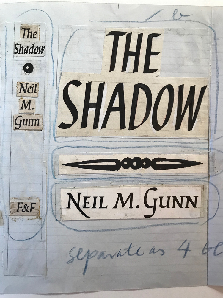
The show is structured chronologically, moving from his time in Germany to post-war time in England. An entire wall is devoted to the breadth of Faber & Faber covers he created. It also delves into the idiosyncrasies of Wolpe’s workings, demonstrating the rough paintbrush work, the corrections in white poster paint, his messy working environment, alongside the more refined pen-work and precise paper cut-outs of letters, all done by hand.
Additionally, the exhibition features items Wolpe used in his work and personal life, which add more colour and intimacy to the show. Everything from caricature drawings of Wolpe, drawn by his cartoonist friend Charles Mosley, through to toys Wolpe designed for his children, a hat and a coat he always wore, paintbrushes, pens and a tiny watercolour paint box all feature.
“The paintbox is the size of a postage stamp, and still features old paints, which are now rather dried up,” says Hopson-Wolpe. “What’s funny is that the only colours that were gone from the multi-coloured paint box were red, white and black – my father seemed to only ever use these colours.”
Given Wolpe did all of his design-work by hand, he had an eye for accuracy and precision, says his daughter.

“The most important thing for him was legibility and clarity,” Hopson-Wolpe says. “He always thought a dust jacket was like a poster for the book – it should be clear so you could read it, and descriptive of the content inside it.”
She adds that his background as a metal-worker and bronze bell engraver led him to have an interesting, hybrid typography style that carried through to Albertus and much of his work – a “punchy Gothic black letter” combined with the “Roman alphabet”.
The exhibition space, which has been designed by curator Phil Cleaver, is “pretty full” adds Hopson-Wolpe, with all sorts of mediums – metal work, book covers, wood-work, paintings and even tapestries he had designed – covering the walls. The diversity of the show, plus the ability for visitors to delve into the personal life and history of a great 20th century designer, aims to make this exhibition an original portrayal of Wolpe.

“We hope people will come, enjoy it, laugh at quite a lot of the things in it, and be surprised,” says Hopson-Wolpe. “That’s why the accompanying book isn’t just an exhibition book, it’s full of reminiscent stories about his life. We hope people leave feeling refreshed.”
Ultimately, alongside showing the depths of Wolpe’s personality, the show also hopes to show how this character translated onto his design work too, all done by hand with quirks and imperfections.
Cleaver says: “We would like you to leave the exhibition with a feeling of having met this master of calligraphy and type design. His wealth of artworks carry the human touch, which is so missing from our computer-generated age. This will hopefully inspire young designers to close their laptops and get messy with paper and ink.”
Berthold Wolpe: The Total Man runs 23 March – 24 June 2018 at the Lettering Arts Centre, Snape Maltings, Suffolk, IP17 1SP. Entry is free. For more information, head here.
Read this next


Looking forward to the exhibition. An excellent article and really gives a sense of the breadth of work and his interests. Most of my type specimen books come from rubbish bins that my father and Bethold rummaged through after work at Fabers. One small point, it’s Charles Mozley (not Mosely).