“A newspaper is not a magazine – it should never be an exercise in graphic design”
Publisher Gestalten has released Newspaper Design, a new book delving into editorial graphics from around the world. We speak to featured graphic designer Mark Porter, former creative director at the Guardian and art director at the Evening Standard, about the endurance of print, journalistic integrity and the power of visual storytelling.

Design Week: Tell me about your story as a newspaper and editorial designer – what were some of your notable moments?
Mark Porter: I became a designer more or less by accident after studying modern languages at Oxford University. Design had always been a hobby but I never had the opportunity to study it. I ended up working on a small magazine which I redesigned (very badly) in my own time, but amazingly the editors accepted it, and from there I was able to move on and learn from some great art directors and editors in the industry.
I worked in magazines for 10 years before I became involved in newspapers when I became art director at Guardian Weekend. My best-known project is probably still the Guardian redesign of 2005, which was a unique opportunity to totally reimagine a household name. David Hillman’s 1988 design was a tough act to follow, but we were determined to do something completely new. It is still the only project I have ever done which had the perfect combination of client (editor Alan Rusbridger was an inspiring leader and advocate of design), schedule (almost two years, the time it took to build the new printing factory for the revised Berliner format), and budget (a six-figure sum to develop a custom typeface family with over 200 fonts).
But I have also had amazing moments working on Italian magazine Colors with the late, great Tibor Kalman; more recently breaking into TV with our relaunch of RTL Nieuws, the biggest commercial news network in the Netherlands; and in the last year, when I was lucky enough to follow in the footsteps of Ettore Sottsass, Alan Fletcher, and Italo Lupi redesigning prestigious architecture magazine Domus in digital and print.
DW: What got you interested in print and editorial design?
MP: I always loved magazines as I was growing up, starting in the 1970s with the great colour supplements from the Sunday Times and the Observer. Every weekend these magazines would arrive, which opened a window on the whole world, and I was fascinated by the layout, illustration and photography. The Face launched when I was at university, and during the 1980s magazines seemed like the most exciting thing you could possibly do. But what really interested me was how visual tools could be used to tell a story. All those magazines had not just good graphic design but real visual journalism, and that is still what thrills me about working in editorial.

DW: As news is consumed increasingly through digital platforms, why do you think print newspapers and magazines are still relevant today?
MP: People have been predicting the death of print for as long as I can remember, but newspapers and magazines are still with us. There is something uniquely tactile about reading on paper, which appeals to part of our human needs in a way digital media never can. Of course there has been a decline in print readership, and print does not dominate mass media like it used to. But it offers an immersive, engaging way of gathering information which will never completely disappear. And as disinformation and distortion thrives in the digital world, print has a very important role to play in society, so good print design is more important than ever.
DW: What do you think print newspapers can do that news websites can’t?
MP: It is partly a question of the way our fingers interact with paper as opposed to glass. This has a cognitive effect which makes reading especially satisfying. Print is also much more successful at being immersive. On a screen we are one touch away from distraction by social media, email or games. By picking up a printed newspaper, we isolate ourselves for a moment and immerse ourselves in the information. And because print is difficult and expensive to produce, it often has a quality of intention and authority which can be lacking in digital.
DW: What are some of your favourite examples of newspaper design in the book?
MP: France’s daily paper Libération has probably always been my favourite newspaper for design. I first encountered it in the 1980s and have followed it ever since, up to and after Javier Errea’s redesign, so it’s great to see it featured in the book. I love the style that Toni Cases developed with his studio in the 2000s and it’s exciting to see their projects again. The National Post in Canada is another favorite, and of course, the astonishing work being done at the New York Times.

DW: Are there any examples of newspaper design in the book that you don’t like or you think were unsuccessful?
MP: I try never to judge other people’s work too harshly. Every project has its own motivation and goals, and every design decision is made for a reason. While there may be examples which don’t appeal to me on an aesthetic level, everything I have seen in the book feels like a valid attempt to create a visual language for news, and I respect that.
DW: How do you think the style of print newspaper design has changed over the years? Are there trends?
MP: In recent years, newspapers have become more intensively designed. Most newspapers now have former magazine art directors working on them. I am very happy to see visual standards being raised, and I feel lucky that I have been able to play a part in this. But there is a danger of taking design too seriously, and in following design trends. A newspaper is not a magazine, and it should never become an exercise in graphic design. It exists to communicate in a clear, direct and passionate way, and design should serve this aim, not impede it.
DW: Which designers are leading the way in forward-thinking newspaper design today?
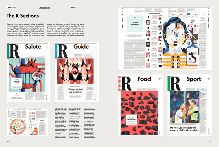
MP: I am a great admirer of the work of Javier Errea. He manages to bring a modern aesthetic to his projects while retaining a passionate commitment to traditional journalistic values. Francesco Franchi is also doing interesting stuff at Italy’s La Repubblica, bringing his unique visual style to a daily newspaper environment, with fascinating results. And I am just in awe of what the New York Times does every day. Many of us who have worked in smaller teams envy their resources, but the sheer intelligence and rigour of their visual journalism and their strong sense of who they are and what is right for their publication is a daily lesson in what design can do for newspapers.
DW: What do newspapers need to do to stay relevant in today’s climate, and how does design play into this?
MP: I don’t believe newspapers need a new formula. What society needs from the media now is high-quality reporting and editing, and a fearless desire to seek out the truth. Those are things which have always been at the heart of great newspapers, and they are more relevant and necessary today than they have been for a long time. Design can play a crucial role in supporting and promoting these values. Through design, we can reinforce the identities and voices of those news organisations we learn to believe and trust. And in an increasingly image-driven age, visual journalism is an essential tool, possibly the most important tool we have, to communicate the information and ideas that our audiences need to know.
Newspaper Design is available for £50 from publisher Gestalten. For more information, head to the website.

-
Post a comment


