Emily Oberman plays on royalty with Warner Chappell Music’s new logo
The Pentagram partner has given the 200-year-old publisher — home to songwriters and composers such as Beyoncé, Radiohead and Madonna — a regal rebrand.
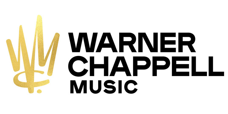
Emily Oberman has rebranded Warner Chappell Music, giving it a new logo centred around a golden crown symbol, which doubles up as a monogram of the company’s initials.
The company, founded in 1811, was originally called Chappell & Co, and started life as an instrument shop specialising in piano, and one of the first ever music publishing companies.
It was acquired by Warner Bros. Music in 1987, and so changed its name to Warner/ Chappell. The company has now tweaked its name again in line with its rebrand, getting rid of the slash symbol and adding the word “music” to its logo.
Company changes
The rebrand also comes amid wider structural change for the company, including new leadership and a new US headquarters in Los Angeles. Ex-Sony executive Guy Moot was hired as CEO and co-chair earlier this year, alongside Carianne Marshall, who is now chief operating officer (COO) and co-chair.
Marshall says that the new slash-free name aims to be more “modern”, and also plays down the distinction between the two previously separate companies, to represent how Warner Chappell Music is “becoming more global and connected”.
Regal new brand
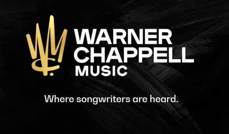
The new branding for Warner Chappell Music includes a golden crown symbol, which is also a calligraphic-style monogram making up the initials “WCM”.
Oberman says the meaning behind it is threefold – the regal icon nods towards the idea of song royalties, as well as the high status of some of the songwriters signed to the publisher, and the scrawl-style monogram represents the act of writing and composing music.
“We wanted to honour the songwriters that are the strength and heart of what Warner Chappell does, and so having a logo that speaks of the moment when they put pen to paper seemed appropriate,” she says. “We also wanted to signal that [musicians] at Warner Chappell are considered ‘songwriting royalty’.”
Gold colour “lets monogram shine”
Alongside the gold emblem, a monochrome colour palette has been incorporated, with the company name now set in a white, sans-serif typeface to the right of the logo, often used against a black background, such as on the website. Faint, white brushstroke marks feature on the background, and this black-and-white palette is sometimes inverted.
“Keeping the gold to the crown monogram only lets it shine and tells the royalty part of the story, without being too over-the-top,” Oberman says. “We also liked how black and white references the idea of pen and paper.”
An animated version of the branding sees it composed out of ink splodges and scrawls, which start off as the notations found on sheet music before transforming into the final logo.
Publishers focus on royalties
Music publishers differ from record labels in that they focus on the business and sale of musical compositions and songs, rather than solely promoting artists and their albums.
A publisher will sign songwriters and composers, and help them sell their songs through various means, such as to recording artists, films, TV shows and adverts, enabling them to collect royalties from the use of their music worldwide. The publisher then takes a cut of the income.
Warner Chappell Music is home to songwriters including Beyoncé, Radiohead, Madonna, Kendrick Lamar and Rihanna.
The new branding has rolled out online and will continue to roll out across all touchpoints including merchandise and print and marketing materials in the coming months.

-
Post a comment


