
Hackney Half Marathon rebrands to make running more “inclusive”
The annual event takes place in East London annually — its new look aims to be flexible and adapt year-on-year, while helping running appear more welcoming as a group sport rather than solo activity.
Soft Power has rebranded the Hackney Half Marathon, opting for a slanted “H” logo made up of many components that looks to represent a running community.
The half-marathon was started in 2014 by Hackney Council and was later taken over three years later by Virgin Sport.
This year’s event, which took place last weekend, was sponsored by Nike London and branched out into a three-day fitness festival, including other activities such as a five-kilometre run, a schools’ race and fitness classes.
Soft Power is a newly-formed design studio, co-founded by ex-members of The Beautiful Meme, including former creative director Ben Haworth and designer Hamish Gardner.

The studio has given the Hackney Half a logo made up of a forward-slanting “H” icon, which is in turn made of several rectangular blocks of irregular length.
Its varying components aim to represent different runners moving on parallel paths to each other, such as on a running track, while the angle of the “H” shape aims to add “perspective and depth, to represent distance”, says Haworth.

The “H” is used in multiple ways, sometimes contained within its shape, and other times “exploded” so that its rectangular parts are spread out, which looks to “accentuate movement” and make the branding flexible.
A sans-serif, neo-grotesque typeface is used in all-caps alongside the logo in varying weights, with the cap height sometimes increased or decreased to create an elongated or squashed effect for typography.
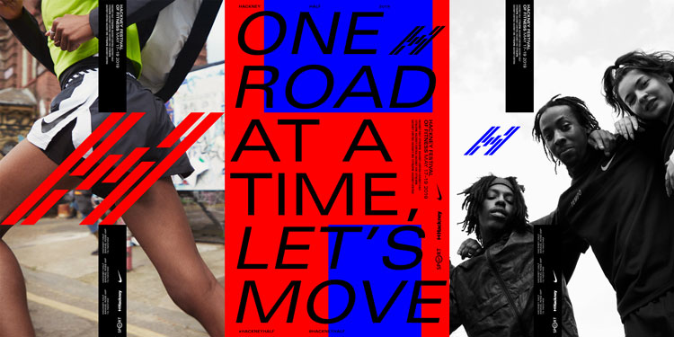
The “H” shape is also used in other forms across the identity, forming a structural grid that can frame content in different ways. The counters – spaces – created in the “H” change in size to accommodate contrasting colours and imagery.
“The grid system brings uniformity to all applications and was created with rigidity in mind to contrast against the dynamic nature of the ‘H’ logo,” says Haworth. “The simple characters of the letter ‘H’ mean the top and bottom counter spaces can flex on a horizontal axis to enhance specific content when necessary.”
An “acidic” colour palette of blue, red, pink and green has been incorporated, but the typeface and colours will change year-on-year depending on which illustrators or designers the half-marathon partners with, says Haworth, with the only constants being the “H” grid and slanted “H” logo.

Photography has been shot by Alina Negoita, and features group shots of running crews like TrackMafia and Tempo.
The overall identity, from the diverse photography through to the logo made up of many parts, looks to represent the idea of community, and change perceptions of running.
“Running has a bit of an image problem, in that it’s seen as a solo activity,” says Haworth. “But there has been a boom in urban running crews, which champion the value of acceptance and inclusivity. We wanted to create a brand that was a celebration of running’s ability to build communities.”
The new identity launched at the Hackney Half Marathon and Festival 2019, which ran 17-19 May, across wayfinding, signage, a new recovery area for race finishers and bespoke medals created for the five-kilometre run. The recovery area and medals were created by product designer Samuel Ross. The branding has also rolled out across social media and the website, print and marketing materials and apparel.


More stretched type and RGB colour palettes… Hmmm.
Looks fantastic, love it.