
The new identity for Mexican beer Tecate resists “macho stereotypes”
Elmwood New York has updated the beer brand’s identity in an attempt to reach a younger and more “progressive” generation.
Elmwood New York has created the new identity for Mexican beer Tecate which seeks to appeal to the “progressiveness of a younger generation”.
The new identity is rolling out now and has been applied to packaging on bottles and cans, as well as a new range of digital assets.

Tecate was established in 1944 in the town of Tecate, Mexico by Alberto Aldrete. Over the years, the beer company has expanded its range with a lighter version of the drink as well as a version with tomato juice, lime and chilli pepper.
In the 1960s, it introduced Mexico’s first ever “easy open” can so that a can opener was no longer necessary. It has since been bought by Heineken and is now the second-largest brand in the company’s portfolio.
“The most desirable beer in the country”
The brand is particularly popular in Northern Mexico (close to its original brewery) and the new work sought to expand this regional popularity to all of Mexico. In short, Elmwood says that Tecate wanted to “become the most desirable beer in the country”.
Elmwood New York executive creative director Meg Beckum says that the new identity aims to achieve this by appealing to a younger generation and “shifting the narrative” around beer.
“The brand has been intrinsically linked to masculinity,” she says, but is now “leaning into the optimism, proud patriotism and progressiveness of a younger generation”.
The social side to beer culture was a clear focus. “We pushed against the tired ‘macho’ stereotypes (often used in beer advertising) and shifted the narrative to one of friendship and camaraderie.”
“A deep understanding of Mexican beer culture”
Beckum says that an “immersive” tour of Mexico helped the design team pick up on the patriotism of the branding as the studio picked up on a “deep understanding of Mexican beer culture and drinking behaviour”.
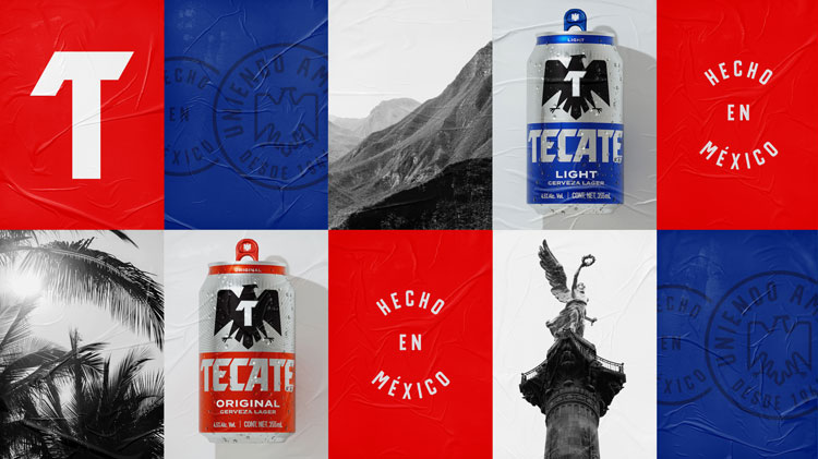
The process illuminated how differently beer is sold, displayed and consumed in Mexico. For example, the team picked up on the small bodegas in Mexico City where “single cans fight for shelf space”.

This was in stark comparison to the northern cities where the bodegas are “literally painted in Tecate brand colours and symbols”, Beckum says. “We had to design a system that could flex for a multitude of different environments and occasions.”
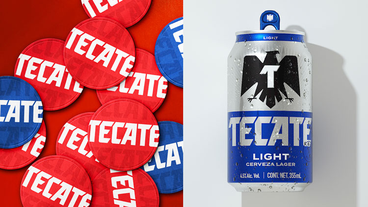
The brand has always featured an eagle as its logo, though its styling has changed over the years. Beckum says this icon was always going to be the “heart” of the visual identity. The bird has symbolic ties to the country; the Mexican coat of arms features an eagle eating a snake.

The latest “emboldened” iteration is a simplified design which retains the heritage of the symbols. It has been crafted with “honesty and simplicity” in mind, Beckum adds.
The wordmark has also been redrawn to align with this look. “Unnecessary visual clutter” has been been stripped back throughout the branding.
Beckum explains that the branding’s “rigid lockup” has also been removed so that there’s greater room for flexibility when scaling up and across platforms. “The icons anchored the system as we moved into more experimental, expressive and interactive experiences,” she adds.
“Millenial-Z audience”
As part of the brand’s awareness push, the assets had to appeal to a wider world: from music festivals to sporting events (although these might be put on hold because of the pandemic).
Beckum explains that another of Tecate’s objectives was to “rejuvenate” the brand among the “Millennial-Z audience”. That meant that digital touchpoints were a key focus for the new identity.
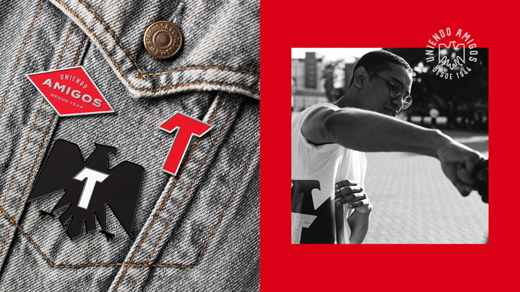
It also tied in with a push to create a “true lifestyle brand” and not just a beer brand, Beckum adds. Elmwood has created apparel with the new branding, such as T-shirts and badges.
Read this next


Done completely in Adobe Illustrator – and it shows. Absolutely no craft, no idea, no feel, no emotion, no love, all vectors and shutter stock. Rubbish.