
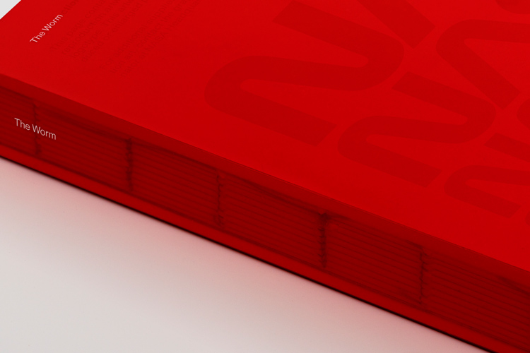
How Bruce Blackburn and Richard Danne designed the NASA Worm
Following the news of Bruce Blackburn’s passing at the age of 82, we look back on how the ubiquitous red logo was developed.
American graphic designer Bruce Blackburn died earlier this month at the age of 82, his family have confirmed.
Blackburn’s career was one that spanned some four decades in total. His work was characterised by modernist and minimalist principles, and he counted IBM, the Museum of Modern Art and the US Federal Government among his client base.
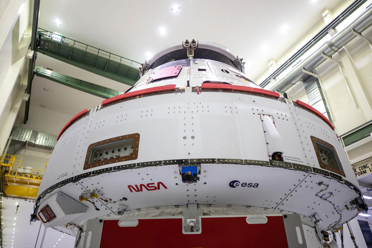
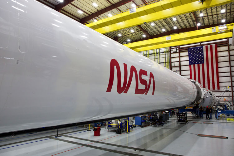
But without a doubt, Blackburn’s best-known and best-loved project was the NASA “Worm”. Following its adoption in the 1970s, the curved red wordmark quickly became synonymous with technology and spaceflight – and even now has such a dedicated fanbase that it was brought out of retirement last year to return to space in future missions.
Here is the story of the NASA Worm:

Produced for “a pittance”
The NASA Worm was born as a result of the US Federal Design Improvement Program – an initiative prompted by then-President Richard Nixon and the National Endowment for the Arts (NEA).
Under the scheme, more than 45 federal agencies had their identities evaluated and redesigned, including the National Park Service, the Environmental Protection Agency and the US Postal Service.
Danne & Blackburn was one of ten New York studios approached to submit a redesign proposal in 1973. Recalling in a 2016 documentary on the subject, Blackburn said the pair had offered to do their design “for a pittance”, because theirs was a new studio in need of the exposure.
Fighting against “hype and fantasy”
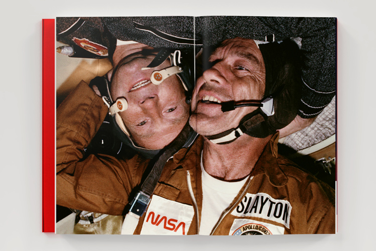
The outgoing logo was the red, white and blue NASA insignia designed by James Modarelli just one year after the agency’s inception in 1958.
Affectionately referred to as the “meatball”, the logo was not capable of dealing with the renewed attention NASA was getting post-moon landing, Blackburn once said.
Blackburn’s studio partner Danne added to this, reflecting in an interview with Creative Review: “The meatball was complicated, hard to reproduce and laden with Buck Rogers imagery – clearly it was born out of the classic airman syndrome where hype and fantasy dominated over logic and reality.”
“Our [proposed] logotype was quite the opposite: it was clean, progressive, could be read from a mile away, and was easy to use in all mediums,” he added.
Working with the asset “nobody would touch”
Blackburn referred to his own practice as having an “emphasis on programmatic design”. In the case of NASA’s redesign, the biggest question was how to accurately represent such a forward-facing organisation for years to come.
“Their whole business is the future and getting us there,” he said of the challenge in the 2016 documentary Blackburn, calling it one of the most difficult he encountered during his career.
The pair agreed that the key to the logo would be in the NASA name – Blackburn went so far as to call it the one asset “nobody would touch”. The final result, with its circle curves and lines, was intended to look “otherworldly”.
Almost an entirely different logo
But such a radical overhaul in design would never go down smoothly with everyone – during the development of the Worm, Danne & Blackburn would need to explain their work several times.
According to the 2016 documentary Blackburn, NASA’s administration took particular issue with the lack of cross strokes on the logo’s A’s.
“We laughed, though not in their presence, because it seemed so foolish,” Blackburn recalled – then they set to work convincing those in charge they were wrong.
The ultimate “what not to do” rulebook
Eventually, those at the top came on board and Danne & Blackburn moved to the next stage of the project: guidelines.
The NASA standards manual from the time was a “rulebook” according to Blackburn. The pair “thought of everything” he said, including a comprehensive list of all the ways the Worm was not to appear in official NASA communications.
“Everyone has an idea of how to make something like this better than it is, all of which have a tendency to dilute the power of [the original],” he said.
The manual, originally enclosed in three ring binders for ease of reference, would be reborn decades later when a 2017 Kickstarter campaign raised almost $1 million (£723,000) to reprint 10,000 copies for contemporary fans.
A reminder of the Challenger disaster?
The Worm’s 17-year lifespan would be cut short by NASA in 1992 – a few years after the Challenger explosion during undeniably a tough time for the agency. In its place, the revived meatball stood.
The change was the work of newly-appointed administrator Dan Goldin, who cited a boost in morale for the reason for the switch. According to him, NASA employees didn’t like the Worm.
Perhaps the real reason was a little more nuanced: the meatball represented the glory of the Apollo missions, while the Worm had reigned during the 1986 Space Shuttle disaster.
An army of designers fighting for the Worm
Designers would not let such a well-thought out logo go quietly. Blackburn himself recalled the design community “reacting violently” to the decision: “They said, ‘This is a crime, you cannot do this’, and ‘This is a national treasure, and you’re throwing it in the trash bin’.”
Indeed, even years later, designers would have something to say about it. Pentagram partner Michael Bierut would be quoted in an article for the New York Times in 2009 saying: “The worm is a great-looking word mark and looked fantastic on the spacecraft. By any objective measure, the worm was and is absolutely appropriate, and the meatball was and is an amateurish mess.”
Blackburn’s daughter Stephanie McFadden would further attest to her father’s disappointment in a conversation with the New York Times years later.
“His design sensibility was offended by what happened,” she said. “He thought the meatball was clumsy and sloppy and not representative of the future.”
It would remain a tender topic for Blackburn, who lamented the excuse of staff morale for axing the Worm. Last year, when the Worm returned to space on the side of a SpaceX rocket, it appeared a full circle had been made.
“I think he was glad to know that his design was finally back in space,” his daughter said.
Bruce Blackburn died at the age of 82 in a nursing home in Colorado. He is survived by his wife, daughter, two sons, sister and eight grandchildren.

-
Post a comment


