Tokyo 2020: Olympic torch designed to showcase “hope”
The Olympic flame has started its relay, though the future of this year’s Games looks uncertain because of the coronavirus outbreak.
Update [1/4/2020]: The Tokyo Olympics have now officially been postponed, and will take place in July and August 2021.
While the rest of the world begins an extended period of travel restrictions, the Olympic torch travelled from Greece to Japan last week. It was lit at the Temple of Hera in Ancient Olympia on 12 March, and handed over to Tokyo at the Panathenaic Stadium in Athens.

The journey is supposed to take 121 days and aims to “bring a message of peace and hope to the world”, according to Olympic organisers. The flame — which is being called the Flame of Recovery’ — is planned to go on display at areas of the country that were badly affected by the 2011 Great East Japan Earthquake and ensuing tsunami. In 2011, the 9.0 magnitude earthquake resulted in more than 15,000 deaths.
It is scheduled to arrive at Tokyo’s New National Stadium in July, though like many events across the world, this is now in doubt after the coronavirus outbreak.
A reference to Japan, sustainability and the bullet train
The form of the torch is a marriage of Japanese tradition and modern technology. Five flames emerge from flower petals and unite at the centre of the torch to “give off a more brilliant light”, which the organisers of the Games are calling the ‘Path of Hope’.

The torch itself has been designed with a cherry blossom motif. Its journey around the country coincides with cherry blossom season in Japan. The torch is made out of aluminium, employing the same manufacturing technology used in the production of the Shinkansen bullet train. The high-speed train reaches speeds of 200mph, and links major cities within the country.
In a bid for “seamlessness”, the torch is made from a single sheet of metal.
Who designed the Tokyo 2020 Olympic torch?
The torch has been designed by Tokujin Yoshioka, a Japanese designer and architect who often works with light and perceptions of human senses. His installation, Rainbow Church, in Seoul showcased a 9m tall mirror made of 500 crystal prisms.
The flame made its way through Japan, showcasing areas of the country such as the Tohoku region which has been badly affected by the 2011 earthquake. On social media, a campaign is being run with the hashtag: #HopeLightsOurWay.

The design also boasts sustainable credentials; 30% of the torch is made from recycled aluminium, originally used in the construction of prefabricated housing units in the aftermath of the Great East Japan Earthquake. This is largely symbolic, “highlighting the steps taken toward the reconstruction of disaster-affected areas”.
The cauldron shares the torch’s cherry blossom motif, and is also partly made from the same recycled aluminium material. It weighs approximately 200kg.
A relay lantern is used when the flame is transported from Greece to the host country. The lantern is then taken from region to region, along with the flame.
An emblem that represents Japan’s landscape

The relay emblem has been designed to be “consistent” with the rest of the Olympic identity, according to the event organisers. Three rectangular shapes that make up the logo have been redesigned to look like the flame of the torch.
It also aims “to express the dynamic movement of a flame” and incorporates the “bokashi technique for colour gradation often used in traditional Japanese ukiyoe painting”.
Bokashi is a technique traditionally used in woodblock printmaking, which can create a variation in light and darkness of a colour. Ukiyo-e paintings are known for their blue tones, and can be seen in the works of the artist Hokusai.

Traditional colours, such as vermilion (which represents “energy, passion, affection and dynamism”) and yellow ochre (which “suggests vast expanses of earth or land”). Together, they “create the sense of a Japanese-style festival”.
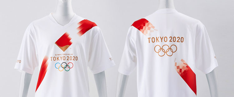
A set of uniforms has also been designed for the torchbearers, featuring a diagonal slash which has its origins in Japanese Shinto rituals (activities based around the country’s temples). The director for this project was Daisuke Obana, a fashion designer who started his own brand, N-HOOLYWOOD.

A threatened games
After the outbreak of coronavirus, the certainty of Tokyo 2020 is in doubt. Many have voiced concern about the international aspect of the games; while most other sporting events have been either cancelled or postponed. Thousands gathered to see the Olympic flame in the country last week despite the virus outbreak (there are over 1,000 cases of COVID-19 in Japan).
It has been reported that the IOC (International Olympic Committee) is looking into delaying the events, while others have suggested that the games take place privately, without audiences.
This week Canada announced that it would not send its national athletes to Japan while Australia also told its athlete to prepare for a later Games. Seb Coe, the World Athletics president, said that the Games could be postponed.
The Olympics and design

Until the recent coronavirus outbreak, the design industry had been excited about the upcoming games – both from the IOC and studios. In Tokyo, there was an exhibition of “art posters” from a range of designers which aimed to encourage “momentum” before the summer. In the UK, Tom Pigeon, a Scottish design studio, celebrated Team GB’s participation in a series of “subtle and considered” posters.
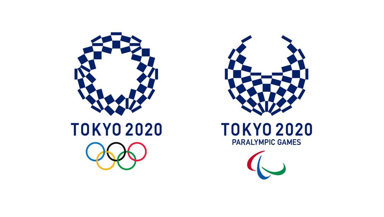
The official logo for the games has been designed by Asao Tokolo. After a public vote narrowed the designs to a selection of four, Tokolo’s chequered design won. It uses indigo blue, which is both traditional for the country, and expresses “elegance and sophistication”, according to the Tokyo 2020 Emblems Section Committee. The three rectangular shapes in the logo are intended to depict “unity in diversity”.

The Olympic committee also started a competition to create the mascots for the Games, specifying that those submitting designs didn’t have to be designers. Eventually two figures – or yura-chara in Japanese – were picked: Miraitowa and Someity. The pair, voted for by Japanese elementary schoolchildren and the Mascot Selection Panel, are designed by Ryo Taniguchi and riff off the chequered logo.
-
Post a comment


