NHS sets strict guidelines around use of its visual identity
The National Health Service (NHS) has new compulsory rules around logo placement, typeface and colour usage, which have allegedly sparked anger from hospital managers under pressure to save money.

Hospitals, GP surgeries and clinics across the UK will need to update their NHS branding, as the organisation has published new, strict guidelines around the use of its visual identity.
The new NHS Identity Policy includes the use of a consistent logo format and placement, colours, typefaces, imagery, tone of voice and rules around which organisations can use the logo.
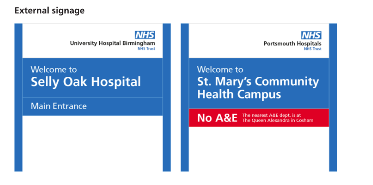
When used alongside a hospital name, the NHS logo must now sit above the name, the number of permitted typefaces and fonts has been reduced and there is a wider colour palette.

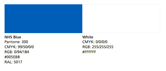
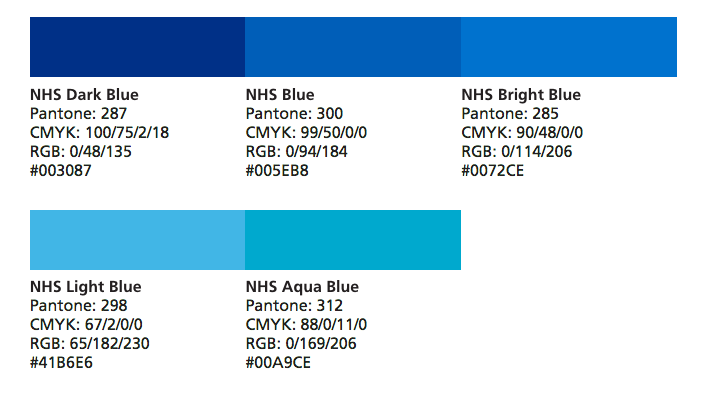
The core colour palette of NHS Blue – Pantone 300 – and white will continue to be used, alongside four groups of colours including blues, neutrals, a support palette of greens, and highlights, ranging across purple, pink, red, yellow and orange. Particular shades have been specified.

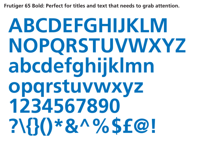
The core typeface Frutiger will continue to be used in a variation of fonts, alongside a secondary typeface of Arial, and a foreign language typefaces when necessary for those who do not have English as a first language.

Imagery used must now “reflect diversity” within the NHS and “promote equality”, as well as being representative of the public across factors such as gender, race, disability, age and sexual orientation.
The new guidelines follow market research, gathered from 1,000 interviews and 28 focus groups with patients and the wider public, which showed that people “want to see the NHS identity consistently applied”, according to the NHS.
The guidelines are compulsory for NHS organisations and aim to reduce “confusion and concern” surrounding NHS services, but have “prompted fury and ridicule” from hospitals and charities reports The Telegraph which may now need to update branding across multiple platforms. The NHS is currently trying to save £22bn by 2020.

The new guidelines apply to all mediums, from print communications to interior and exterior building signage and online and social media platforms.
The organisation says that existing print materials using inconsistent versions of the branding do not need to be thrown away, just gradually phased out as new materials produced adhere to the guidelines, so as not to be wasteful.


All images courtesy of the NHS.


Having just visited Frimley Park Hospital and found it incredibly hard to follow their messy and indistinct signage which looks very very old fashioned I can see the need for an update BUT with money so short NOT a good idea at this time…
This hasn’t changed for years?
Having been in hospital recently I must admit it was lovely to see some cohesive NHS branding as I waited the 17 days for my broken elbow to be looked at.