YouTube reveals new logo and app design
The social media platform has taken on a “cleaner” look, with a logo incorporating a play button symbol and an app that aims to be more “intuitive”.

YouTube has a new logo, in line with an app and web browser redesign for the social media brand.
YouTube was founded in 2005 as a platform for watching videos, and has since evolved to provide users with curated and bespoke video content based on their interests, as well as a place to share their own videos. It was bought by Google in 2006.
The new logo sees the red cylinder that used to surround the word “Tube” removed and swapped with a red play button symbol, which sits to the left of the brand name.
The word YouTube is now all set in black, rather than black and white as it was previously.

The play button symbol is now also used individually as an abbreviated version of the logo, making the branding better suited to “our multi-screen world”, says YouTube’s chief product officer Neal Mohan.
“The updated logo combines a cleaned-up version of the YouTube wordmark and icon, creating a more flexible design that works better across a variety of devices, even on the tiniest screens,” says Mohan.
The refreshed logo comes alongside a wider revamp for the social media brand, including a “clean new design” of its mobile app.

This includes a white header, with menu tabs now at the bottom of the screen, so “they’re closer to people’s thumbs”, says Mohan, with new Library and Account menu options to provide more information about the user’s video history.
A feature has been added allowing users to browse and discover similar videos through a row of suggested videos, which is visible when watching a video in full-screen mode.
New user functions have also been added, such as a gesture-based one that means a double tap on the left or right hand side of a video will fast forward or rewind it by 10 seconds. Users can also watch videos at different speeds, as has already been rolled out across the desktop version.
YouTube is due to introduce a Tinder-style swipe function in coming months, which will let users swipe left to a previous video or right to watch the next one.
It will also roll out different-shaped video screens to suit various formats alongside horizontal, such as vertical and square.

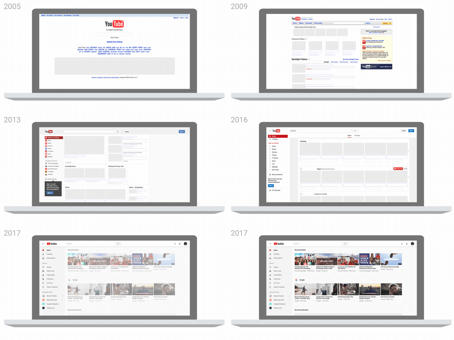
The desktop version of YouTube has been updated to suit the “cleaner” look of the app, with more white space, a less prominent side menu, fewer video borders and larger, brighter photography.
The new look aims to be “fresh, simple and intuitive”, says Mohan, and has been redesigned based on parent company Google’s Material Design guidelines.
The new logo, app and browser version have rolled out.


I was thinking, just the other day, that the YouTube Logo needed an update but imagined it would be bought more in line with their Play logo range: https://cdn.cultofandroid.com/wp-content/uploads/2016/04/google_play_icons_blogpost.png