
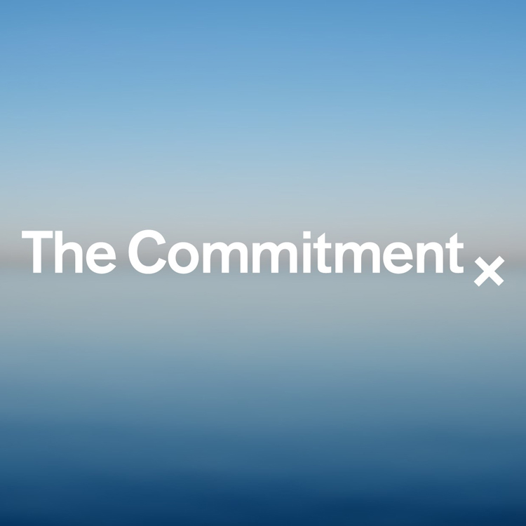
The Commitment’s new brand by Studio Sutherl& sealed with an ‘x’
The visual identity for the climate campaign and research group takes inspiration from the history of letter writing and launches ahead of the 6 May local elections.
Studio Sutherl& has designed the identity for environmental campaign group The Commitment based around the idea of marking letters with an ‘x’.
The Commitment works to put the climate and environment at the top of the political agenda through campaigning and research.
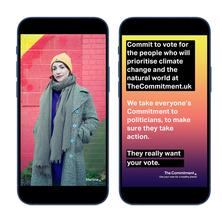
The UK-based non-partisan organisation encourages people to vote for politicians who prioritise the environment and make written commitments to the natural world on its website.
Studio Sutherl& founder Jim Sutherland says that the studio “wanted to avoid anything that was too overtly ‘green’ or natural” when it came to the organisation’s identity.
Instead, the studio looked to the idea of making a cross as a “vote, a signature and mark of love for the planet”, he says. This custom dates back to the Middle Ages, according to Sutherland, when a cross at the bottom of letters and documents would signify “sincerity, faith, and honesty”.
It was Gilbert White, a pioneering 18th century naturalist, who first used ‘x’s to mean kisses in a letter, Sutherland explains. “The multiple meanings of the cross seemed to sum up the idea of voting and of love and of commitment,” he adds.
The ‘x’ is used on the logotype and in wider applications, including as a device which follows voter statements. Headlines, portraits, quotations and names can all be signed off with the ‘x’ mark.
“These explanations – colourful, emotive and varied – are powerful in getting the attention of politicians,” the designer says.

Akzidenz-Grotesk has been used as the typeface, which is “bold, modern and fairly neutral”, Sutherland says. The logotype has been slightly modified so that the angled ‘t’s match the ‘x’ mark, according to the designer.
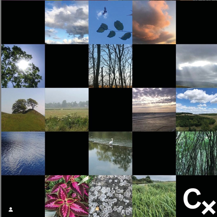
As The Commitment has no political affiliations, any party political colours had to be avoided, Sutherland explains. “Abstract gradations of colours” have been used instead, he says, which are taken from natural landscapes. These are used for printed material and stationery such as business cards.

Photography has been shot by creative agency Improper. These include portraits of people in Derby, Dumbarton and the West Midlands in the run-up to local elections taking place on 6 May.
A campaign has been launched on social media platforms using Improper’s visuals and Studio Sutherl&’s identity. As part of this, the design studio has created animated used for video commitments.
The “social first” campaign will be animating more names and faces as commitments are added, Sutherland says.
He adds: “Overall the idea is that people themselves can create and post their commitments in what form they feel most comfortable with – and simply sign off with a cross.”
View this post on Instagram
You can find more information and read people’s commitments on the group’s website.
What do you think of the identity for The Commitment? Let us know in the comments below.

-
Post a comment


