
Ascend Studio eschews energy branding tropes with Edify’s visual refresh
The Australian energy start-up Edify was founded in 2015 but needed an identity to match its “established success” and wider work network.
London-based Ascend Studio has provided Australian energy company Edify with a visual update to help it stand out from its competitors.
The refreshed identity includes a “neatened” logo and wordmark, expanded colour palette as well as a user experience (UX) and user interface (UI) update for the company’s website.
When the energy company first launched in 2015, it was somewhat of an outlier in the Australian energy space. Coal is used to power 80% of the nation’s electricity. Edify aims to accelerate the sustainable energy movement by creating solar farms across the country, thereby making use of the country’s expanses of space.
The new identity is based on an “impact-focused narrative” that builds on an “established legacy of success”, according to Ascend Studio. It was also a chance to show the company’s transformation from “youthful disruptor to an established and mature organisation”.

Neatening the logo
Ascend Studio created Edify’s original identity when it was first set up, the studio’s creative director Paul Croxton tells Design Week. It was launched as a bold start-up with an electric green logo, and a colour palette to match. However, as the brand has evolved – and as the field has become more competitive – the identity needed to reflect their “market-leading” standing.
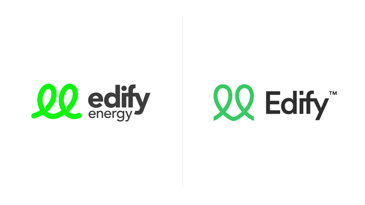
The logo and wordmark features several updates, some more subtle than others. The original logo takes its shapes from a light bulb filament, and also signifies linking – as a way to show how the start-up could link with industry and new partners. The single line also forms a double-‘e’, an acronym of the company’s name. Overall, the logo was also a way to not fall into energy branding tropes, like using symbols such as the sun or fire and focus on invention and innovation.
The updated logo keeps these details but has been “neatened”. It is now less angled, which makes its “subtle” heart-shape reference more obvious.
The wordmark drops the ‘energy’ thanks to the company’s name recognition (the name has also now been trademarked). It also has a capital ‘E’, which was important as the company is involved in an expanding corporate world too. The dot above the ‘i’ has now become a square – added to give the wordmark more “balance”. Sailec is used as the font for the wordmark but also the wider identity.
A more “natural” colour palette
As well as adopting a more “natural” green, a secondary colour palette has been established with blue tones. ‘PB Blue’, ‘Sky Blue’ and turquoise are now used across the identity. Croxton explains that this inspiration came from the way the solar panels glint in the sunlight. This colour palette was also chosen specifically to avoid tropes the yellow and sunny tones used in energy branding.
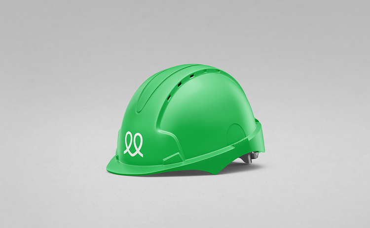
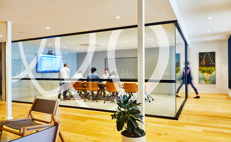
Edify’s website has also been updated to align with the new identity, and the UI and UX has been updated. The new branding rolls out across collateral including car decals, office supplies and products such as hard-hats.

-
Post a comment


