A hand-painted logo for a pop-up dining experience
DewGibbons+Partners has created a hand-painted logo for a Chilean pop-up dining experience, which is influenced by native Ona artwork.
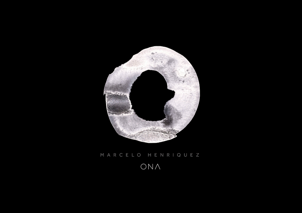
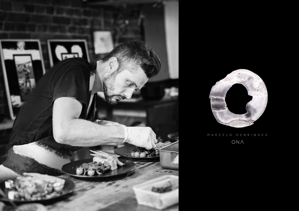
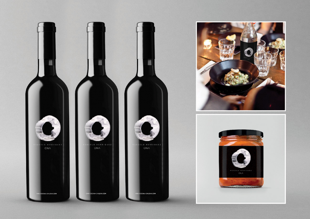
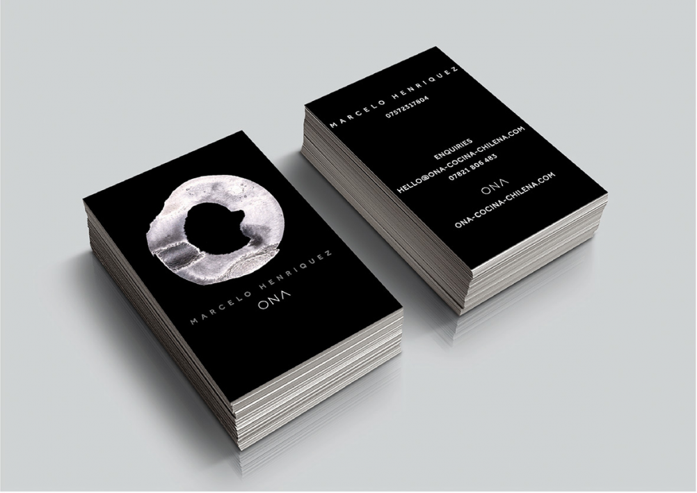
DewGibbons+Partners has created a hand-painted logo for ONA – a Chilean pop-up dining experience run by chef Marcelo Henriquez.
Chilean chef Henriquez is launching ONA across a series of venues in London, aiming to introduce Chile’s food to the UK.
The ONA name comes from the now-extinct Ona tribe, who lived on the Tierra del Fuego islands in the far south of Chile.
The ONA identity has been hand-painted by DewGibbons design director Raj Phull and aims to reference a dinner plate, while also being reminiscent of patterns and prints created by the Ona people.
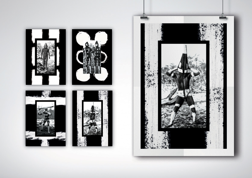
A series of monochromatic artworks, created by DewGibbons and Chilean artist and designer Jaime Poblete Aravena, are used at the pop-up dining events.
The monochromatic look is carried through the experience, with a black-and-white dress code for diners and black crockery.
DewGibbons creative director Nick Vaus says: “What I like about the ONA identity is that it feels really organic and it comes across as really well-crafted.
“In a design world where things are all too often so stylised and perfect, it’s refreshing to have something that feels so natural.”
Read this next


I wouldn’t want to be the finisher responsible for trimming those business cards. Nonetheless the logo and identity work looks lovely, and I love the tie-in with the artworks.
Is that Alfred Hitchcock I see?!
Very disctinctive, often overlooked in today’s maximallist information overload packaging.